連鎖品牌都長一樣嗎?
連鎖不複製,飯BAR餐飲集團
連鎖品牌新思維
有沒有可能有一個連鎖品牌 每家店都不同呢?
有沒有可能有一個連鎖品牌
每家店都不同呢?
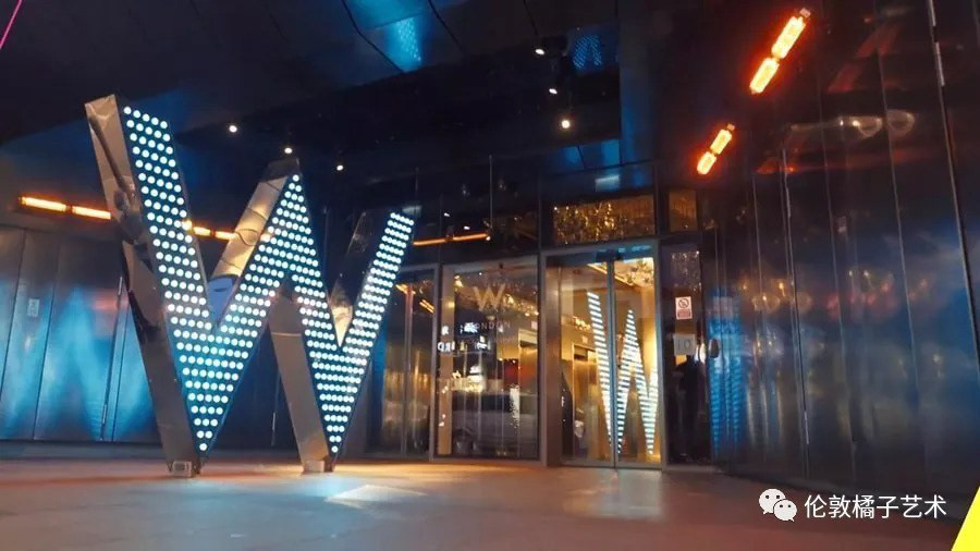
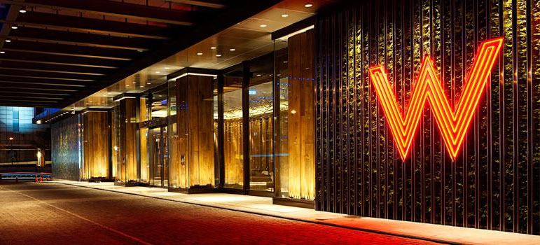
答案是有的!全球化發展的 W hotel ,就是一個很好的範例,在完整的品牌規範策略,核心價值不變提下,品牌延伸融合當地的特色,設計出每個國家專屬的規劃,不僅展現品牌的廣度,更能加深消費者多元的印象!

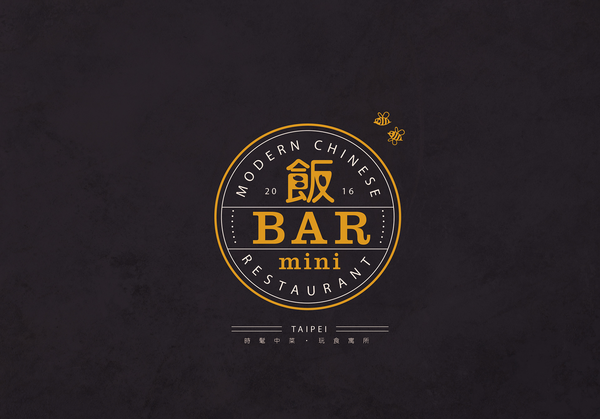
 「連鎖不複製,系出同門,各自精采!」
One Franchise, different stores. From the same root, growing their own uniqueness.
齊禾也有一個客戶案例可以跟你分享:
川菜剛開始在台灣被介紹,是很早期的時代了!當時因為川菜口味重而且價格便宜,很快的便以外省菜的姿態在巷弄間開始流行。但幾十年來,世代一直在變動,現代人講求健康,口味也越來越精簡,越來越淡。川菜 、粵菜、 這些口味較重的特色菜,慢慢的也開始沒落。
飯BAR
「飯BAR把好味道用貼近年輕人的方式,好好傳承!」
飯BAR 就是在這樣的時空背景下所創立,兩個7年級生的老闆,想復興這些傳承著文化的好味道,用嶄新的方式來融合並且介紹給年輕世代!
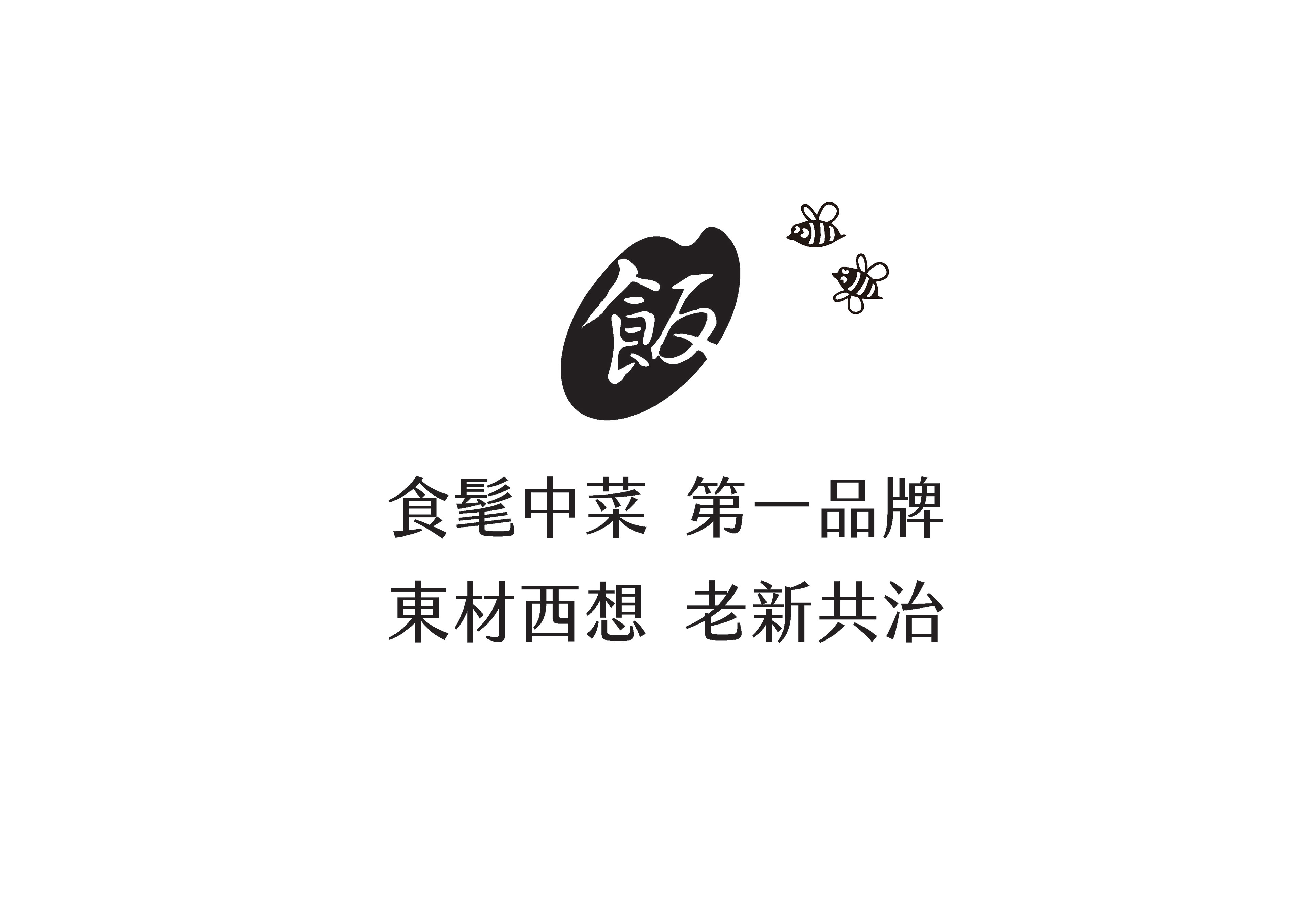
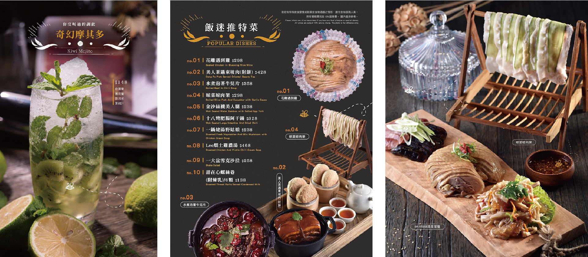
飯BAR的核心價值在於 ,東材西想,老新共治。運用東方常見的食材,結合西方料理的方式,融合川、粵、滬、湘、閩各家特色,並以上海菜為基底,做出創新的菜色!
飯BAR的核心價值在於 ,東材西想,老新共治。運用東方常見的食材,結合西方料理的方式,融合川、粵、滬、湘、閩各家特色,並以上海菜為基底,做出創新的菜色!
Rice Bar
從飯吧的創始一路走來~我們陪著客戶整理方向,定位品牌。我們思考著有沒有可能有一個連鎖品牌可以讓每家店都有不同風貌呢?
A stylish Chinese restaurant where you can taste fresh style in classic dishes with creativity.
Taiwanese eating culture is diverse, aside from foreign cuisine, Chinese cuisine itself consists of Taiwanese, Hakka, Fuzhou, Sichuan, Cantonese, Jiangsu, Zhejiang, Hunan and Shanghai cuisine…etc. Before 80s, there were numerous restaurants as such throughout the streets, these stand for home dish, it was a wonderful taste that lingered in many diners’ memories, as time goes on, generations change, small diners have been replaced with fast-food franchise , PASTA, and the traditional taste only seems to be available in hotels or restaurants.
The Rice Bar was founded by two young men born in 1980s, with their passion for Chinese cuisine, let’s try the fresh, new taste in the classic dishes with creativity.
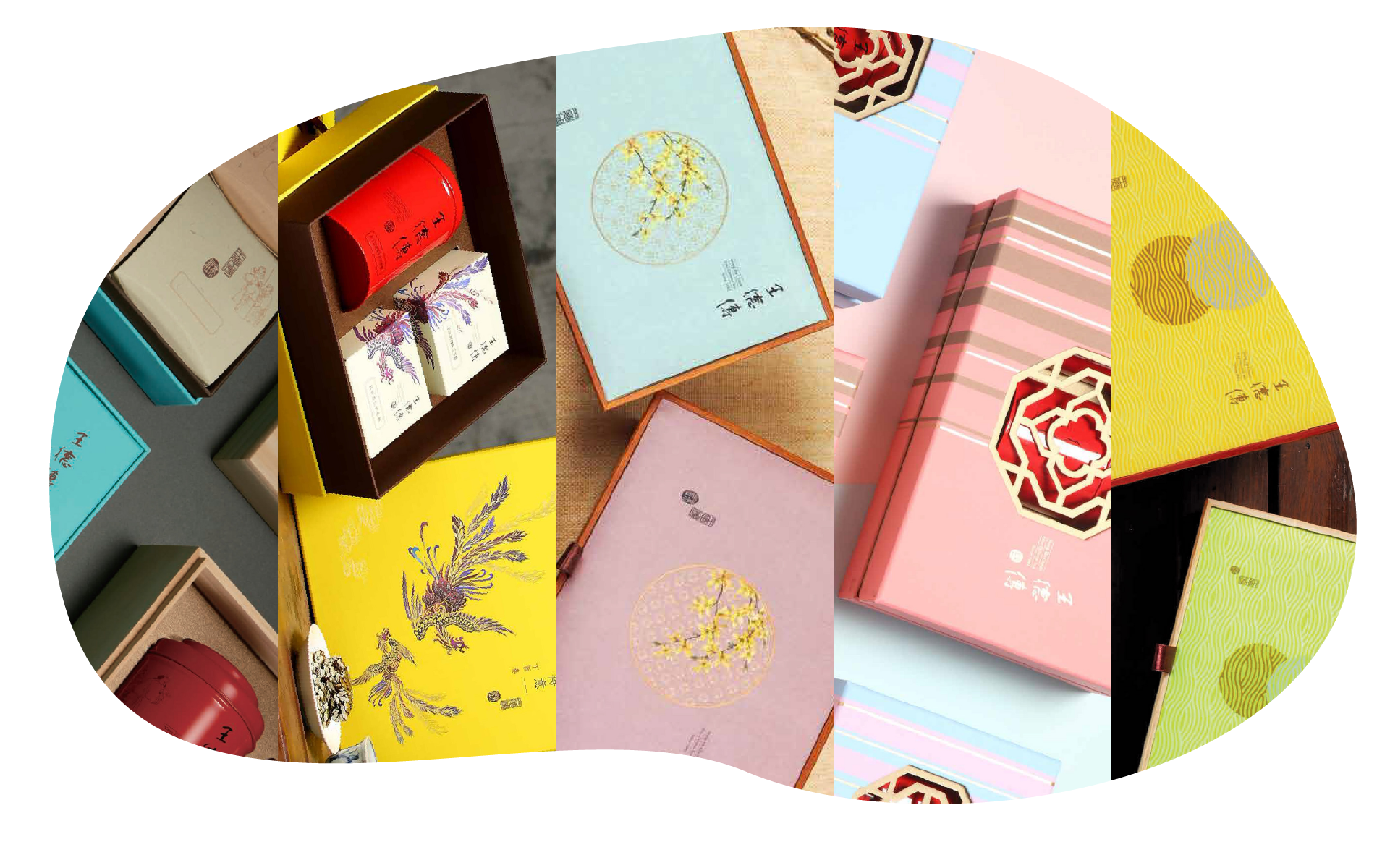
四家店分別有鎖定的消費客群
從飯吧的創始一路走來~我們陪著客戶整理方向,定位品牌。我們思考著有沒有可能有一個連鎖品牌可以讓每家店都有不同風貌呢?
From the very beginning until now, we redirect and rebrand with customers.We wonder if it’s possible to have different presentations in different branches of a franchise.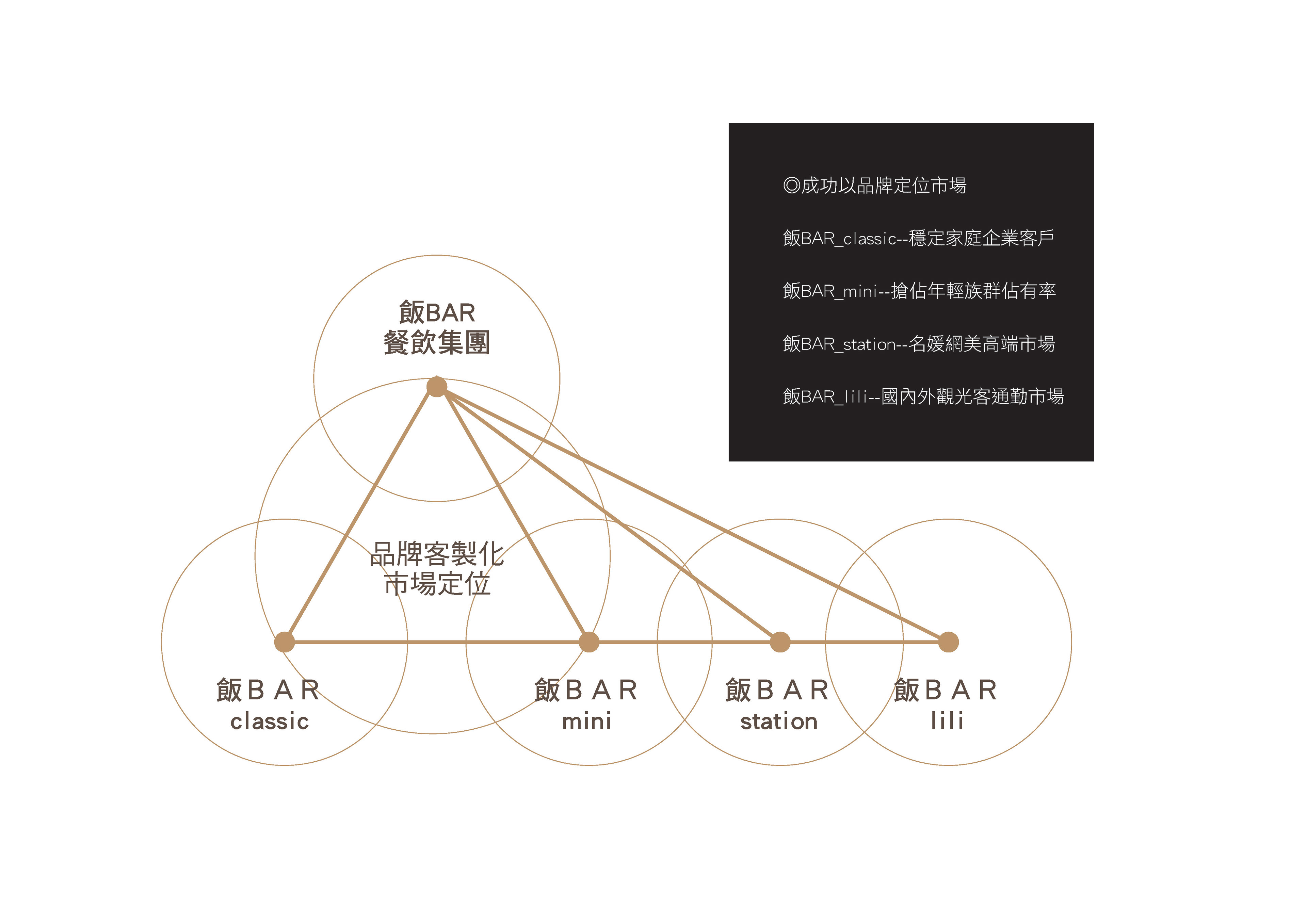
四家店分別有專屬的品牌識別
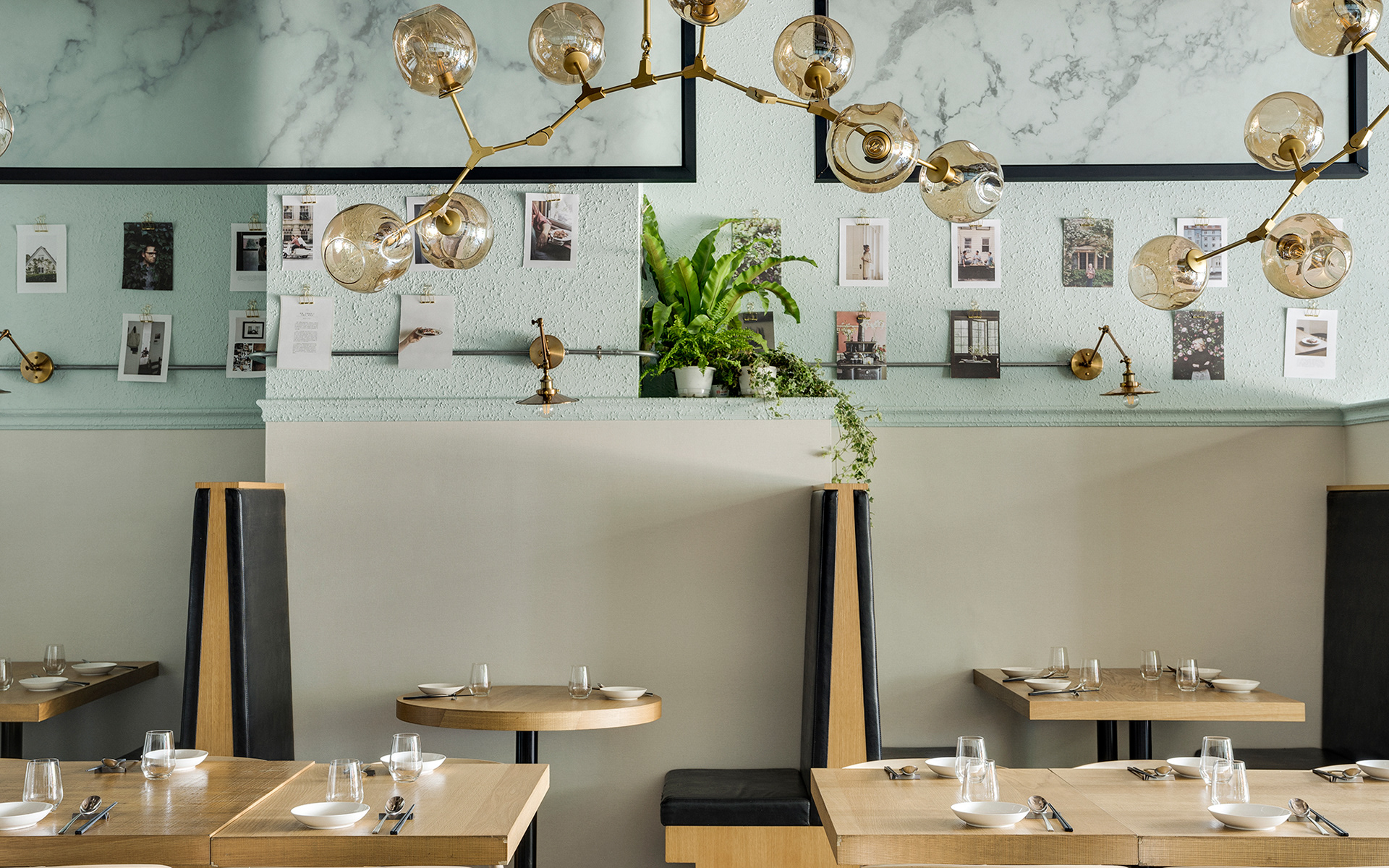
在完整的品牌規範策略,核心價值不變提下,針對不同的商圈客群,我們投其所好展現店別差異,即使是同樣的一道菜,在不同的分店也有著不同的展現手法,這同樣表現在品牌識別上,連鎖不複製的概念不僅展現品牌的廣度,更能加深消費者多元的印象!
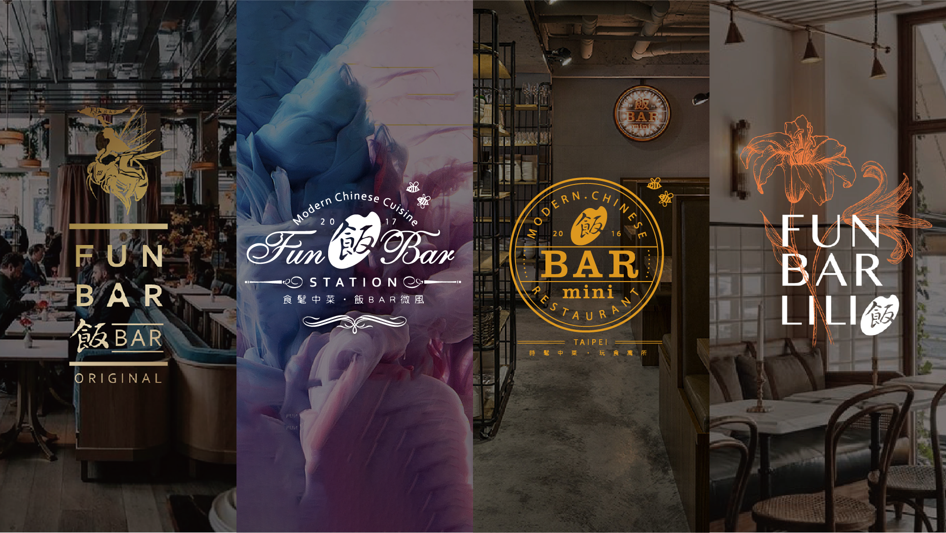
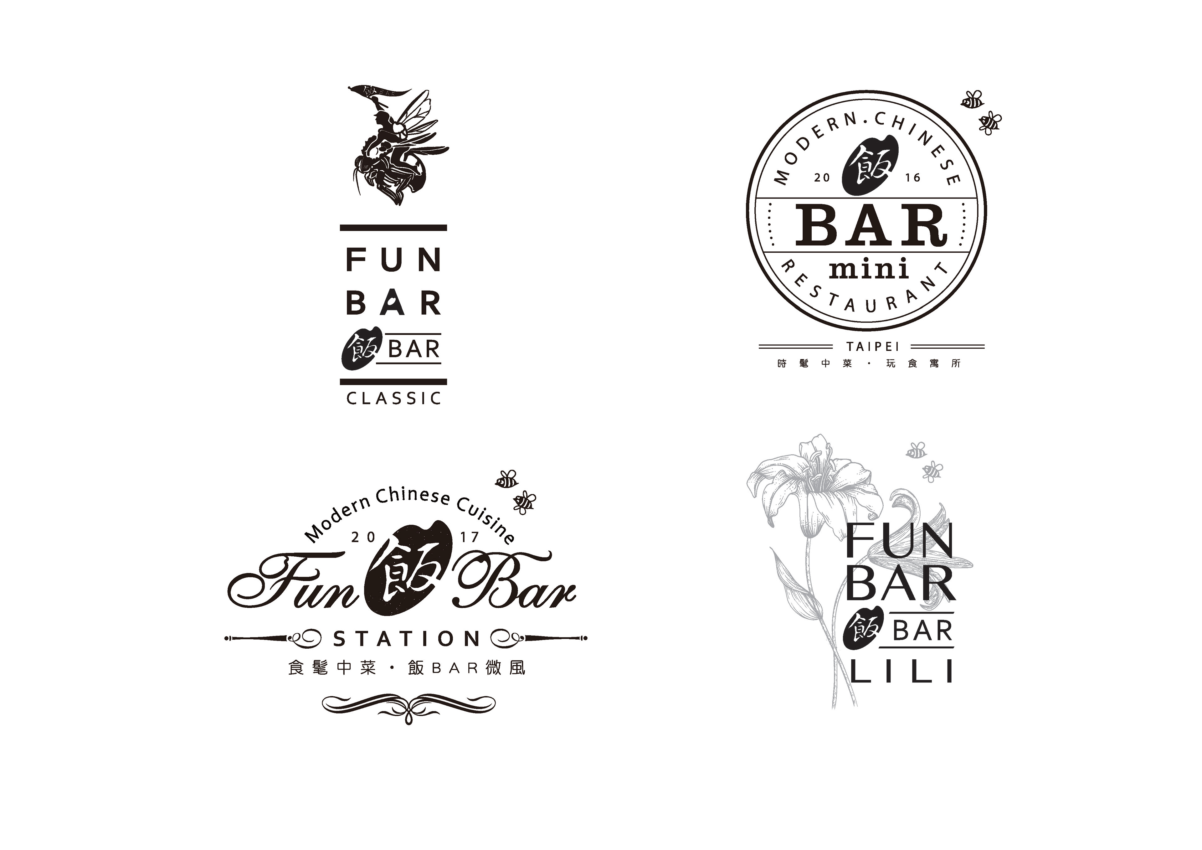
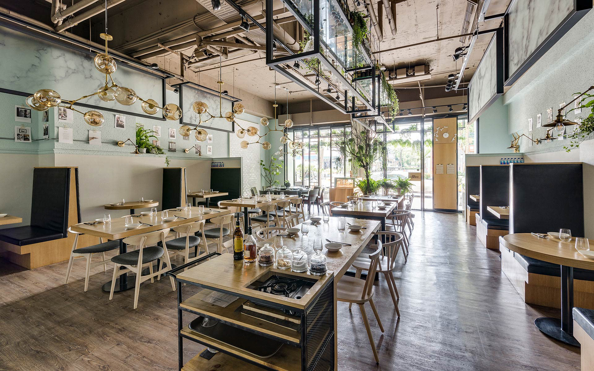
飯BAR CLASSIC 內湖旗艦店
座落於內湖科學園區,主要客群是中午吃飯,企業餐敘的科技新貴,還有內湖住宅區的家庭式客戶。室內規劃有很多綠色的植栽,傳遞出種早期台灣,一家人團圓吃飯的氛圍,有一種家的味道,濃濃的人情味!
不同的分店各有其主要經營族群,從品牌定位與識別做精準規劃設計,延伸到店裝設計讓各店各有特色,經營4年多以來,不因展新店而分食業績,反讓營收大幅成長,在在顯示出品牌定位與經營策略的準確功不可沒!
Under the circumstances of the same core value and complete brand guidelines, we target at different audiences, giving what they desire to distinguish our stores, even the same dish, is presented differently in different stores, the same manner goes with the trademarks as well, the concept of one franchise but not the same shows the depth of the brand, impressing consumers even more!
Different branches targets at different groups, from the accurate design of the branding and identity to interior design, through four years, the sales didn’t spit with the expansion, instead, it rose significantly, showing again and again how crucial Branding and Operation Strategy are.
飯BAR CLASSIC 內湖旗艦店
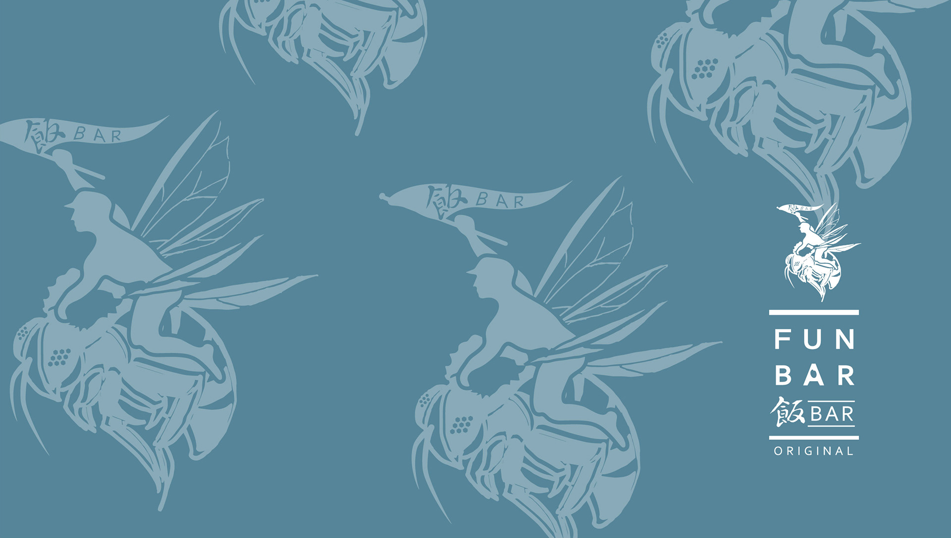
座落於內湖科學園區,主要客群是中午吃飯,企業餐敘的科技新貴,還有內湖住宅區的家庭式客戶。室內規劃有很多綠色的植栽,傳遞出種早期台灣,一家人團圓吃飯的氛圍,有一種家的味道,濃濃的人情味!空間設計上以大型圓桌與包廂,可多人共同用餐的形式為主軸,企業識別是一位背著米袋的勇士,騎著蜜蜂,帶領企業往前衝,米袋代表的米食帶有中華文化的意涵。
蜜蜂勇士,有開創先鋒的意思,也期許企業成為創意中菜的領導先鋒!
RICE BAR CLASSIC NEIHU FLAGSHIP STORE
從2017開始受大環境的影響,景氣不好,飯BAR決定在東區開館,我們同時也將品牌重新定位,雖然經濟不僅氣,但很有趣的是,同時也有一股網紅年輕勢力的崛起!飯BARmini也就此誕生,客群就是這群年輕的消費者。mini在行銷上做了調整,把餐點的份量變少,價位也拉低許多
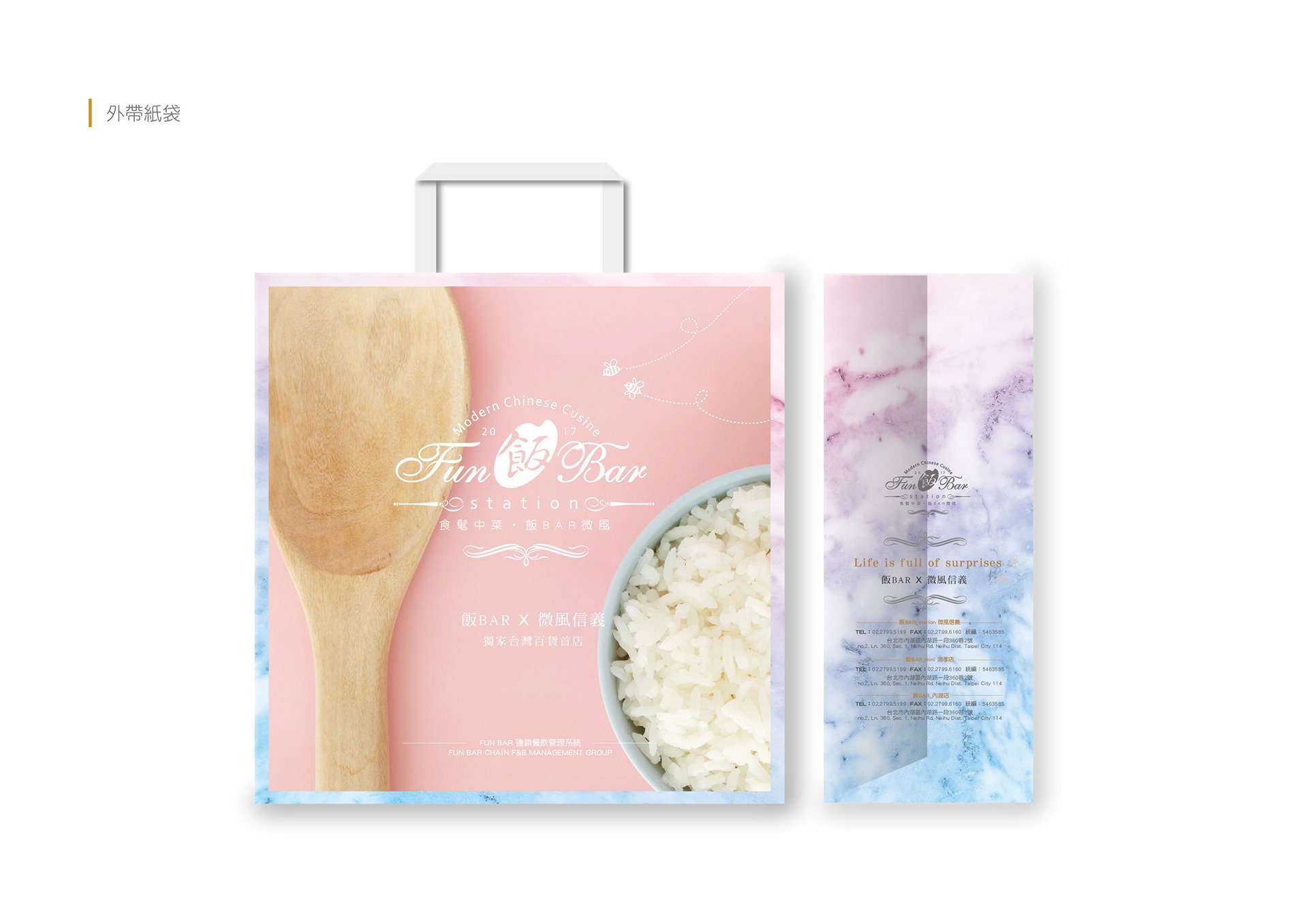
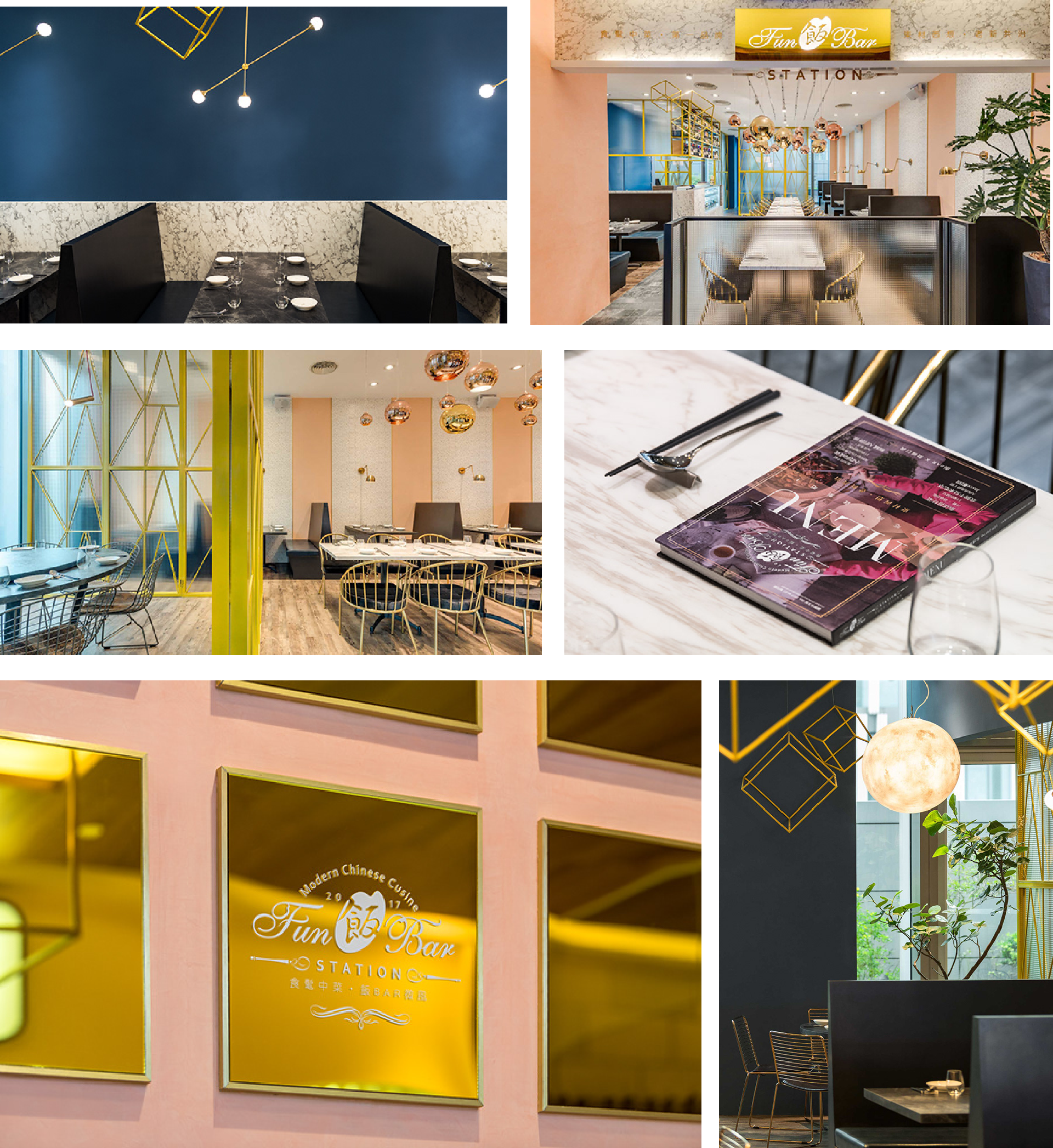
經過兩年的努力耕耘,飯BAR 交出了亮眼成績,也被看見!開始有百貨來邀約,飯BAR Station就此誕生,與微風集團合作就座落於名媛雲集的微風信義館
第四家店2019年五月開幕,飯BARLILI ,座落於台北車站二樓的微風北車,人來人往的交通樞紐
Rice Bar Classic Neihu is situated in Neihu Science-Based Industrial Park, is the original store of Rice Bar, the main audience is the officer workers during lunch break as well as family reunions and business assemblies in the evenings.
The key interior design is the sizable round tables and booths for big groups of diners, the trademark is a warrior carrying a sack of rice, riding a bee to lead businesses forward, the rice sake stands for Chinese cultures. The bee warrior stands for pioneer, and wish the businesses to become pioneers in creative Chinese cuisine.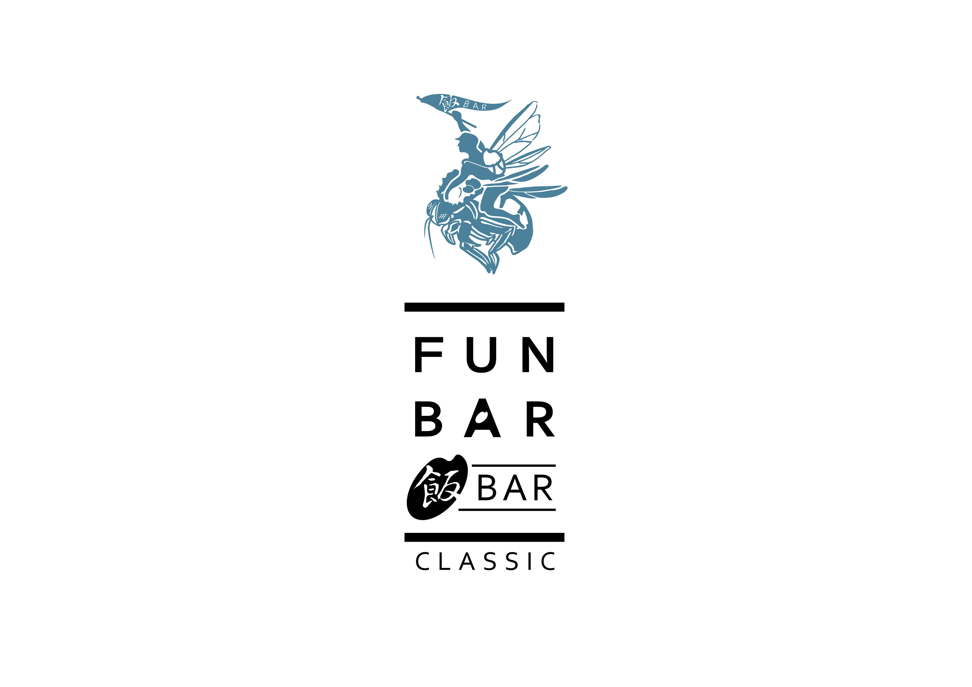
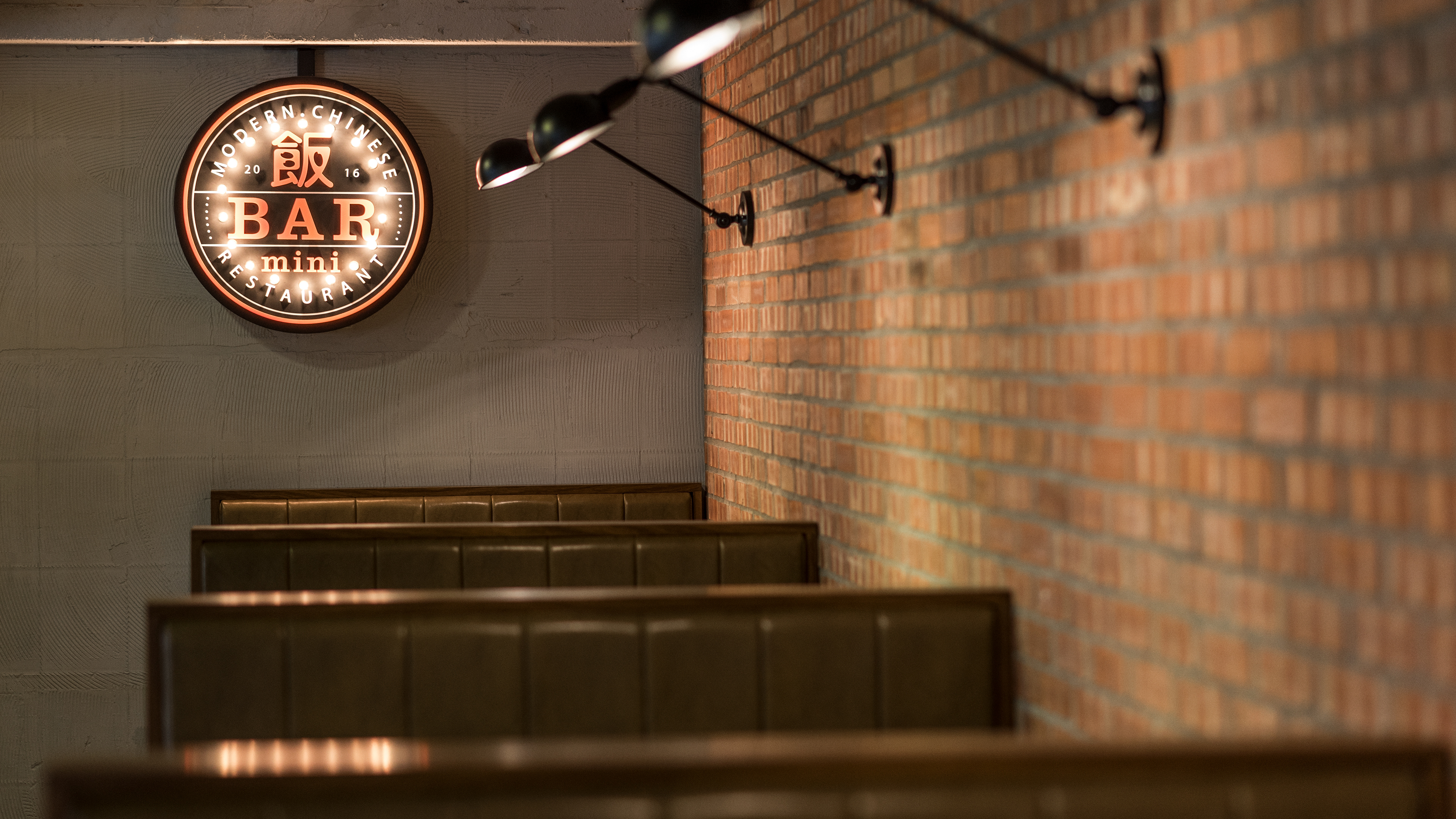
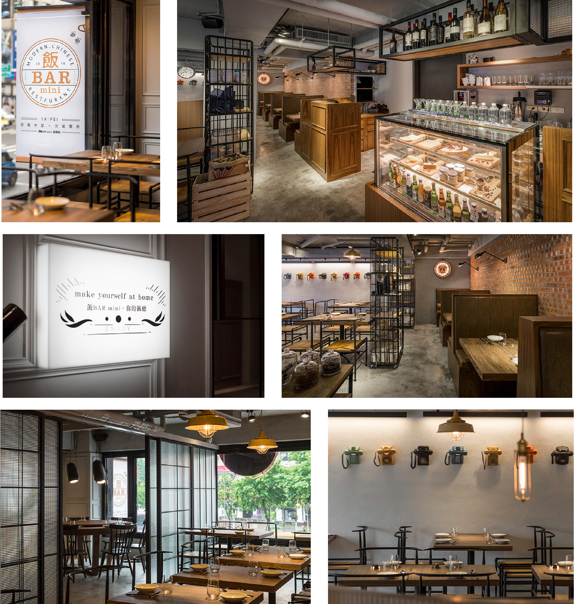
 飯BAR-mini 台北東區mini館
從2017開始受大環境的影響,景氣不好,飯BAR決定在東區開館,我們同時也將品牌重新定位,雖然經濟不僅氣,但很有趣的是,同時也有一股網紅年輕勢力的崛起!飯BARmini也就此誕生,客群就是這群年輕的消費者。mini在行銷上做了調整,把餐點的份量變少,價位也拉低許多
這樣即便是三兩朋友小聚,也可以很好點菜,大家一起分享。
室內風格中式結合美式工業風,有小桌,有調酒,有射飛鏢的休閒小酒館風格,企業識別運用80年代美式復古霓虹藝術,很像早期的公路漢堡餐廳輕食的概念。新舊的融合呼應品牌核心精神的老新共治,也有世代交替的意味!
另外,這個策略也成功把一部分原本內湖店家庭客群的年輕後輩,成功導入。原本小時候會跟的家人一起去聚餐的小朋友們,也正是這一波主打的年輕新勢力。憑藉著我以前吃過的對品牌的信任與熟悉,最直接體現出對品牌忠誠度!
RICE BAR MINI TAIPEI EAST-DISTRICT STORE
A conversation between the young people and Bar mini, smaller portion of the food, with more amicable prices, giving young people a new option. The trademark utilizes Vintage Neon art from the 80s, resembling the concept of road-trip burger restaurants back in the day. A combination resonates with the core value, old and young as one, it’s old-fashioned and innovative at the same time.
Different from being bright and homey in the first generation of Rice Bar, Rice Bar mini combines American industrial style with Chinese style, small tables, cocktails and dart as in a country bar, meanwhile, Rice bar mini reinterprets how Chinese cuisine presents in flavor and smell, giving the Chinese dishes simple presentation and idea, becoming a chic and iconic Chinese restaurant.
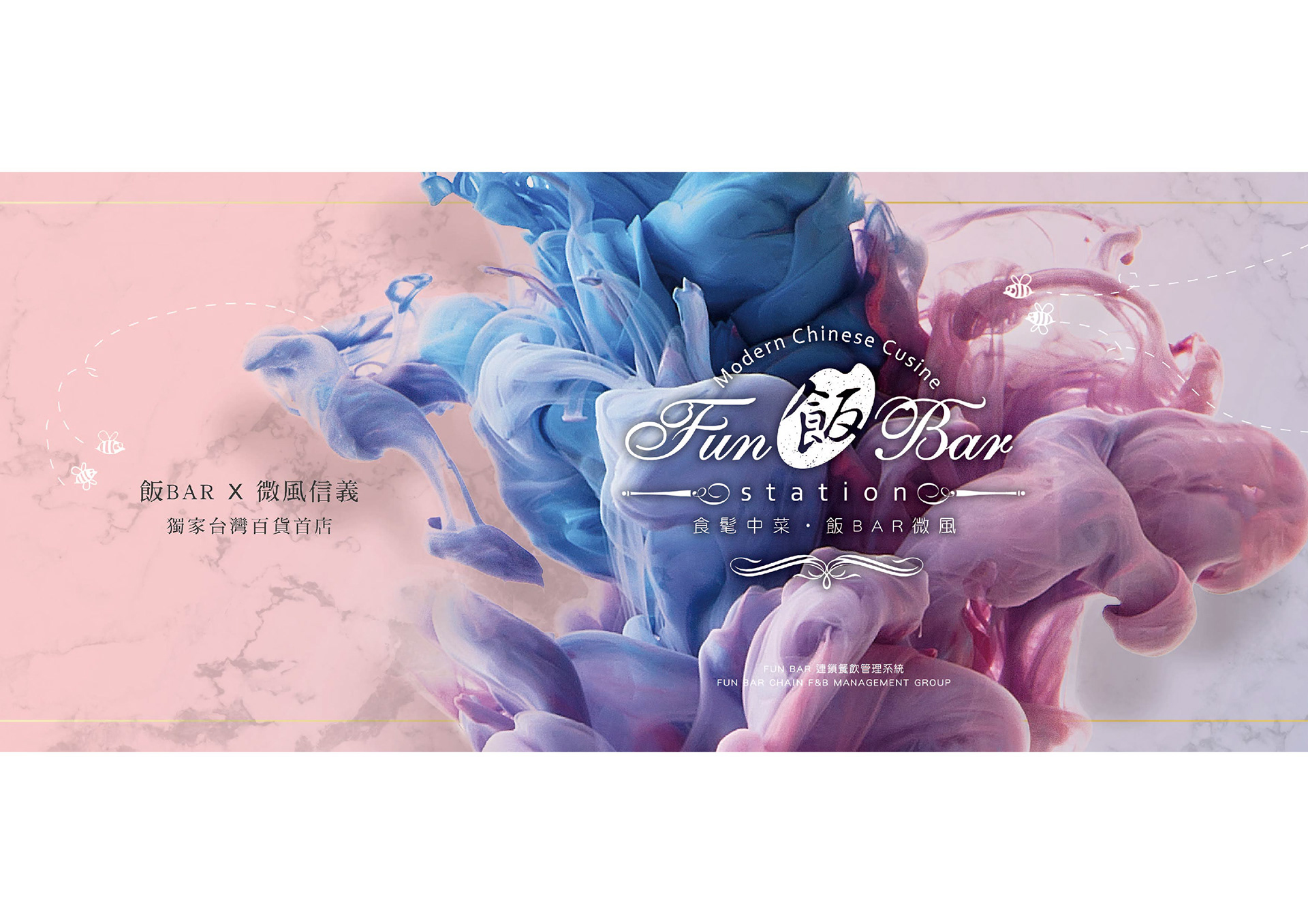
 飯BAR Station 信義微風館
經過兩年的努力耕耘,飯BAR 交出了亮眼成績,也被看見!開始有百貨來邀約,飯BAR Station就此誕生,與微風集團合作就座落於名媛雲集的微風信義館
經過品牌策略討論,我們把這裡的客群,大膽定位於 “來逛百貨的人”。
也就是我逛累了,想吃個飯,然後繼續逛街的那些人,主要客群就會是信義微風的精品客群,品牌調性走法式優雅風格,讓客人可以自在融入用餐,搭上IG潮流,好好的拍照打卡!
RICE BAR STATION XINYI BREEZE CENTER
2017 Rice Bar Station opened in Breeze Center, Rice Bar’s system became a success during the three years, taking the concept of “relay station”, the brand creates a brand new eating sensation with the unique aesthetics. Since Rice Bar Station is located within a shopping mall, we regard the customer base as shoppers, which are people who wish to take a break or eat from their shopping journey. The customers are targeted as Breeze Center’s high-end consumers, so the brand takes on France’s elegant style, indulging customers in a brief but enjoyable dining time.
The trademark features an elegant brush stroke to exhibit French romance, walking in Rice Bar Station, the space color is based in French blue outlined by gilt golden geometric lines. Visual is emphasized with quartz powder and serenity blue for French elegance.
“Rose Quartz” and “Serenity Blue”, the two iconic colors soothe nerves like Lavenders, bringing peaceful vibes. Healing colors and design, pleasing diners as they walk in.
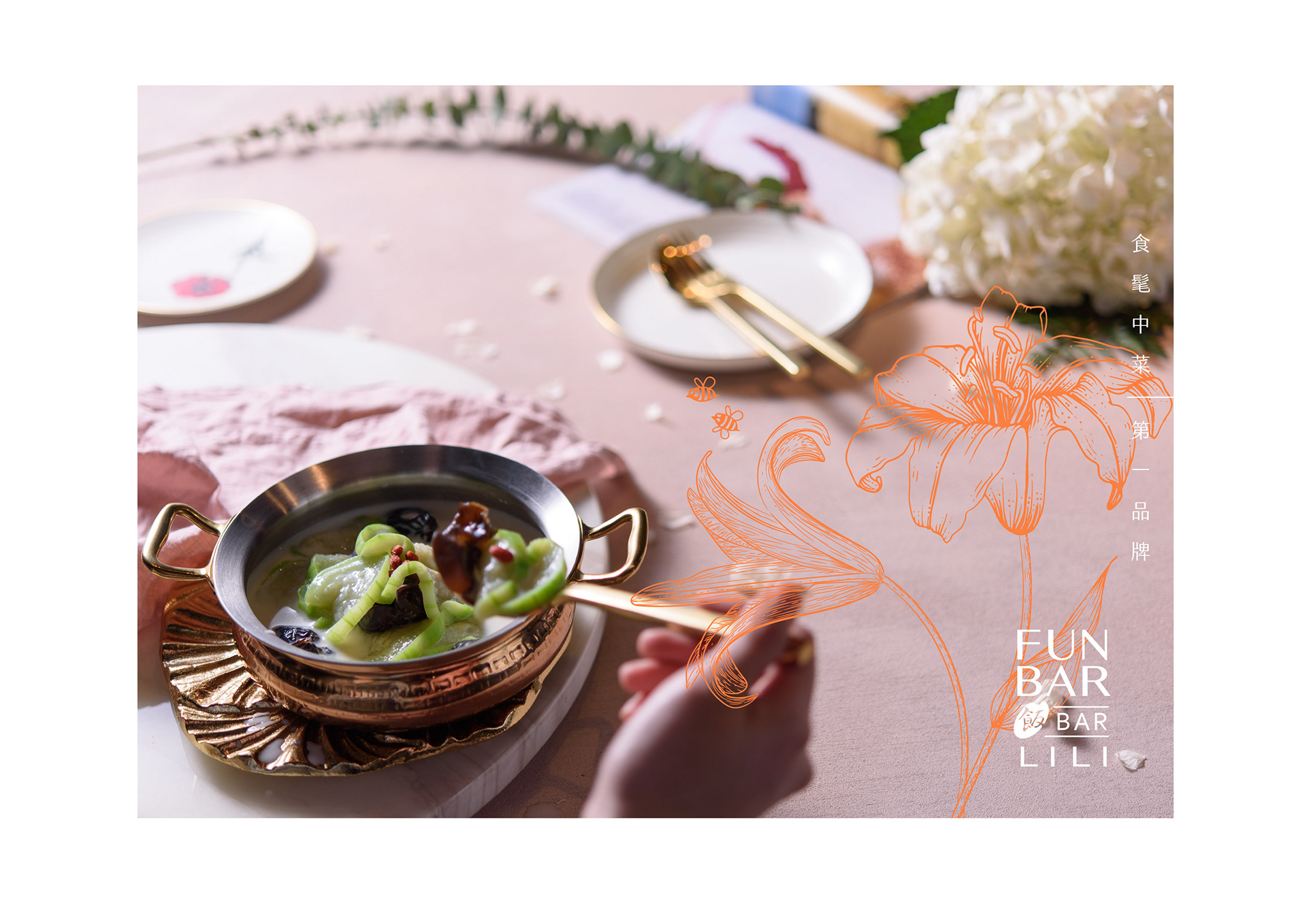
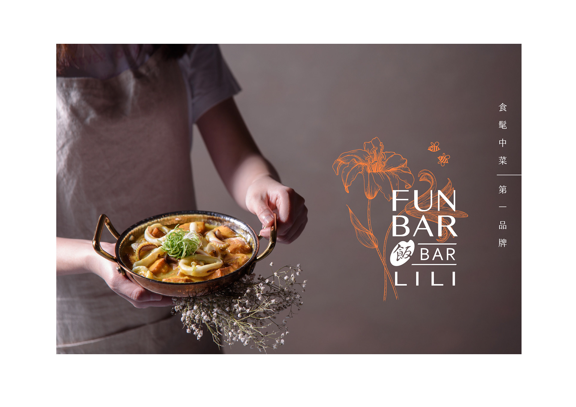
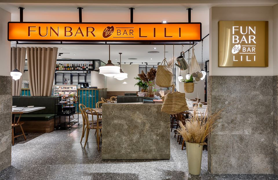
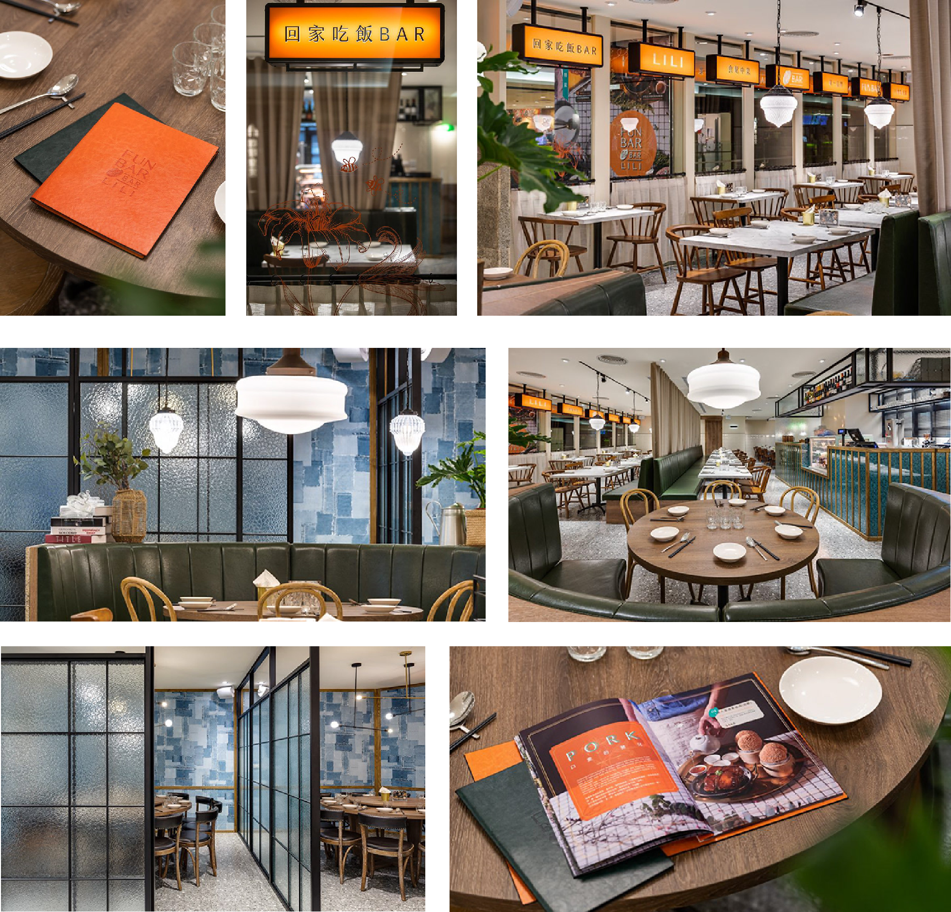
飯BARLILI 台北車站微風廣場
第四家店2019年五月開幕,飯BARLILI ,座落於台北車站二樓的微風北車,人來人往的交通樞紐
客群定位鎖定對台北不熟的旅客的“朋友”。為什麼呢?
請問如果你有外地朋友來高雄找你玩,想說先一起吃個飯吧! 會是誰決定吃飯地點?
一定是你啊!而且大家大概知道,台北車站對新來的朋友來說,其實沒有很友善,很像是迷宮,要成功離開車站 ,也是很難得,所以直接約在車站最方便!
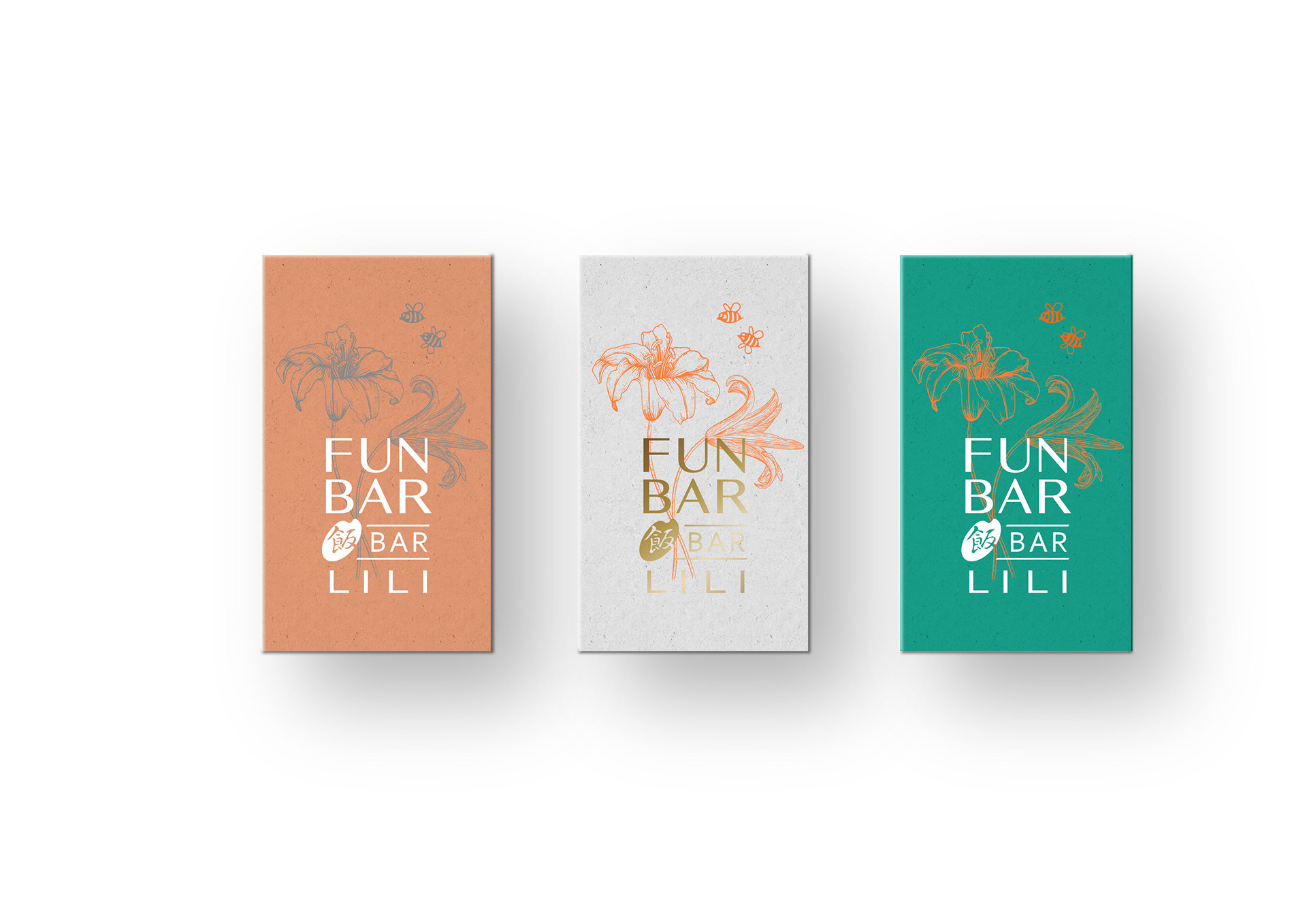
設計風格以歐風市集的概念,帶入異國風情,飯BAR LiLi 是創辦人媽媽的名字,企業識別用代表母親的金針花,橘黃色作為品牌色,顯眼又有溫度!
Rice Bar Lili Taiepi Main Station Breeze Center
Rice Bar Lili Taiepi Main Station Breeze Center is situated on the second floor of Breeze Center at Taipei Main Station, a hub of hustle and bustle. In-store design takes the concept of European market, infused with exotic atmosphere, targeting at travelers, the station is both the beginning and the end. Home is where mother is, Rice Bar Lili is named after the founder’s mother, the trademark features an orange daylily as a mother’s incarnation comforting a child, orange as the brand’s color brings brightness and warmness.
世代在走,設計要有
連鎖品牌不一定都要長得一模一樣。透過飯BAR集團的例子,齊禾協助品牌在三年內展了四家據點,創造近兩億的營收!因為明確的品牌定位,
不但沒有互相搶客,反而達到品牌相互連結與加分的效果。
這就是品牌規劃的威力!
刊登日期:2023.05.23
連鎖品牌都長一樣嗎?
連鎖不複製,飯BAR餐飲集團
連鎖品牌新思維
連鎖品牌新思維
有沒有可能有一個連鎖品牌 每家店都不同呢