



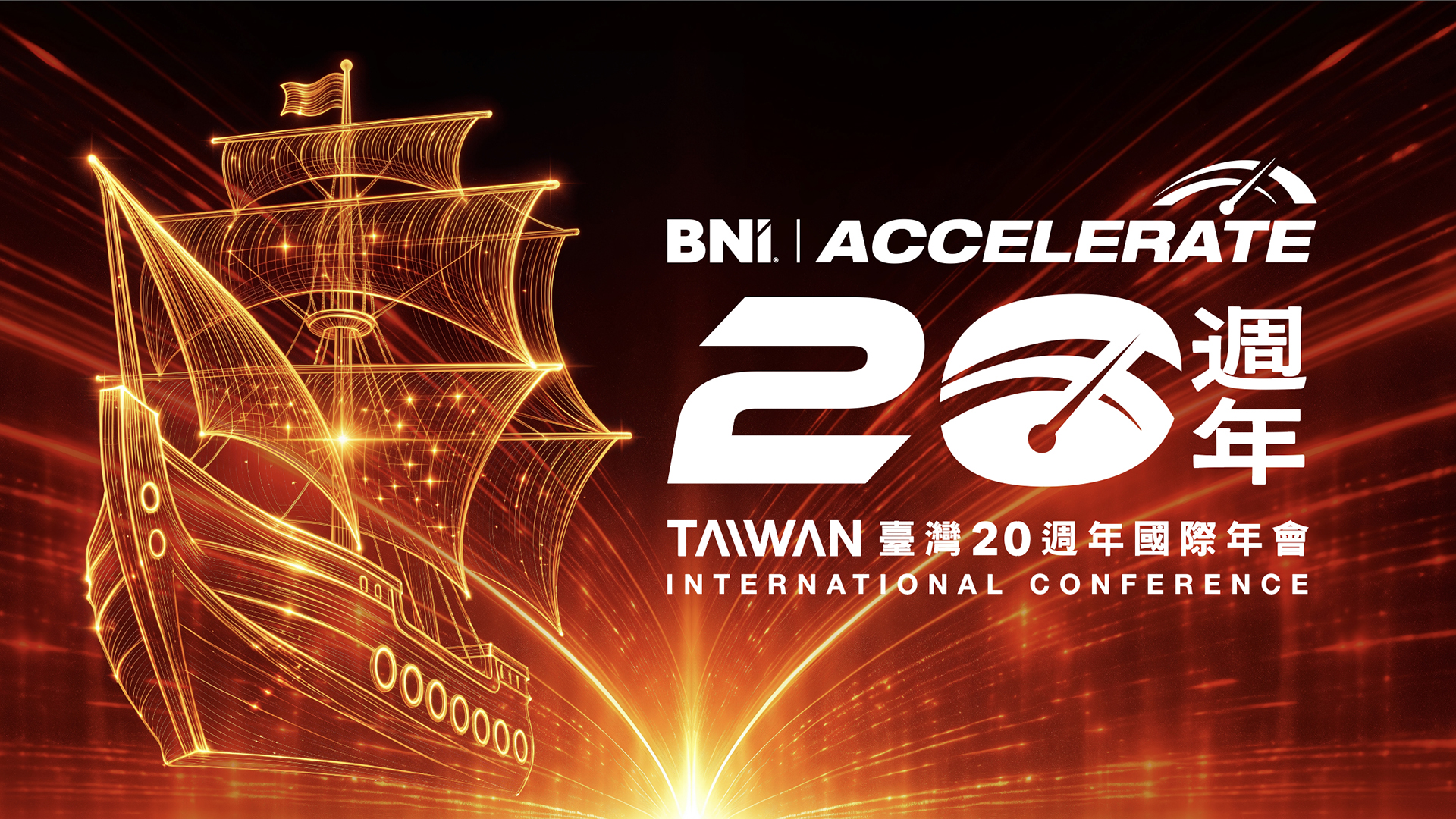
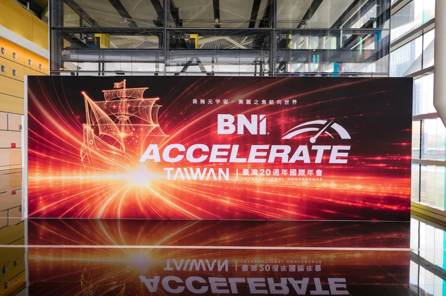
CHIHE Design created the “ACCELERATE” main visual and exhibition system for BNI Taiwan’s 20th Anniversary International Conference, translating the global theme into an annual brand experience with Taiwan identity and sustainable strategy.
Marking BNI Taiwan’s 20th anniversary in 2026, CHIHE Design led the conference’s main visual and exhibition visual system. Building on the global theme “ACCELERATE,” the project introduced the local interpretation “Beautiful Island Sailing Toward the World” and developed two visual directions: the “Light-Speed Corridor Version” and the “Vintage Gold Map Version.” The system extended across typography, collateral, motion posters, and exhibition print applications, while integrating recycled fabric and material reuse strategies to realize an exhibition design that combines brand storytelling with sustainability.
BNI
BNI(Business Network International)是全球最大的商務引薦組織,以「付出者收穫/Givers Gain®」為核心理念。2026年適逢 BNI 臺灣進入第20週年,台灣國際年會以「ACCELERATE 加速」為主題,齊禾設計受邀擔綱本屆主視覺設計與全場展場視覺統籌。
BNI (Business Network International) is the world's largest business referral organization, built on the philosophy of Givers Gain®. 2026 marks BNI Taiwan's 20th anniversary, celebrated under the theme "ACCELERATE" at the Taiwan International Conference. CHIHE Design was commissioned to lead the main visual design and full-venue exhibition visual coordination.
本屆主題|THEME CONCEPT
全球年度主題:ACCELERATE 加速|
Global Theme: ACCELERATE
「ACCELERATE 加速」是 BNI 國際總部 2026 年發布的全球統一主題,象徵商務引薦網絡在信任累積後所展現的推進速度。對 BNI 臺灣而言,2026 年同時也是邁入第 20 週年的重要節點,這份「加速」不只是成長速度的展現,也代表二十年來會員關係、商務信任與跨區域合作持續累積後,進一步邁向國際舞台的能量。
“ACCELERATE” is the unified global theme released by BNI International Headquarters for 2026, symbolizing the forward momentum of a business referral network built upon accumulated trust. For BNI Taiwan, 2026 also marks its 20th anniversary. In this context, acceleration is not only about the speed of growth, but also the energy generated through two decades of member relationships, business trust, and cross-regional collaboration as BNI Taiwan moves further onto the international stage.
在地詮釋:美麗島嶼,航向國際|
Local Interpretation: Beautiful Island Sailing Toward the World
齊禾設計以「美麗島嶼,航向國際」作為本屆主題的臺灣在地詮釋,將臺灣作為國際商務連結節點的角色轉化為視覺敘事核心。從臺灣島嶼、航海意象到世界舞台,本屆年會不只是周年慶典,而是一場從在地出發、連結全球的品牌表述;以設計為帆,讓年度盛典的視覺語言,成為臺灣商務能量航向世界的具體輪廓。
CHIHE Design developed “Beautiful Island Sailing Toward the World” as the local interpretation of this year’s theme, transforming Taiwan’s role as a hub of international business connection into the core of the visual narrative. From the island of Taiwan and seafaring imagery to the global stage, this conference is not merely an anniversary celebration, but a brand expression that begins locally and connects globally. With design as the sail, the visual language of the annual conference becomes a tangible outline of Taiwan’s business energy sailing toward the world.
視覺設計|VISUAL DESIGN
1 主視覺設計:雙版本策略|Main Visual Design: Dual Version Strategy
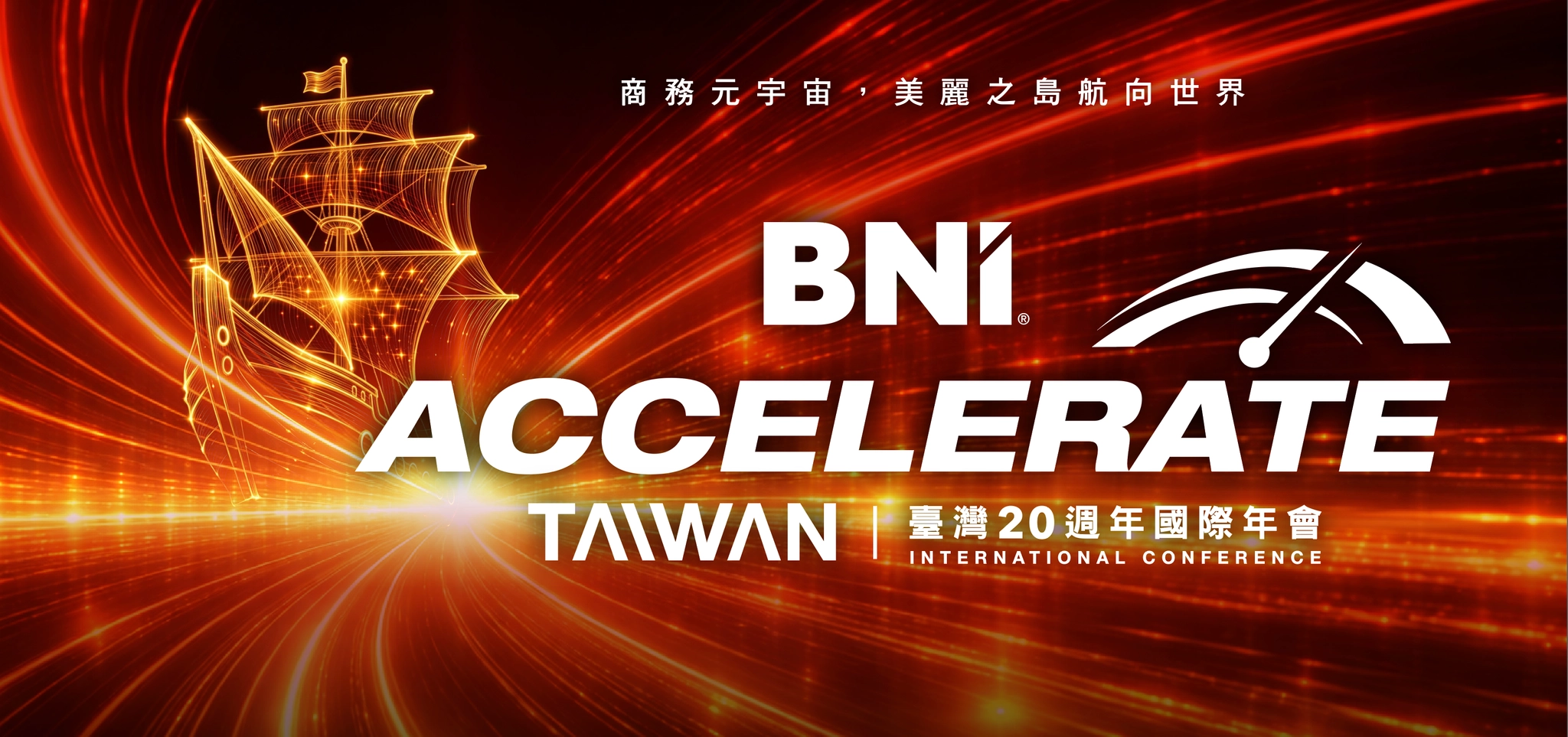
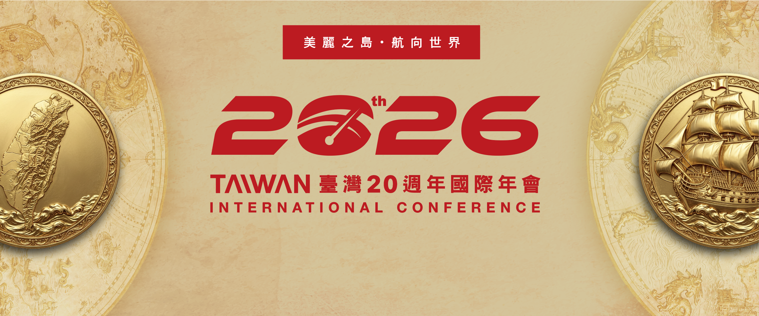
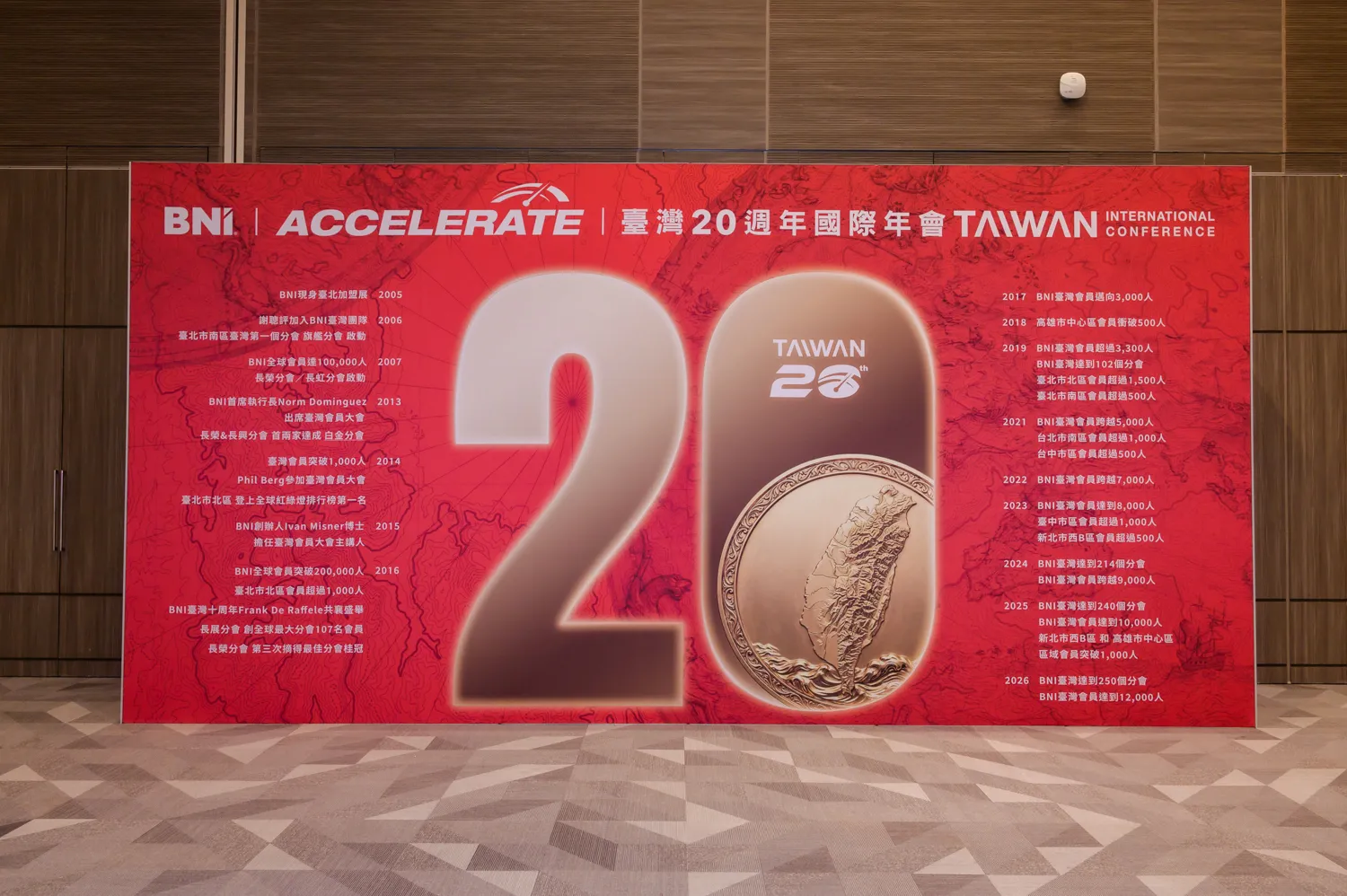
承接「ACCELERATE 加速」與「美麗島嶼,航向國際」的主題概念,本屆主視覺採用雙版本策略,分別從「未來速度」與「歷史厚度」兩個面向展開。『光速航道版』面向未來,以近科幻的場景呈現未來加速感。品牌精神與航向未來的速度,強化加速向前的動能;『燦金地圖版』則回望來時路,以做舊航海地圖、金色徽章與航海語彙,呈現 BNI 臺灣二十年累積的信任、傳承與國際航向。
兩種視覺版本依展場牆面屬性與功能交替應用,在前衛動能與莊重歷史感之間取得平衡,使主題概念能完整落地於展場空間與各項延伸設計之中。象徵臺灣商務網絡跨越時空、持續加速航向國際。
Building on the theme concepts of “ACCELERATE” and “Beautiful Island Sailing Toward the World,” this year’s main visual adopts a dual-version strategy, developed through two perspectives: future speed and historical depth. The “Light-Speed Corridor Version” looks toward the future, using a near-sci-fi visual scene to express a sense of acceleration. It reinforces the brand spirit and the momentum of sailing toward the future, strengthening the dynamic energy of moving forward. The “Vintage Gold Map Version,” on the other hand, looks back at the journey so far, using aged maritime map textures, gold medallions, and seafaring visual language to convey the trust, legacy, and international direction accumulated over BNI Taiwan’s twenty years.
The two visual versions are applied alternately according to the character and function of each exhibition wall, balancing progressive momentum with a dignified sense of history. Together, they allow the theme concept to be fully translated into the exhibition space and its extended visual applications, symbolizing Taiwan’s business network crossing time and space while continuing to accelerate toward the international stage.
光速航道版 Light-Speed Corridor Version
以深紅暗色、放射光束與高速航道構成近未來場景,呈現 ACCELERATE 的速度感與商務網絡持續向前的動能。
Built with deep red tones, radiating light beams, and high-speed corridors, this near-futuristic visual scene expresses the speed of ACCELERATE and the forward momentum of the business network.
燦金地圖版 Vintage Gold Map Version
以做舊航海地圖、金色徽章與島嶼航線語彙,回應 BNI 臺灣二十年累積的信任基礎與航向國際的歷程。
Built with aged maritime maps, gold medallions, and island-route imagery, this version reflects the trust accumulated over BNI Taiwan’s twenty years and its journey toward the international stage.
2 標準字設計|TYPOGRAPHY DESIGN
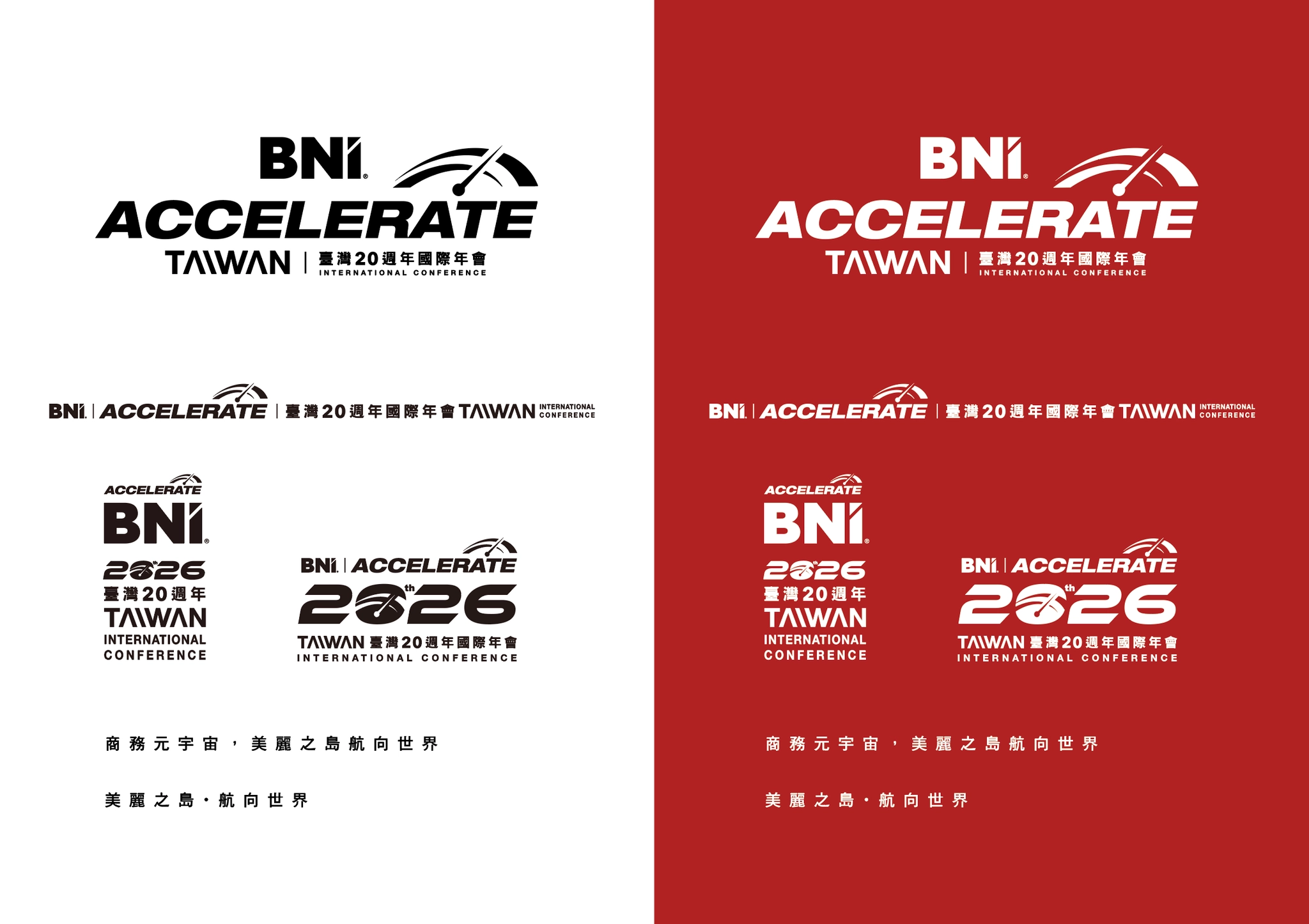
本屆中文標準字特意採用正體「臺」字,而非慣用的簡化「台」字——正體筆畫地基更為穩固,呼應加速概念中沉穩前行的力量感,也讓臺灣的書寫形象在國際場合更具完整性。
The Chinese wordmark deliberately uses the traditional form "臺" rather than the simplified "台." The traditional character's more complex stroke structure conveys a grounded, stable sense of forward momentum echoing the concept of acceleration — and presents a more complete image of Taiwan's name in an international setting.
年份數字「2026」將 20週年「th」字樣融合其中,「0」的筆型對應 ACCELERATE 速度儀表的圖形元素,發展出專屬臺灣地區的 2026 標準字。完整應用系統涵蓋中文直式、中文橫式、20週年標準字三種版本,確保從舞台主視覺到所有印製品的視覺延伸一致性。
The year "2026" incorporates the "th" anniversary marker, with the "0" referencing the speedometer graphic element of the ACCELERATE logo — resulting in a 2026 wordmark unique to the Taiwan region. The full application system spans vertical Chinese, horizontal Chinese, and 20th-anniversary lockup versions, ensuring consistent visual extension from the stage backdrop to all printed materials.
3 周邊設計|COLLATERAL DESIGN
年會提袋 Conference Tote Bag Design
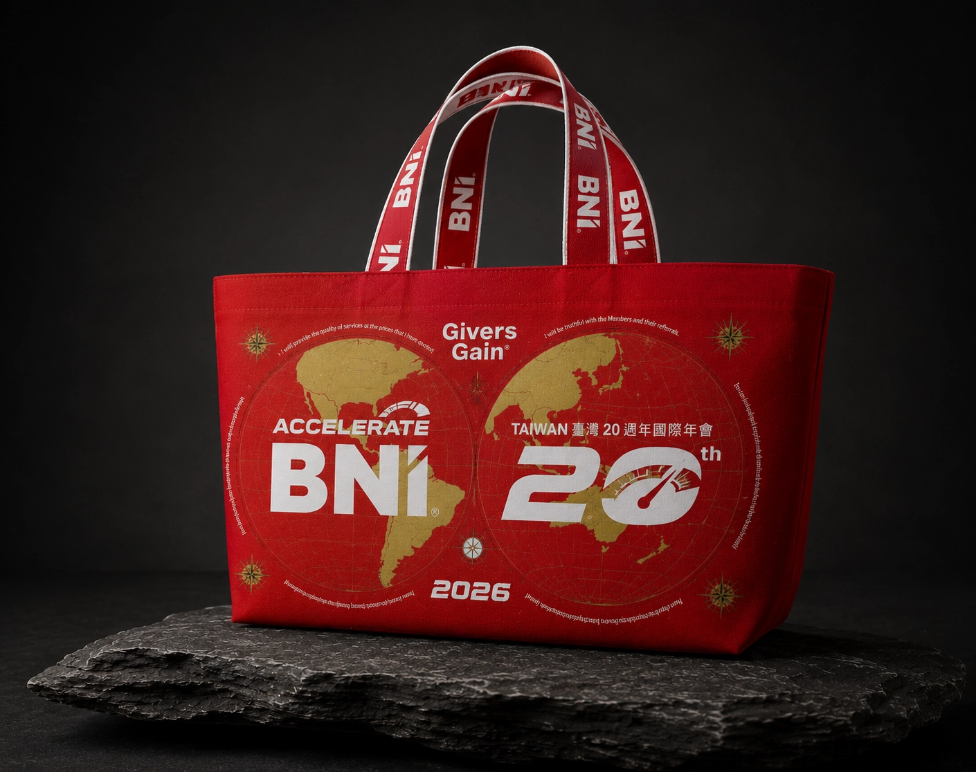
為與會者設計的專屬提袋,以雙地球徽章意象呼應「美麗島嶼航向國際」的主題方向,袋身印有 BNI 12 條職業道德準則(Givers Gain®),讓年會周邊品不只是紀念品,而是承載BNI品牌價值的日常載體。
A custom conference tote bag was designed for attendees. The dual-globe medallion imagery echoes the “Beautiful Island Sailing Toward the World” theme direction. Printed with BNI’s 12 Codes of Ethics, the tote bag becomes more than a souvenir; it serves as an everyday carrier of BNI’s brand values.
年會徽章 Conference Commemorative Badge
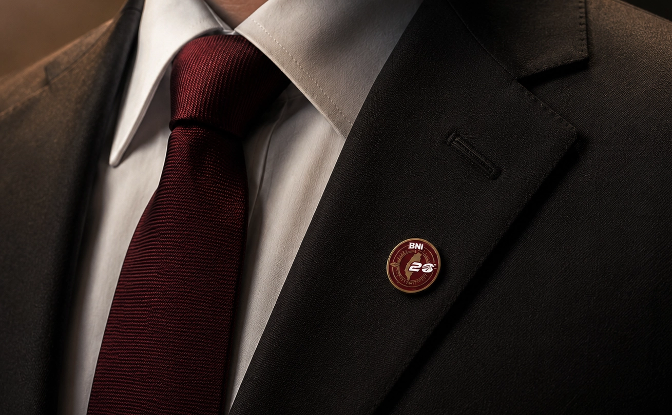
BNI 年會徽章為每年度皆會推出的紀念性物件,本屆以臺灣 20 週年為核心,將主視覺中的航海、指南針、臺灣島嶼與速度儀表語彙,濃縮為一枚可配戴、可收藏的金屬徽章。
徽章以圓形羅盤作為主體結構,象徵 BNI 商務網絡的方向感與全球連結;中央放入臺灣輪廓,強化本屆年會從臺灣特色出發、航向國際的在地精神。外圈金色金屬與紅色琺瑯填色,呼應主視覺中「燦金地圖版」的金色航海語彙與 BNI 品牌紅。讓展場視覺概念從大型輸出延伸至隨身紀念品,成為與會者能帶走的年度記憶。
The BNI conference badge is a commemorative item designed in a different edition each year. For the 20th anniversary of BNI Taiwan, this year’s badge condenses the main visual language of seafaring, compass navigation, the island of Taiwan, and the ACCELERATE speedometer into a collectible metal badge.
Built around a circular compass structure, the badge symbolizes direction, connection, and the global reach of BNI’s business network. The silhouette of Taiwan is placed at the center, reinforcing the local spirit of this year’s conference: starting from Taiwan and sailing toward the world. The gold metal finish and red enamel filling echo the Vintage Gold Map Version and BNI’s brand red. Allowing the exhibition’s main visual concept to extend from large-scale spatial graphics into a wearable keepsake that attendees can take with them.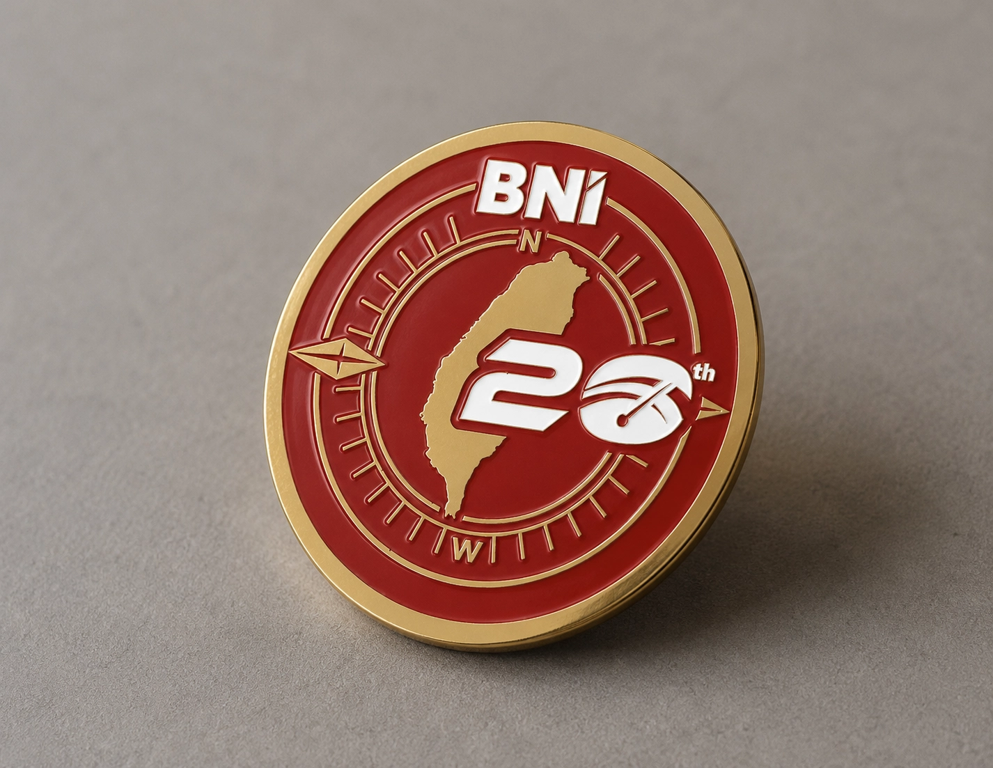
永續展場設計|SUSTAINABLE EXHIBITION DESIGN
展場視覺統籌 Full-Venue Exhibition Coordination
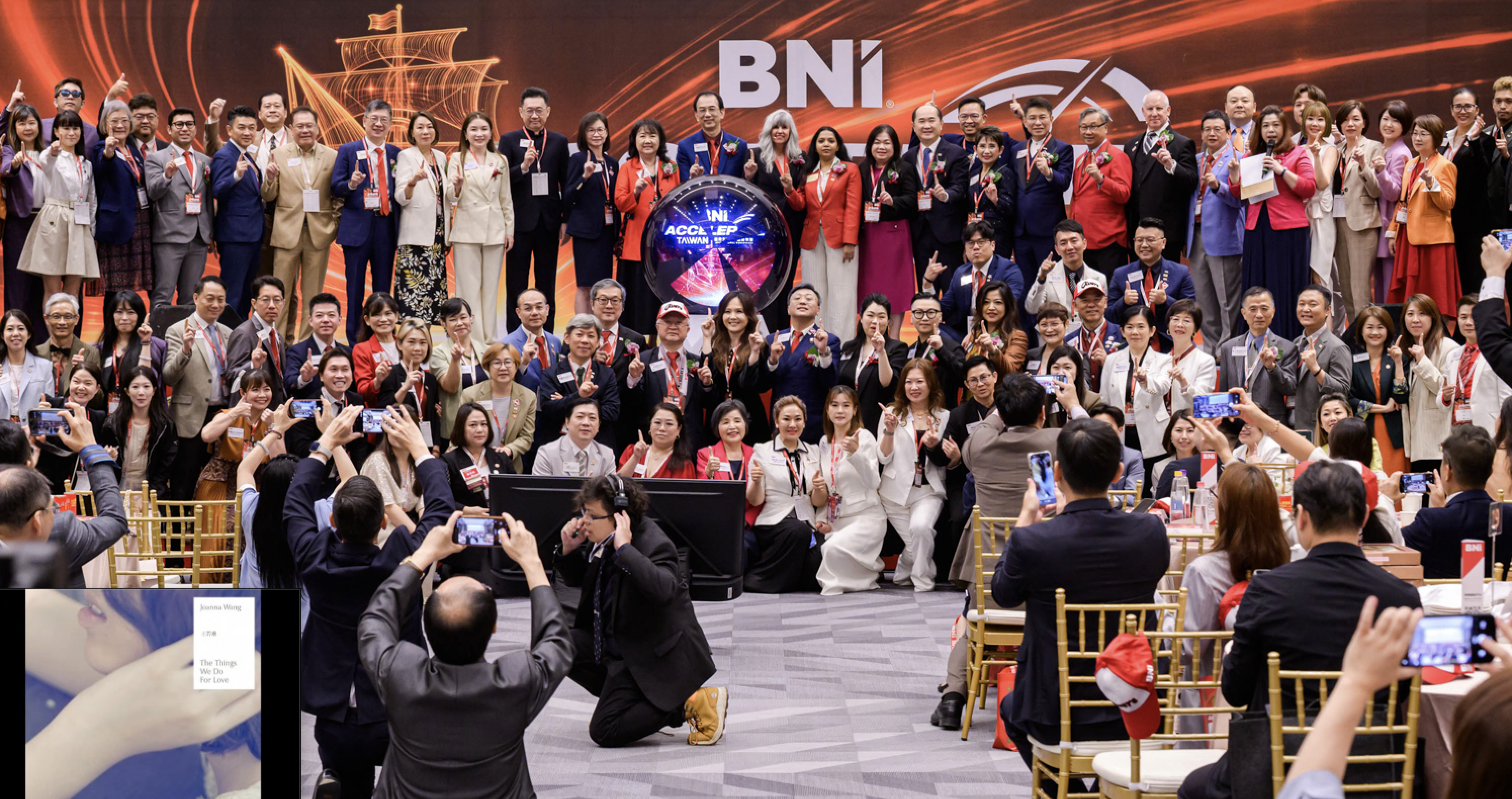
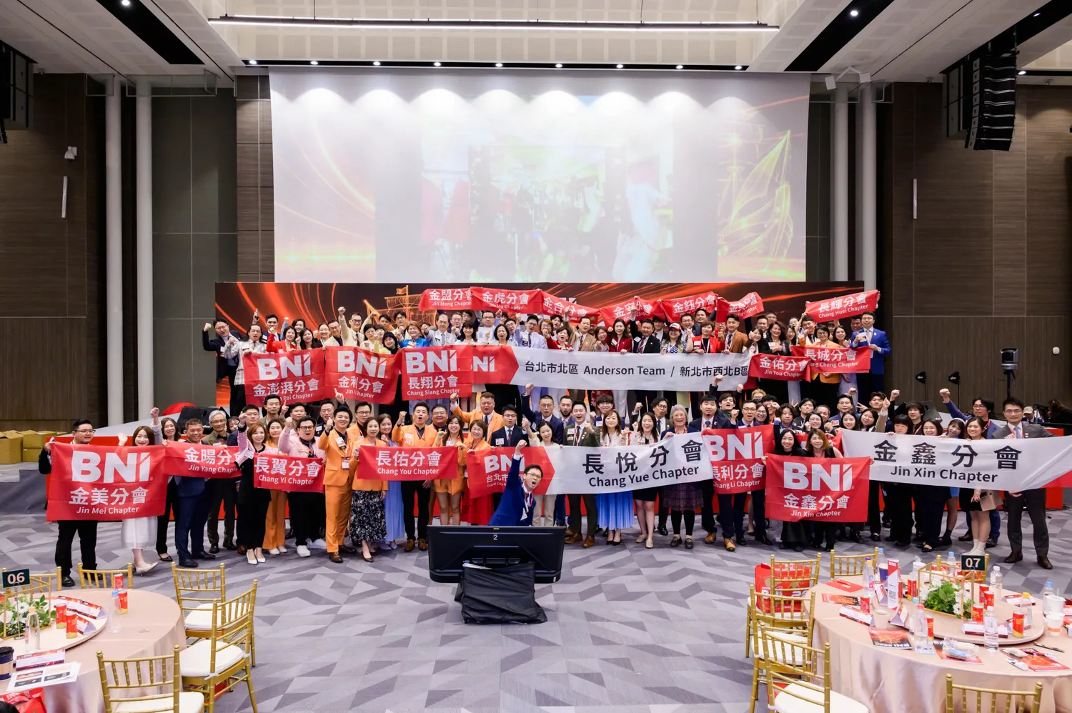
齊禾設計統籌全場六大印製分區的設計與佈展執行,確保視覺語言從入口報到到主舞台保持一致性,不因場域功能切換而產生斷裂。
CHIHE Design coordinated the design and installation execution across six major print zones throughout the venue, ensuring visual consistency from entrance registration through to the main stage without disruption across zones.
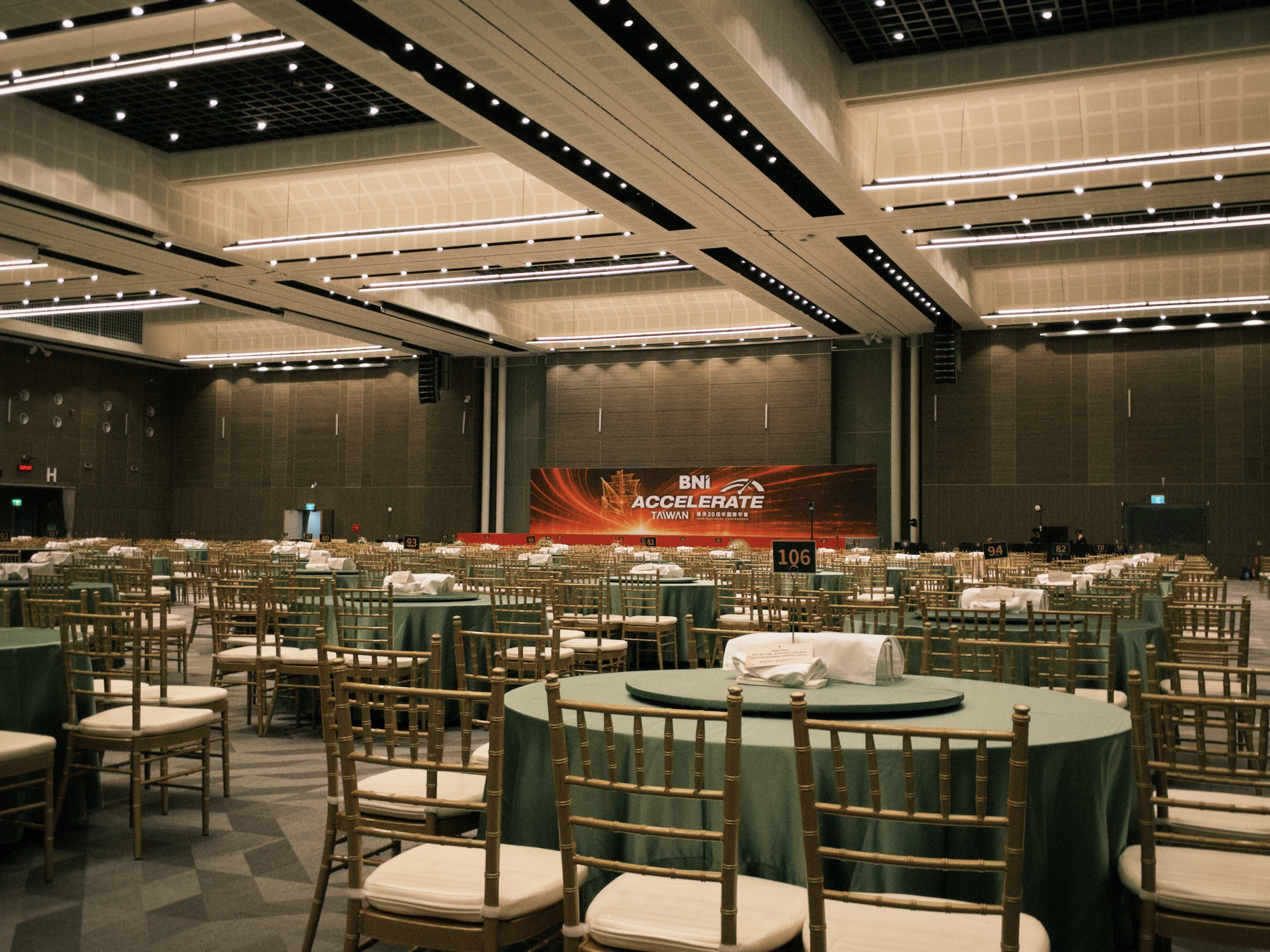
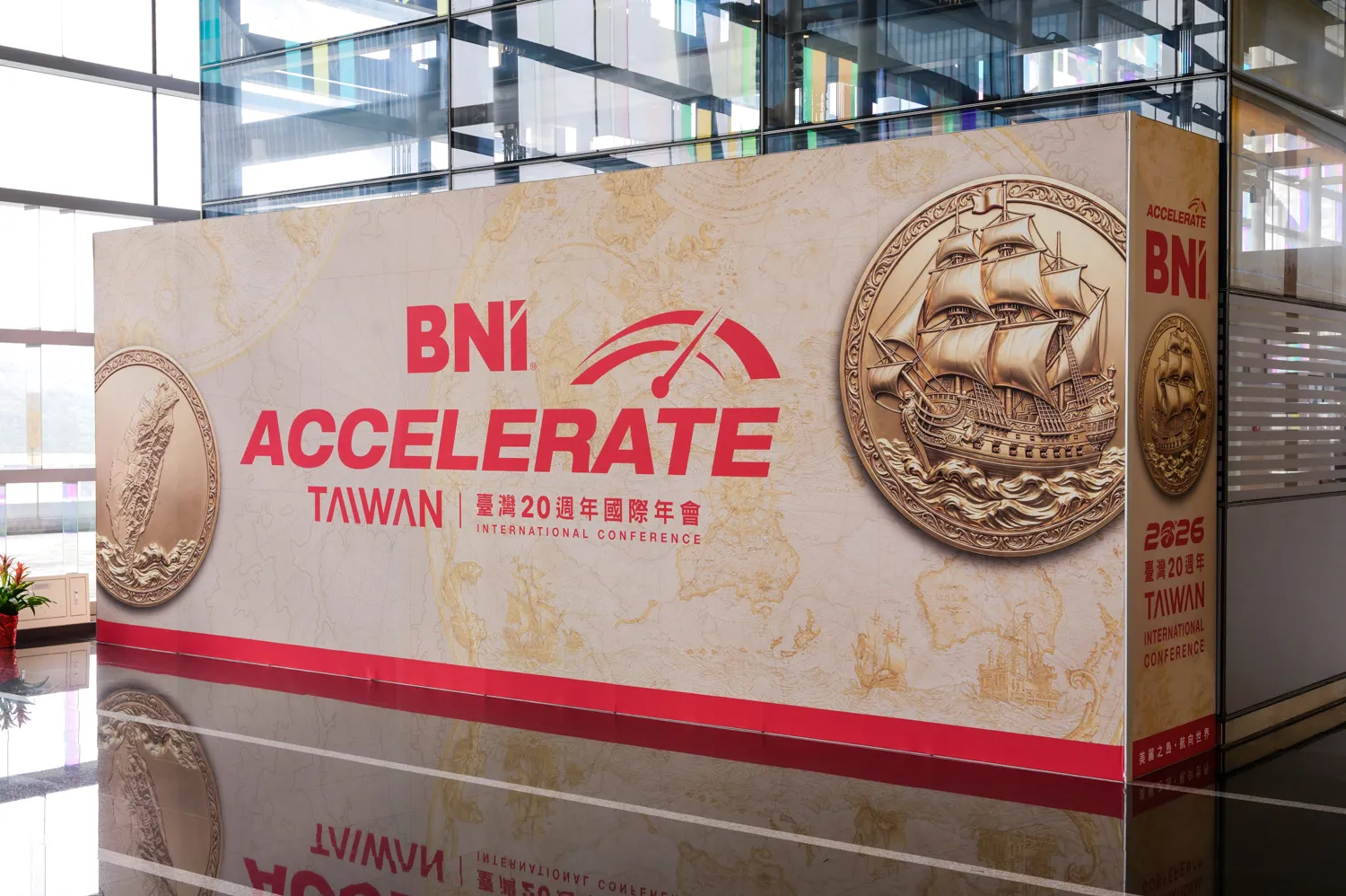
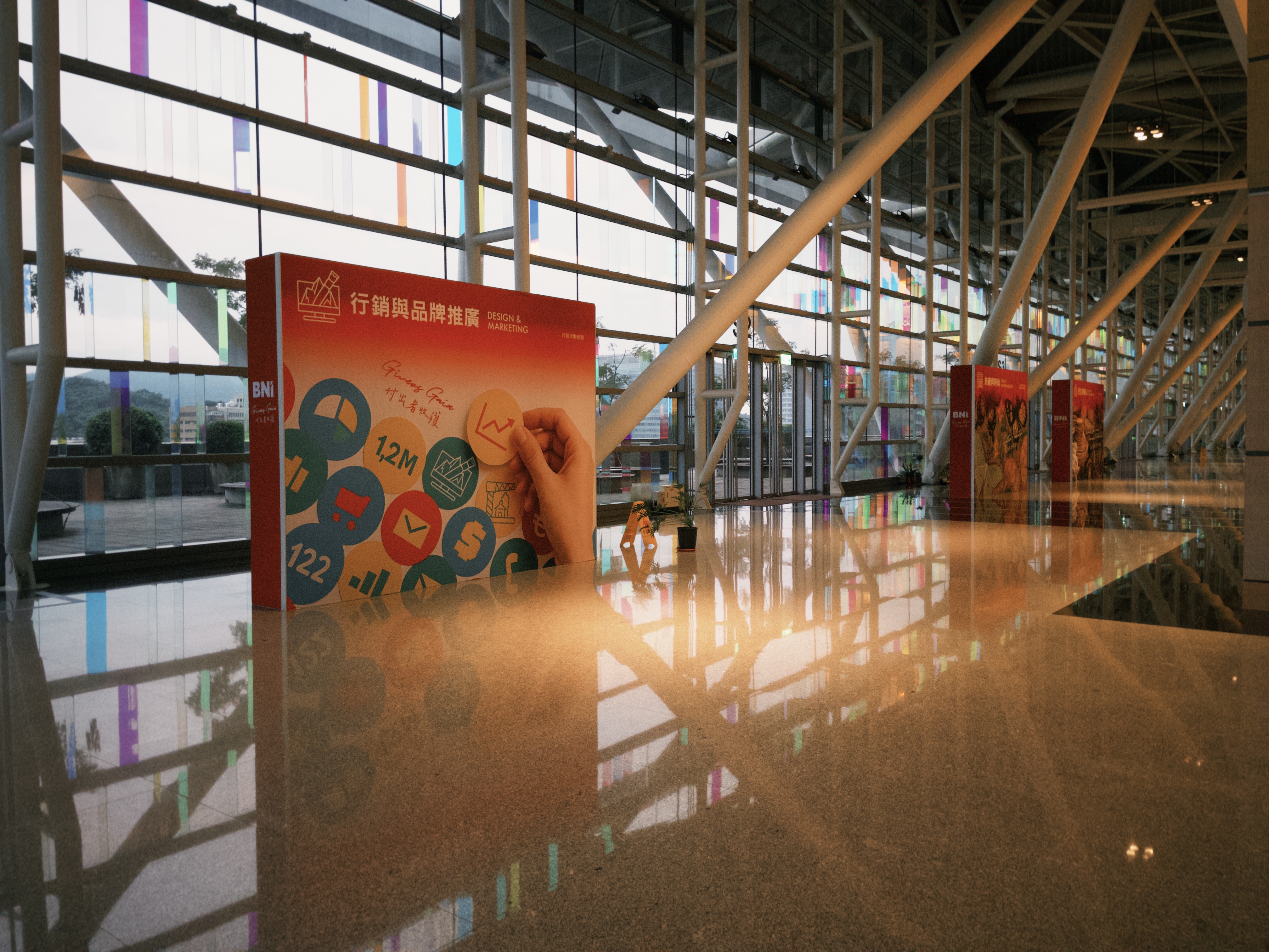
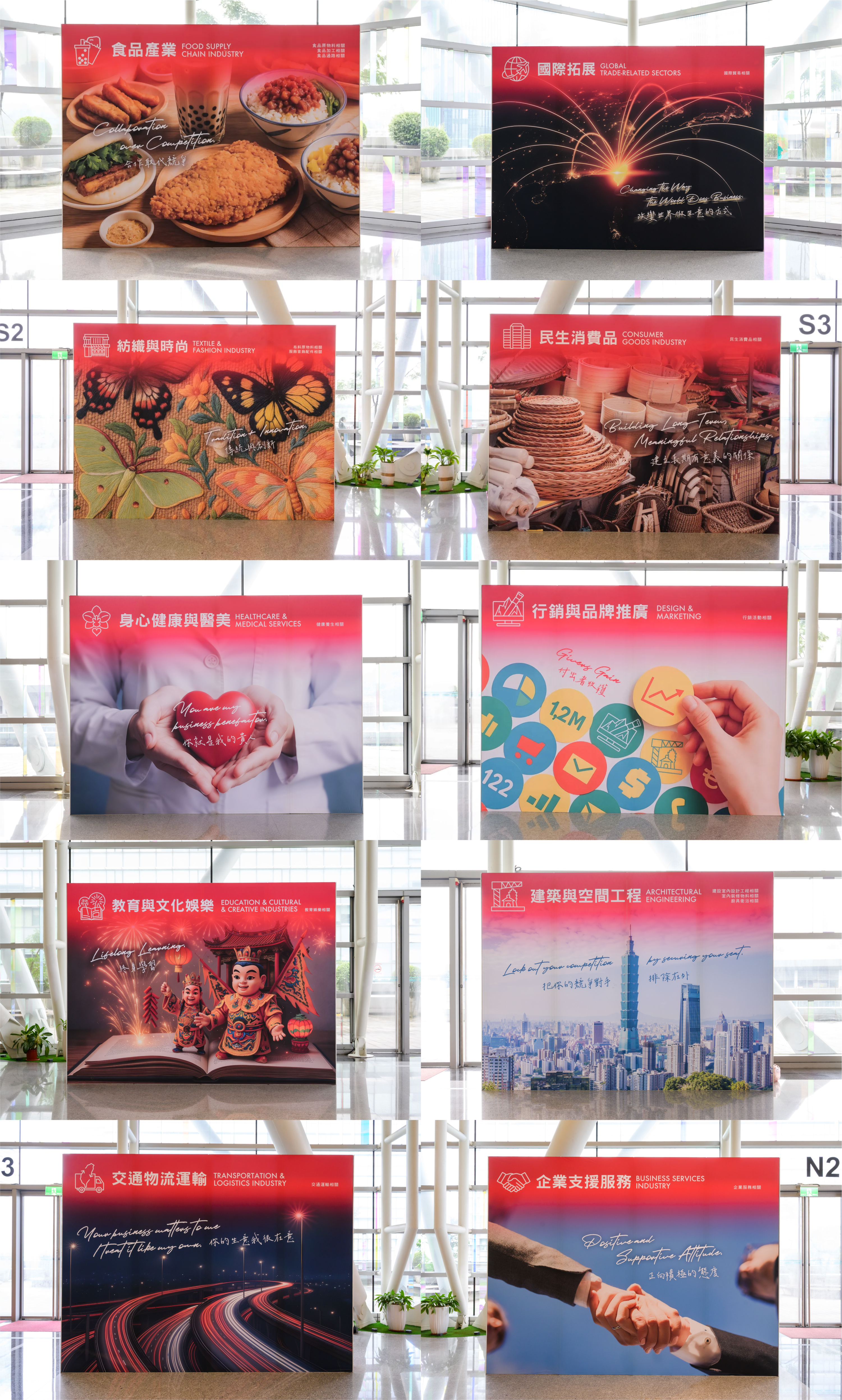
其中十大產業牆面沿用去年已印製的展板,延長材料使用週期,減少重複輸出的資源消耗。
The ten industry wall panels reuse materials printed last year, extending their lifecycle and reducing repeated production resource consumption.
動態海報 Motion Poster Design
本屆年會將部分展場輸出物轉化為動態海報,作為展場視覺展示的一環。相較於傳統靜態輸出,動態海報能透過影像、光線、節奏與轉場,延伸主視覺的速度感與沉浸感,使「ACCELERATE 加速」不只停留在平面畫面中,而是成為會場中持續流動的視覺經驗。同時,動態內容能依照活動節奏切換主視覺、展場資訊、品牌標語與情境廣告,讓原本需要多面輸出物承載的內容,整合進同一個螢幕播放序列中,提高資訊呈現的彈性,也增加觀眾停留與注目的可能。
Motion posters were introduced as part of the exhibition visual system, transforming selected printed display elements into digital motion displays. Compared with traditional static outputs, motion posters extend the sense of speed and immersion through moving imagery, light, rhythm, and transitions, allowing the theme of “ACCELERATE” to move beyond a flat graphic and become a continuously flowing visual experience within the venue. At the same time, motion content can switch between main visuals, exhibition information, brand taglines, and contextual advertisements according to the rhythm of the event, integrating content that would otherwise require multiple printed display pieces into a single screen-based playback sequence. This enhances the flexibility of information delivery while increasing audience attention and dwell time.
在永續布展的角度下,動態海報不是單純的視覺效果升級,而是一種展場材料減量策略。透過數位展示取代部分實體輸出,展場能在保留完整品牌敘事與視覺張力的同時,減少一次性印製物的數量,降低製作、運輸與廢棄成本。這使動態海報不只是吸睛的展示形式,也成為低碳、減廢與循環使用趨勢下的展場設計方法,讓視覺設計在傳達訊息之外,進一步回應永續展覽的實務需求。
From the perspective of sustainable staging, motion posters are not merely a visual upgrade but a material-reduction strategy. By replacing selected physical outputs with digital displays, the exhibition retains a complete brand narrative and strong visual presence while reducing the number of single-use printed materials, lowering production, transportation, and disposal costs. In this sense, motion posters are not only an eye-catching display format, but also an exhibition design method aligned with low-carbon production, waste reduction, and circular use, allowing visual design to communicate information while responding to the practical needs of sustainable exhibition-making.
永續布展:環保再生布料全面導入
Sustainable Staging: Full Adoption of Eco-Friendly Recycled Fabric
「沿用,是循環的第一步。不是每件材料都需要重新製作,而是讓它走得更久。」
本屆展場印製全面採用環保再生布料,取代傳統 PVC 輸出與一次性木作工程,降低展會整體材料耗損與廢棄物產生。這不是形象表述,而是齊禾設計在每一個展案中可複製、可延續的低碳布展方法論。
All exhibition printing for this event adopted eco-friendly recycled fabric across the board, replacing traditional PVC printing and single-use carpentry to reduce overall material consumption and waste. This is not a branding statement but a replicable, scalable low-carbon staging methodology that CHIHE Design brings to every exhibition project.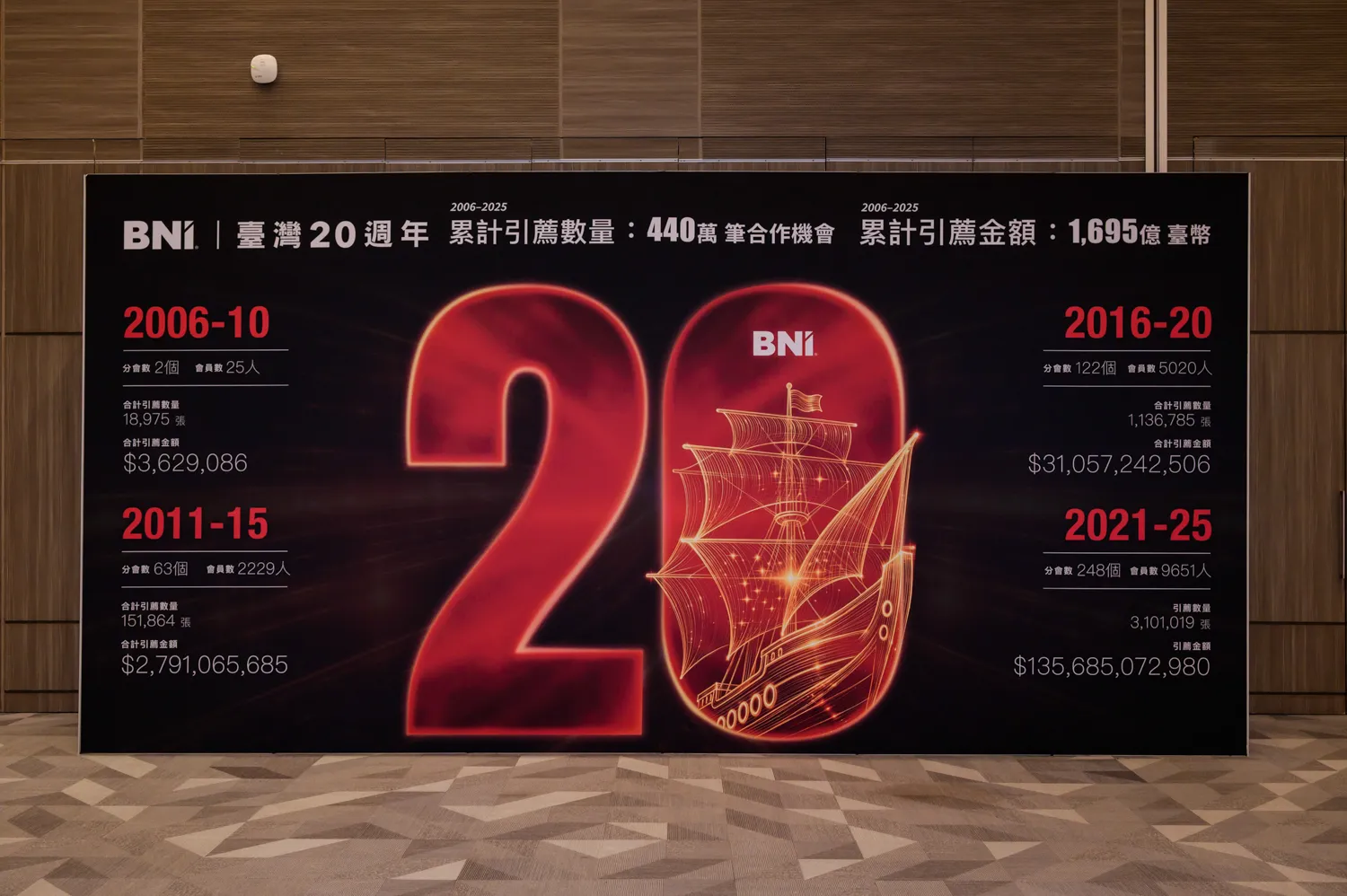

美感循環,感動重現|從 2025 展場主視覺到 2026 外賓禮贈品
Aesthetic Circulation, Emotional Resonance Reimagined
From the 2025 Main Visual Fabric to the 2026 Guest Gift
我們將 2025 BNI 台灣國際年會 的主視覺展布,轉化為 2026 年會致贈外賓的限定領結,讓展場視覺從一次性的空間展示,延伸為可穿戴、可收藏、可被帶走的國際交流贈禮。
2025 年會以「BEYOND|超越」為核心,展場大量採用可重複利用的熱昇華彈性展布系統,取代傳統 PVC 輸出與一次性木作工程。這項布展決策,讓展場碳足跡估算從 651.27 kgCO₂e 降至 405.9 kgCO₂e,減少約 37.7%。年會結束後,這些承載年度主視覺記憶的展布沒有被丟棄,而是被重新整理、裁切與製作,成為 2026 年會的限定領結,實現從 BNI 2025 到 BNI 2026 的資源閉環。
We transformed the main visual exhibition fabric from the 2025 BNI Taiwan International Conference into limited-edition bow ties for international guests at the 2026 conference. Through this process, the exhibition visual extended beyond a temporary spatial display and became a wearable, collectible gift for international exchange.
The 2025 conference was centered on the theme “BEYOND.” Throughout the venue, reusable sublimation-printed stretch fabric systems were widely adopted to replace traditional PVC printing and single-use carpentry. This staging decision reduced the estimated exhibition carbon footprint from 651.27 kgCO₂e to 405.9 kgCO₂e, a reduction of approximately 37.7%. After the conference, these fabrics — carrying the visual memory of the annual event — were not discarded. Instead, they were sorted, cut, and remade into limited-edition bow ties for the 2026 conference, creating a closed-loop resource cycle from BNI 2025 to BNI 2026.
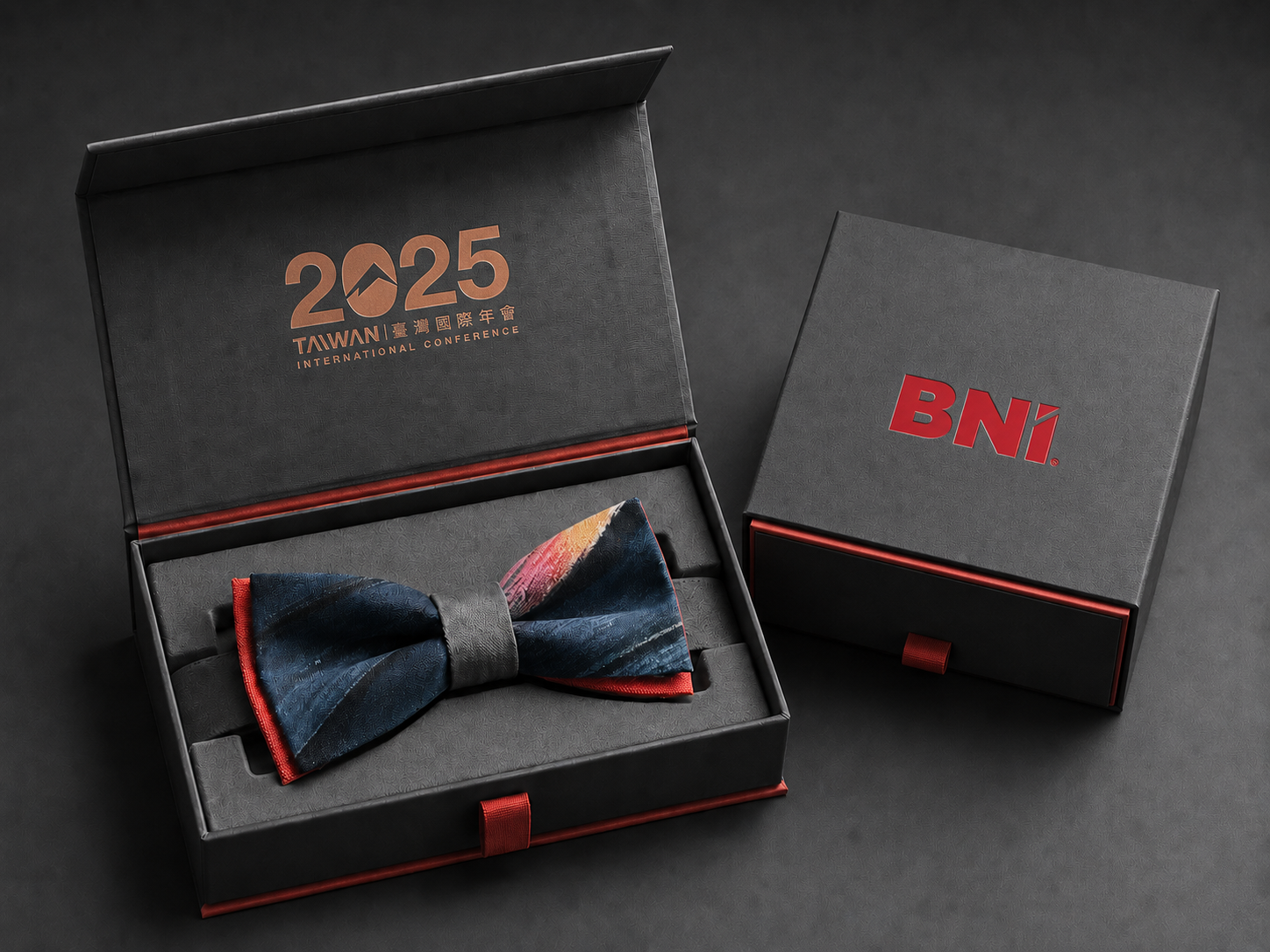
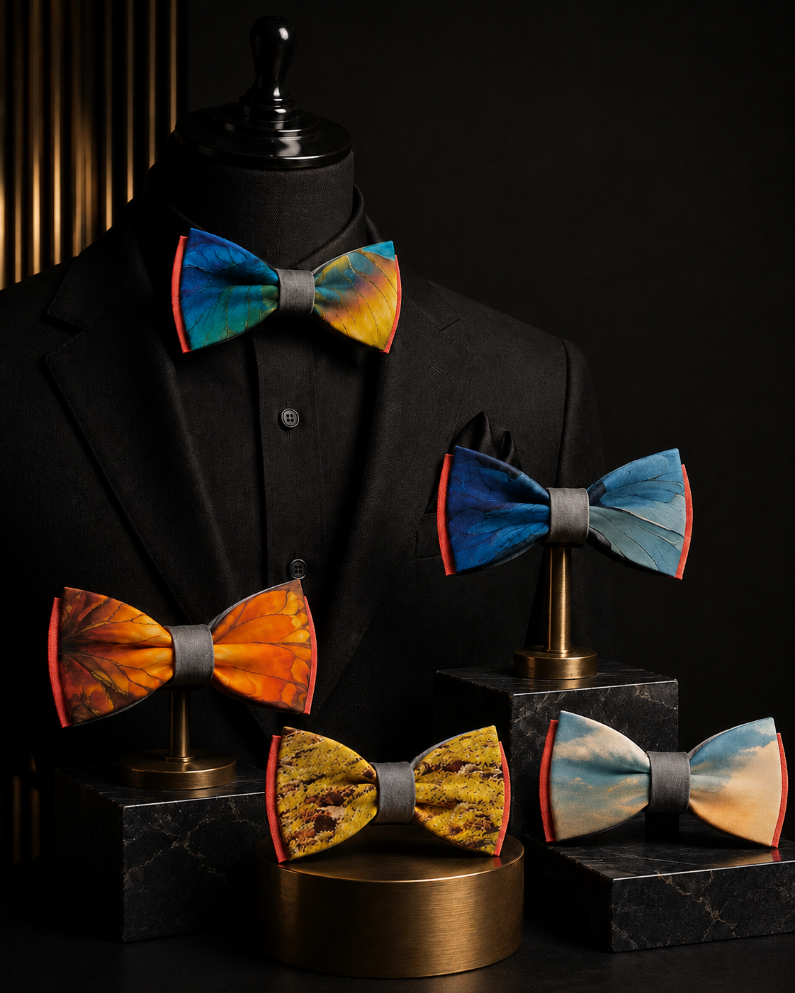
每一只領結都保留原展布不同區塊的色彩與圖像切片,因此每一件都是獨一無二的設計。領結採用雙層結構,前層印有臺灣意象,包含玉山、藍鵲與原生蝴蝶,象徵 tie together 與 tie to the future:將人與人繫在一起,也將這座美麗島嶼繫向未來。後層則保留 BNI 的品牌紅,象徵 BNI has always got our back,回應這兩年總部在背後給予的支持。
從一塊展場的布,到身上的一個結;從 2025 的資源,到 2026 的寶藏。這項設計將年度主視覺、材料循環、外賓接待與 ESG 溝通串連在一起,讓永續不只停留在減廢數據,也成為一份能被穿戴、被收藏、被帶回家的臺灣設計記憶。也藉此感謝 BNI 臺灣總部連續兩年將「視覺統籌」交給齊禾設計,讓我們有機會證明:永續設計能被量化、被驗證,也能被轉化為真正有溫度的品牌體驗。
Each bow tie preserves a different fragment of color and imagery from the original exhibition fabric, making every piece unique. The bow tie features a two-layer structure. The front layer carries imagery of Taiwan, including Yushan, the Taiwan blue magpie, and native butterflies. It represents both tie together and tie to the future — tying people together while tying this beautiful island to the future. The back layer retains BNI’s brand red, carrying a more direct message: BNI has always got our back, in recognition of the support from headquarters over the past two years.
From a piece of exhibition fabric to a bow tie worn on the body; from the resources of 2025 to the treasure of 2026. This design connects the annual main visual, material circulation, international guest reception, and ESG communication, allowing sustainability to move beyond waste-reduction data and become a tangible memory of Taiwanese design that can be worn, collected, and taken home. It is also our way of expressing gratitude to BNI Taiwan Headquarters for entrusting CHIHE Design with the full visual coordination for two consecutive years, giving us the opportunity to demonstrate that sustainable design can be quantified, verified, and transformed into a brand experience with genuine emotional value.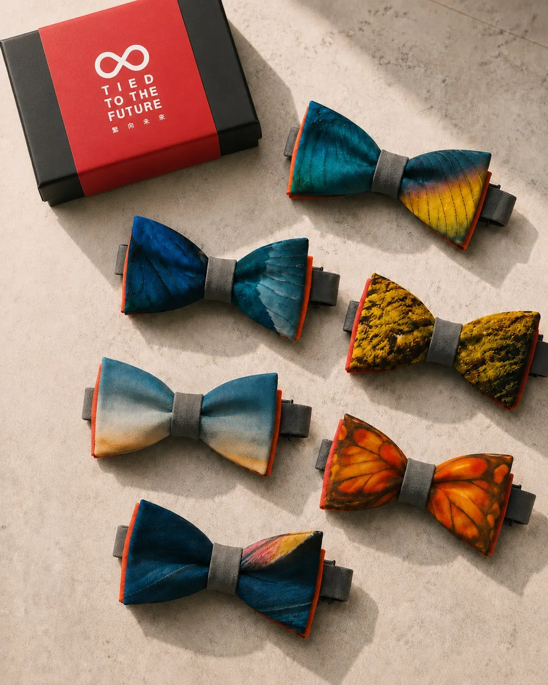
ESG 實踐對應|ESG ALIGNMENT
從展場設計落實 ESG 承諾
ESG Commitments Realized Through Exhibition Design
本案是齊禾設計永續展場設計能力的具體落地,對應 R20 永續管理師認證、Synesgy ESG 評鑑 B 級(92 分)與 ISO 14067 碳足跡顧問 能力的核心承諾,也是 CircoGreen 綠循 永續品牌設計服務的實際展現。
This project is a concrete realization of CHIHE Design's sustainable exhibition design capability, aligned with CHIHE's R20 Sustainability Manager Certification, Synesgy ESG Assessment Grade B (Score: 92), and ISO 14067 carbon footprint consultancy capability — and a practical demonstration of the CircoGreen sustainable brand design service.

BNI ACCELERATE 臺灣20週年國際年會
商務元宇宙,美麗之島航向世界 / 2026
CHIHE BRANDING CONSULTANCY