



窩客商務中心GoWork | 品牌識別設計
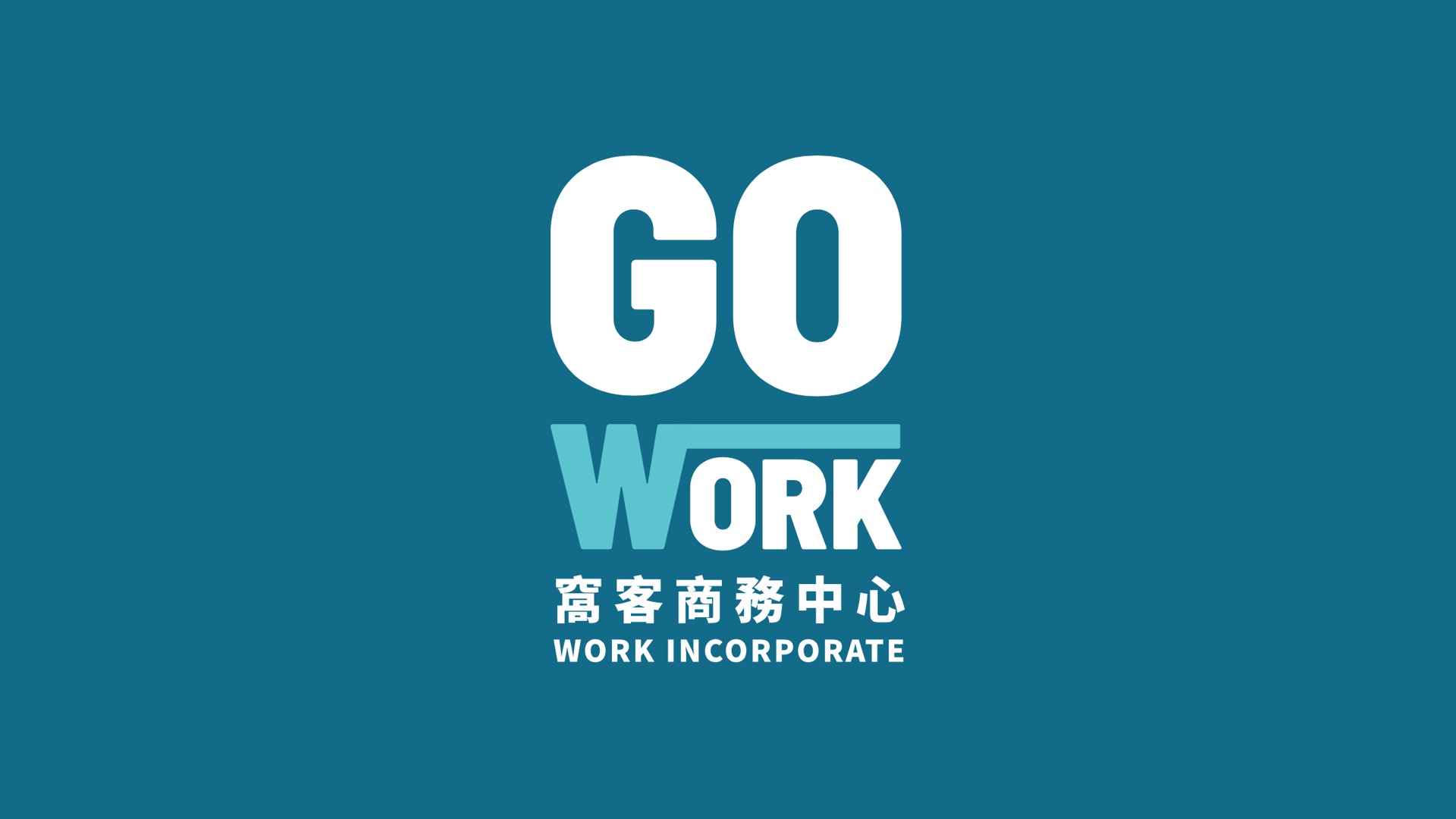
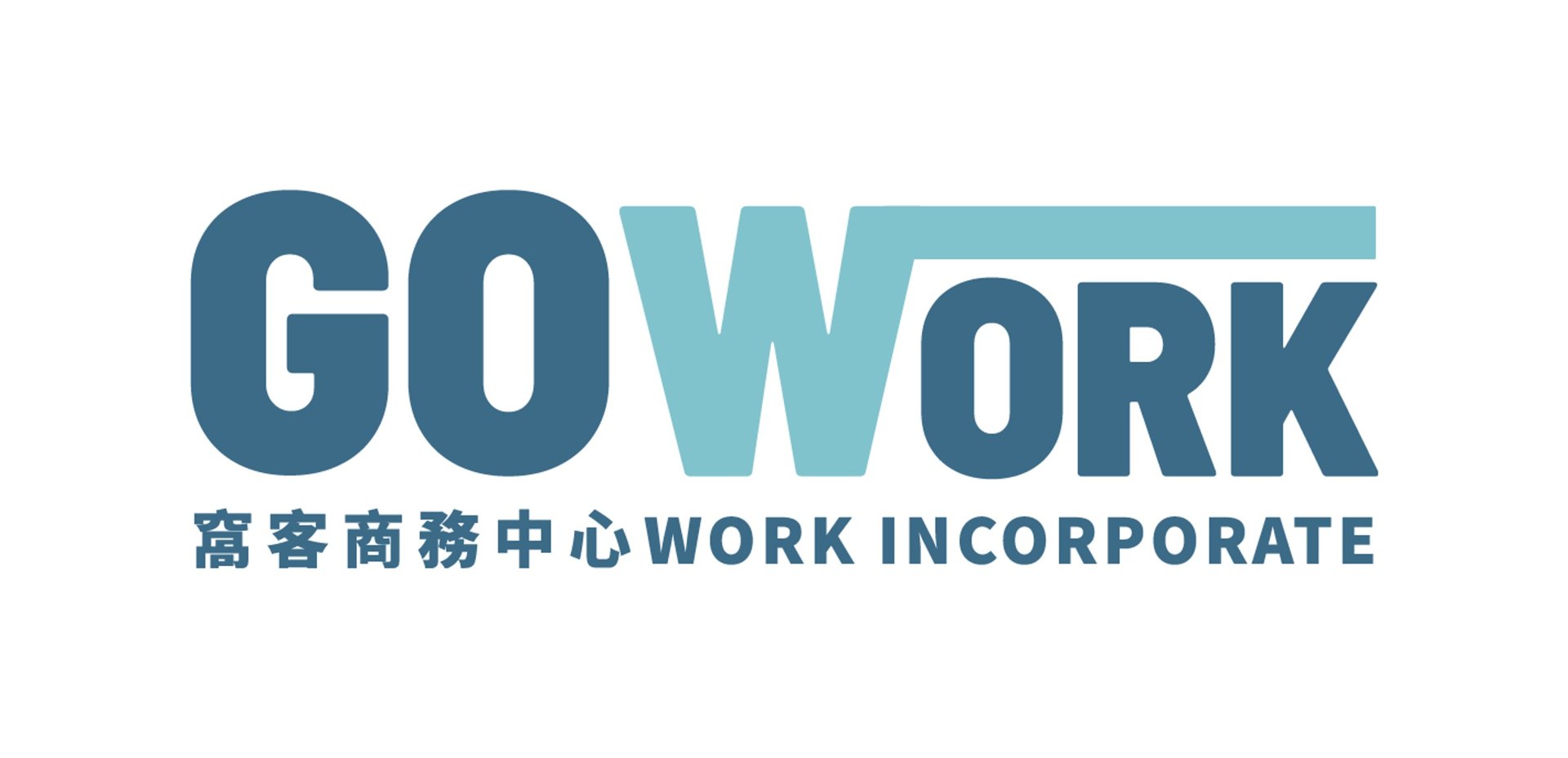
重整 GO 與 WORK 的字體結構與堆疊關係,讓主標誌在各種尺寸與應用場景下都更清晰、更有力量。
窩客商務中心
Go Work
從 1.0 到 2.0,一次讓品牌更靠近使用者的形象更新。
A rebrand that brings the brand closer to its people.

A rebrand that brings the brand closer to its people.
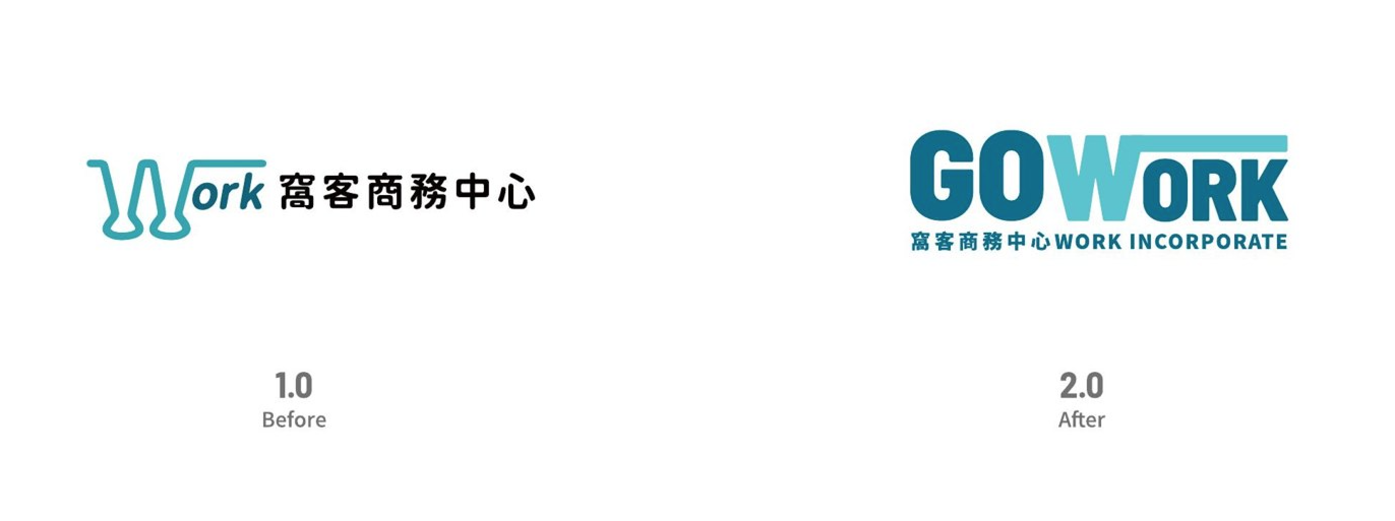
改版對照Before / After
保留品牌既有的識別資產,重整字體結構與色彩,讓標誌在各種尺寸與場景下都更清晰、更有力量。
Refining the existing equity into a stronger, more legible 2.0 identity.
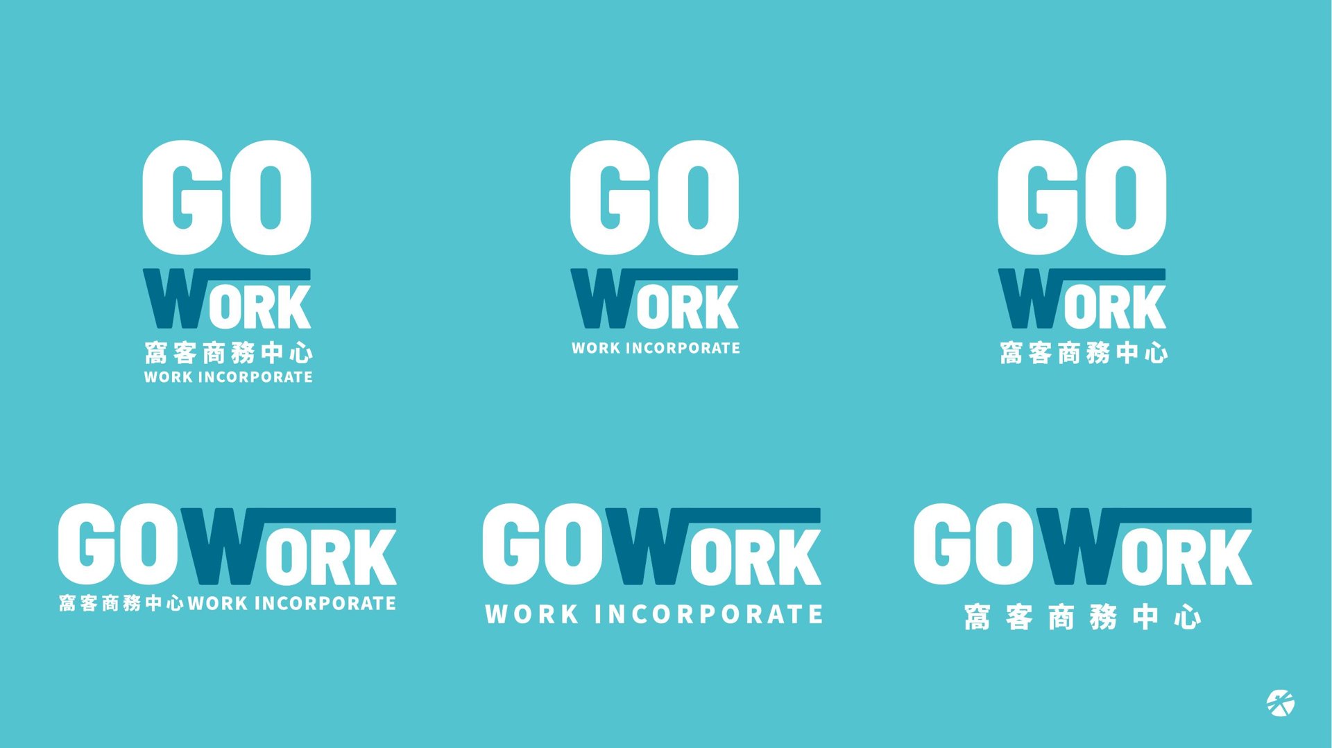
標誌系統Logo System
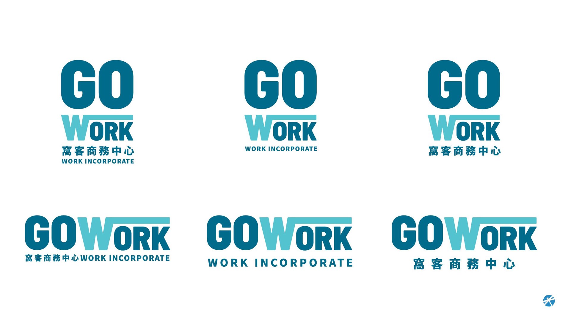
以 GO 與 WORK 的錯位堆疊構成主標誌,搭配中英文標準字,發展出橫式、直式與多種組合,適應各種應用情境。
A flexible lockup system across horizontal, vertical and bilingual variants.
配色變體Colorway
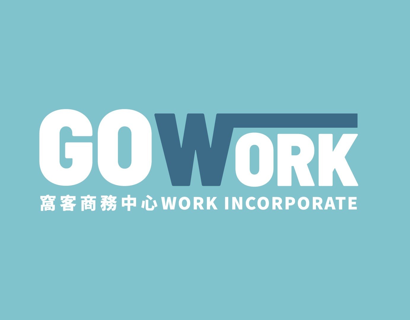
除白底主標誌外,另發展品牌色底的反白配色版本,讓標誌在深淺背景下都能保持一致的辨識度。
A reversed colorway keeps the mark legible on brand-colour backgrounds.
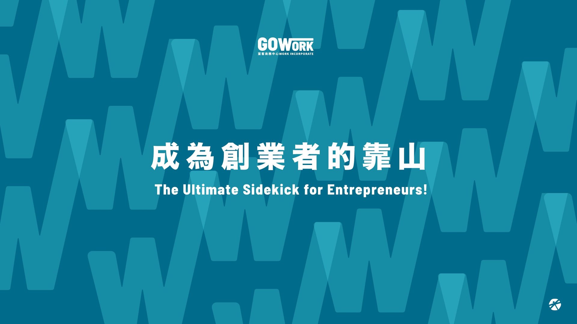
輔助圖形Graphic
取 W 字型延展為連續圖騰,象徵「WORK」與彼此交疊的支持,成為品牌可延伸的視覺語彙。The W-pattern signals support and continuity across touchpoints.
品牌主張Brand Voice
以「成為創業者的靠山」為核心敘事,將品牌定位轉化為一致的視覺與語氣主張。
Positioning the brand as the entrepreneur's ultimate sidekick.
窩客商務中心 GoWork
Chihe Branding Consultancy
MORE