



把市場的吆喝聲,變成看得見的品牌記憶。
皓豐肉市 Hao Feng & Co.|品牌識別設計
皓豐肉市源自新北蘆洲傳統市場的「王媽媽牛肉羊肉舖」,以溫體與冷凍肉品同時服務市場裡的婆婆媽媽與網路商店的年輕上班族。將品牌核心錨定於「市場吆喝聲」——那一句句熟悉的叫賣,賣的不只是商品,更是信任、熟悉與溫度。我們把這份聲音轉化為視覺語言,讓吆喝聲不只停留在耳朵裡,更走進眼睛、進入記憶。
Hao Feng & Co. grew out of a family butcher stall in Luzhou's traditional market, serving both the market's loyal regulars and a younger generation shopping online. Chihe anchored the brand in the vendor's call — the familiar voice of the market that sells not just meat, but trust and warmth — and translated that sound into a visual language that lives on in the eye and in memory.
品牌標誌設計
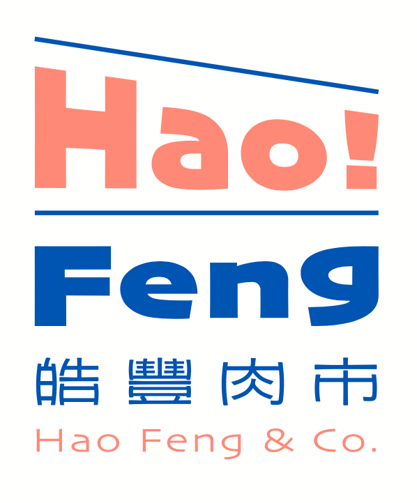
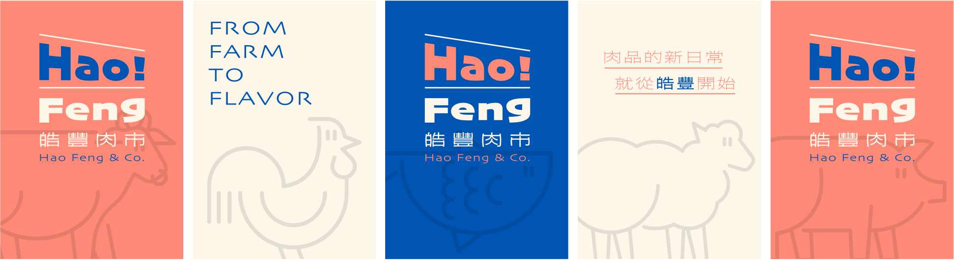
吆喝聲化為大聲公,大聲公再簡化為線條與字型——「Hao!」既是「皓」的聲音,也是市場裡的一聲招呼。
The vendor's call becomes a megaphone; the megaphone is distilled into line and letterform. "Hao!" is at once the sound of the name and a greeting from the market.
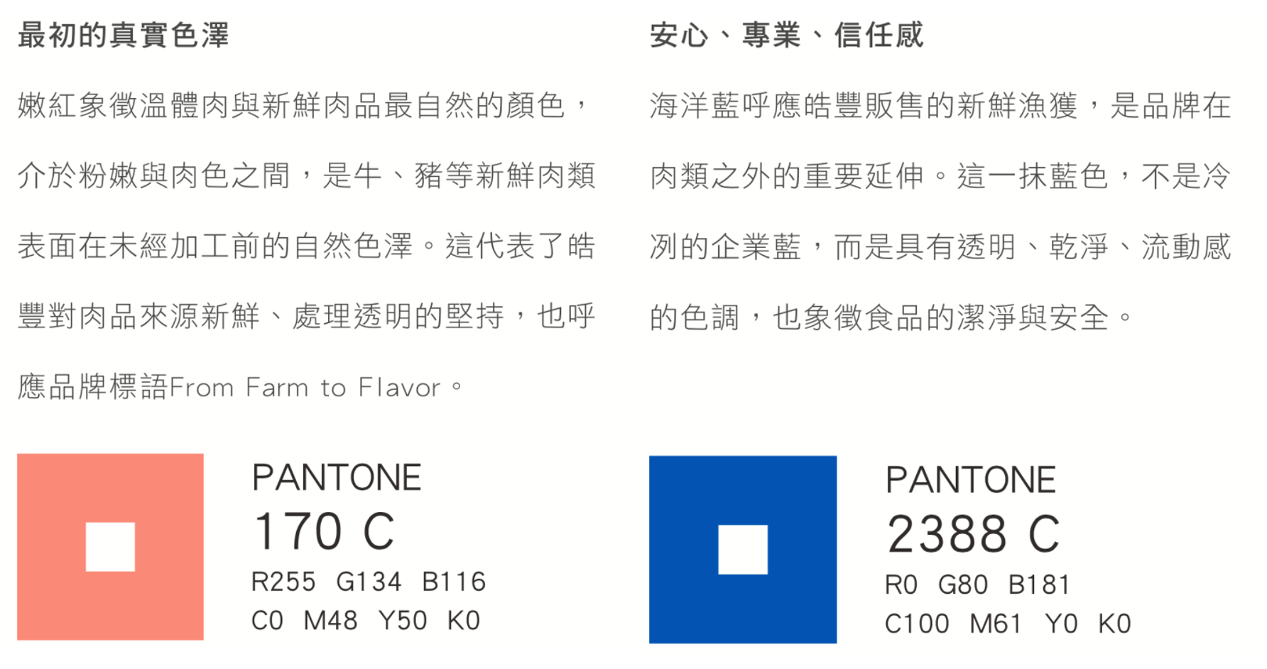
品牌色彩
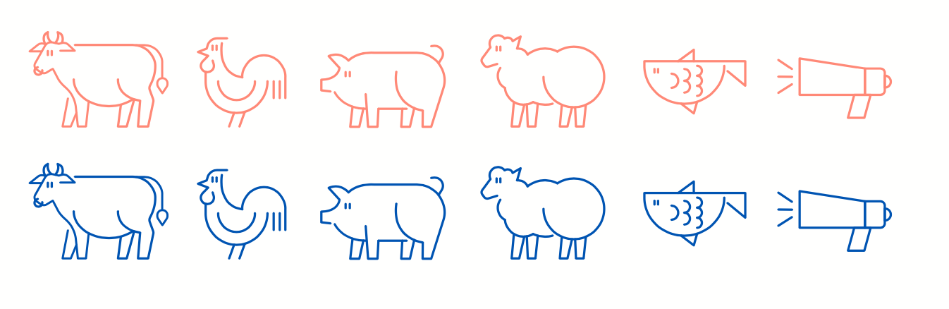
品牌圖騰
事務用品與週邊應用
STATIONERY & MERCHANDISE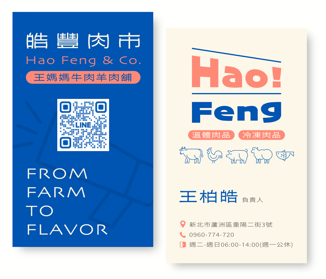
包裝設計
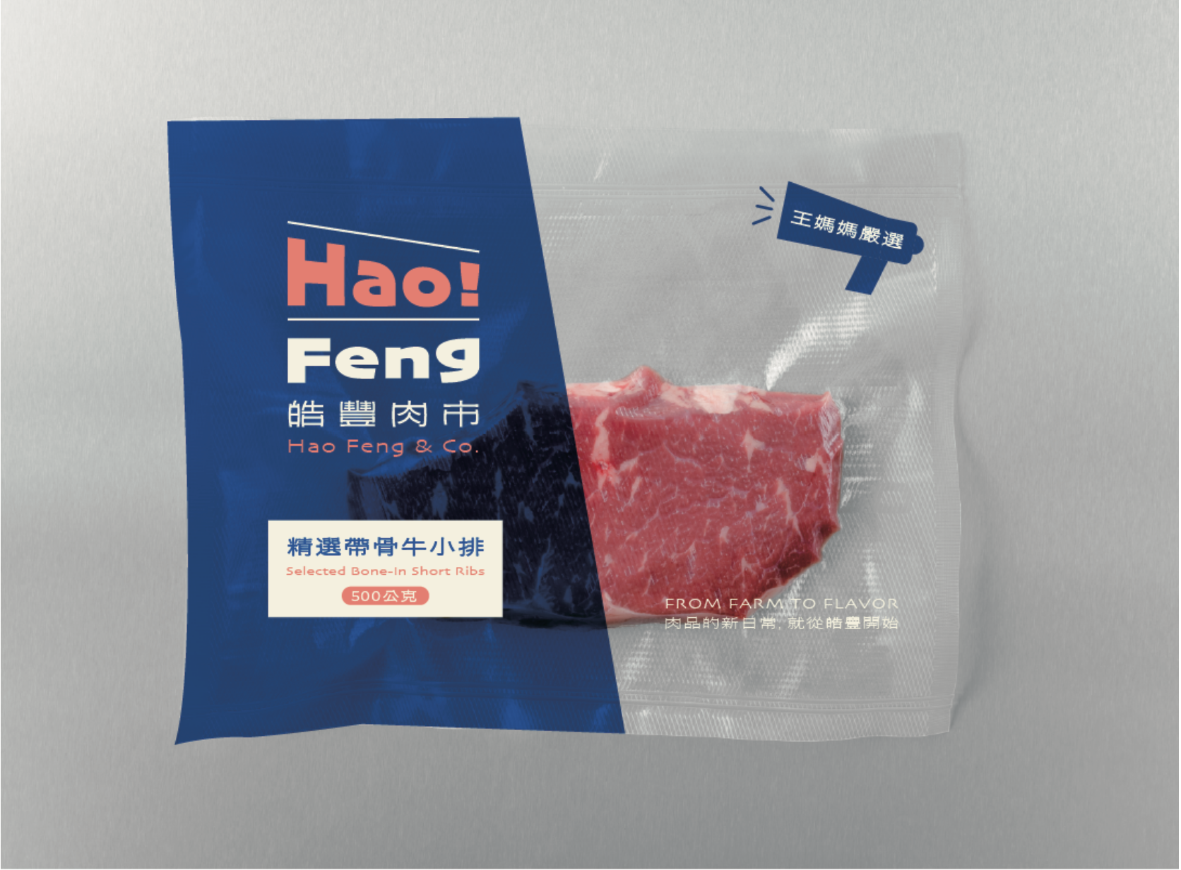
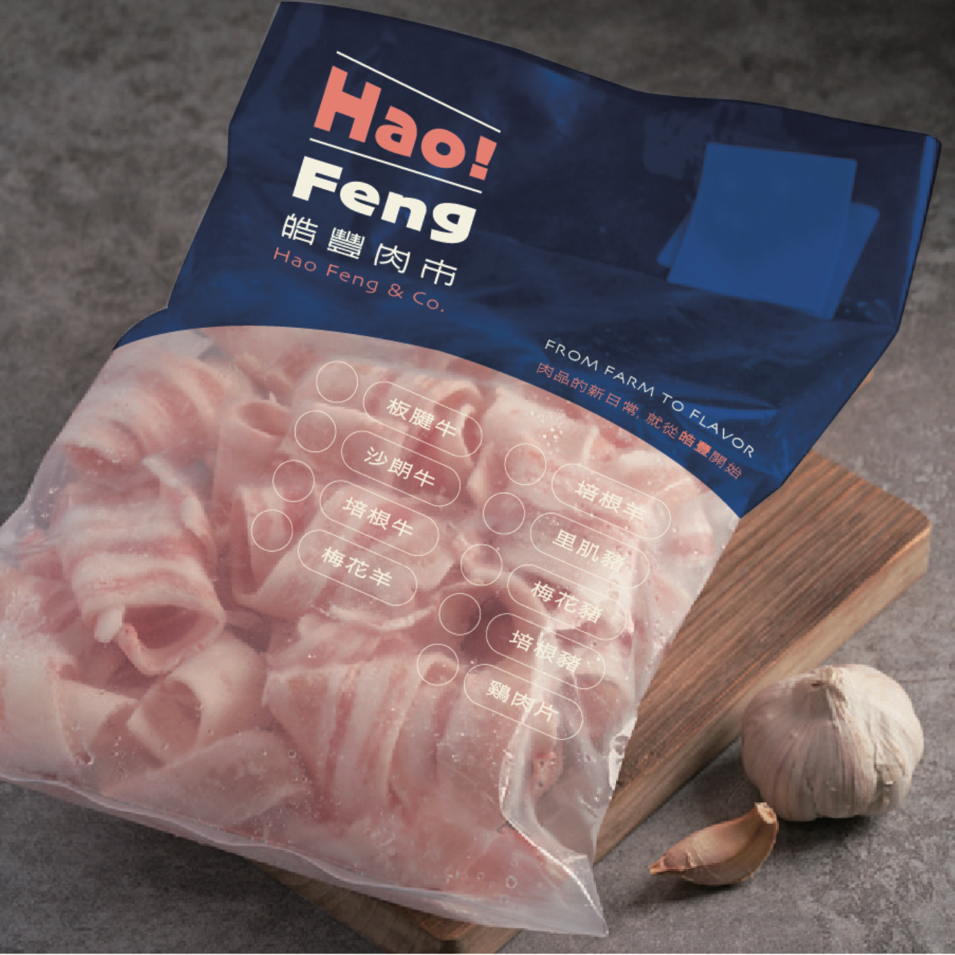
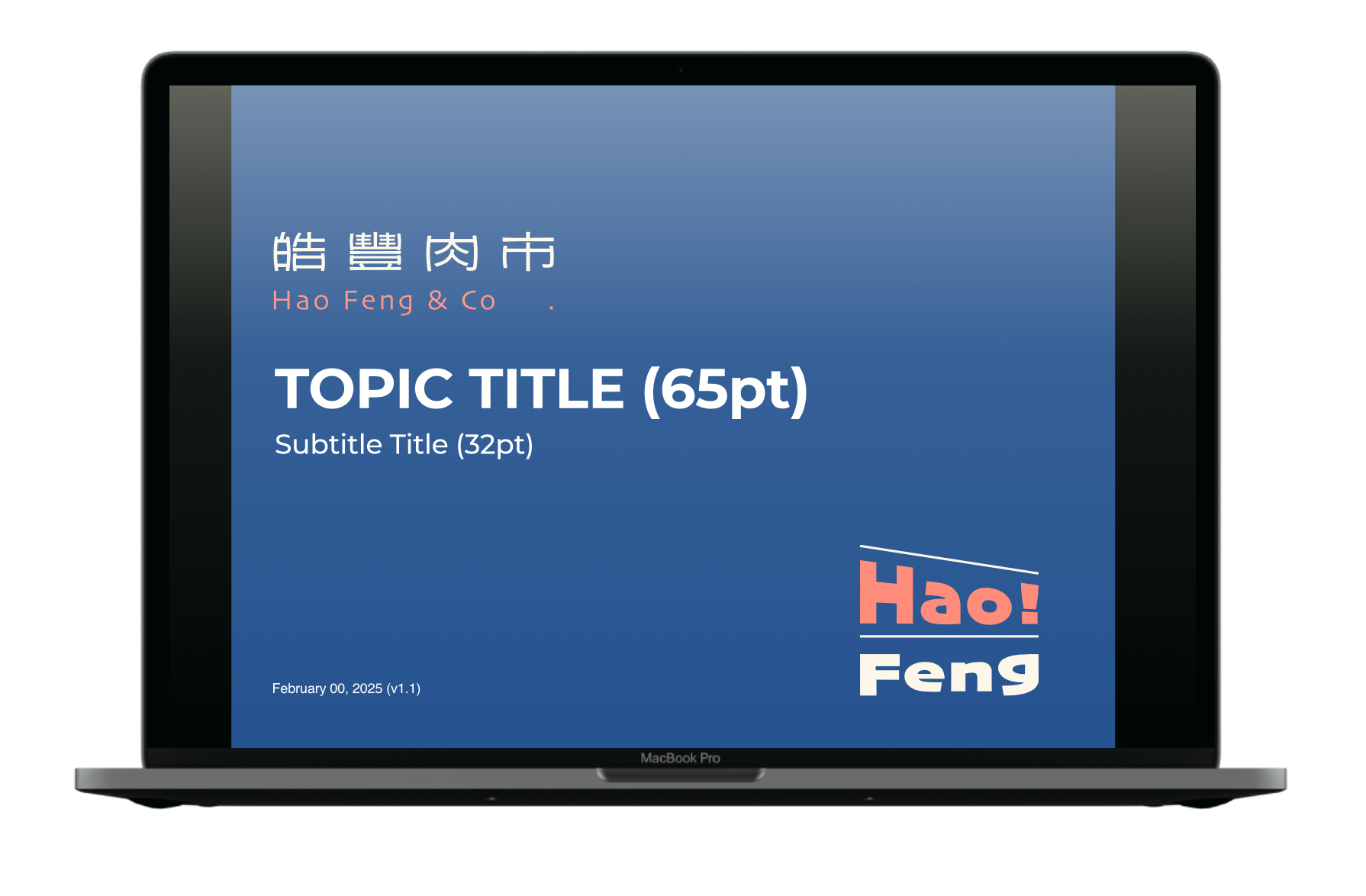
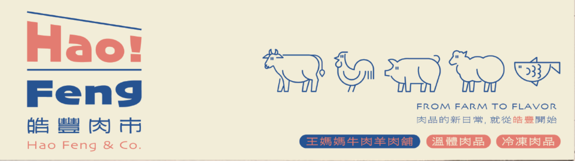
從一張名片到一面招牌,皓豐的每個接觸點都延續著市場裡的那份親切。不只是賣肉,而是把市場的記憶與人與人之間的連結,用視覺語言保留下來。
From a business card to a storefront sign, every touchpoint carries the warmth of the market. This is more than selling meat — it is keeping the memory of the market, and the bonds between people, alive in visual form.
皓豐肉市 Hao Feng & Co.|品牌識別設計 2025
CHIHE BRANDING CONSULTANCY