



依杰 HART's 五行茶|系列包裝設計
木火土金水,五行相生,臟腑和諧
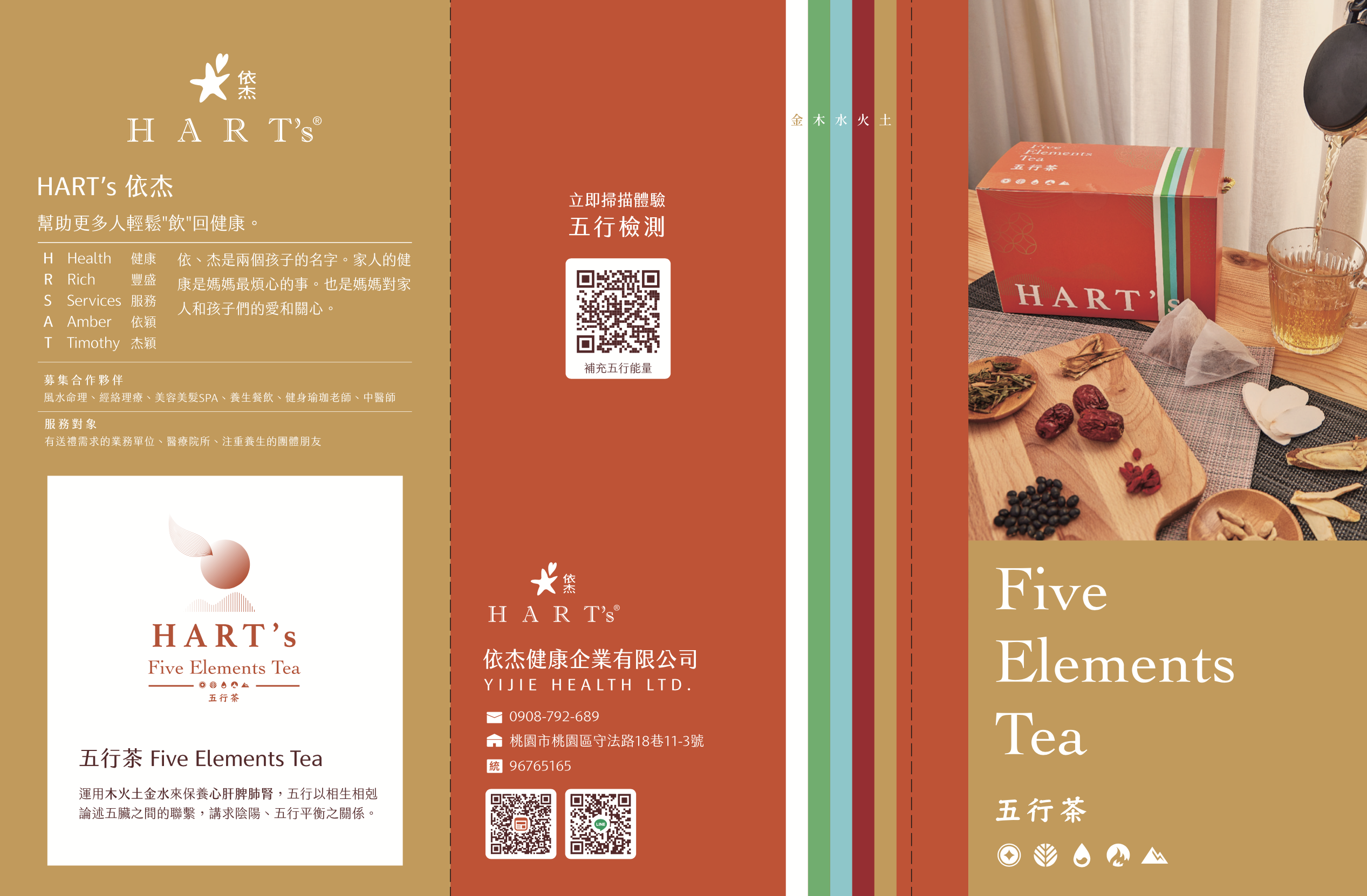
依杰健康企業 HART's(Health · Rich · Services)以中醫五行理論為基礎,開發五行茶系列保健產品。齊禾為其設計完整系列包裝,以木、火、土、金、水五行對應五色視覺系統,融合東方紋樣美學與現代版型,讓「養生」的概念透過設計語言清晰傳達。
HART's (Health · Rich · Services) develops a series of wellness teas rooted in Traditional Chinese Medicine's Five Elements theory. CHIHE designed a complete series packaging system, mapping Wood, Fire, Earth, Metal, and Water to a five-color visual system — integrating Eastern pattern aesthetics with modern layouts to communicate wellness through design.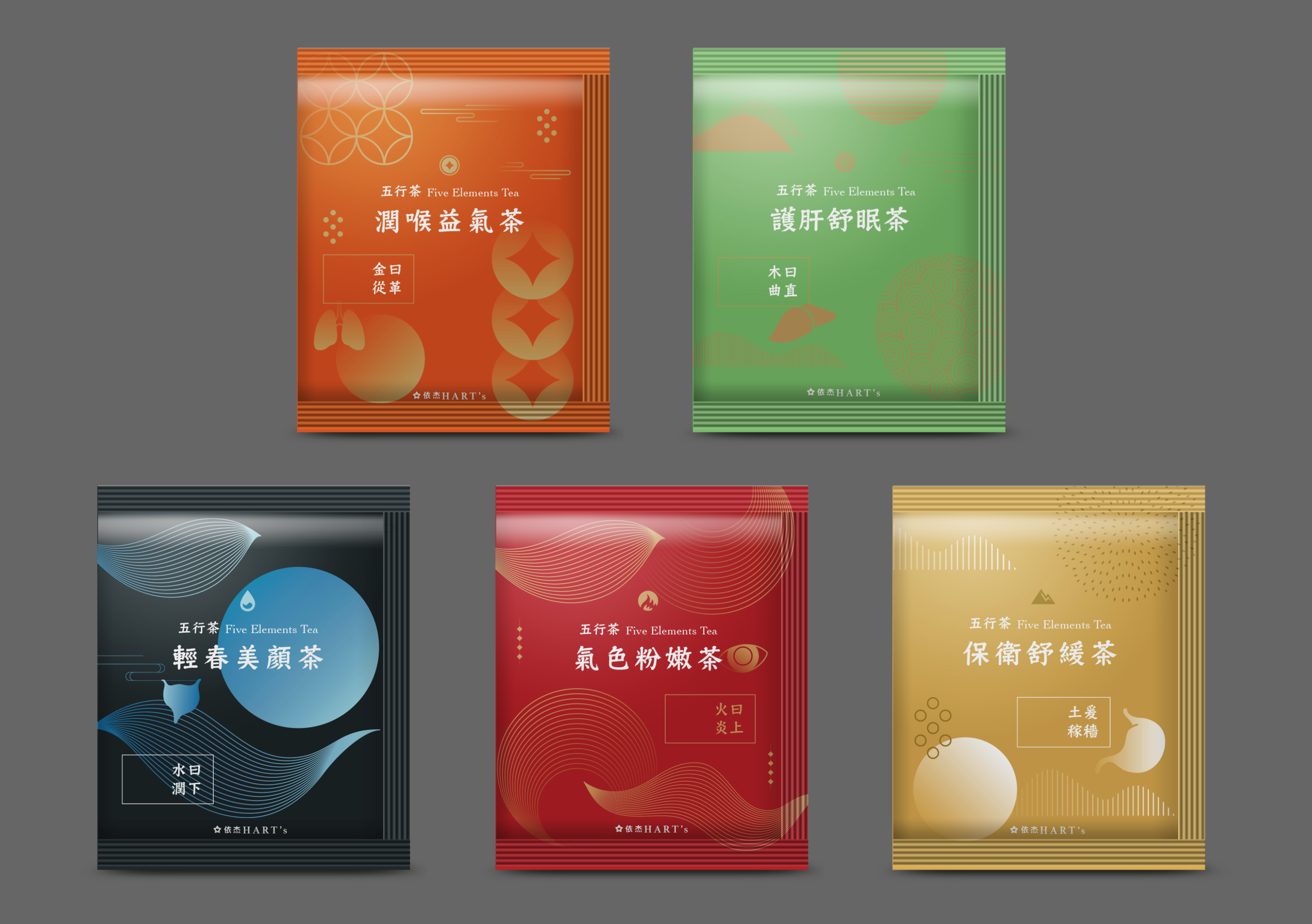
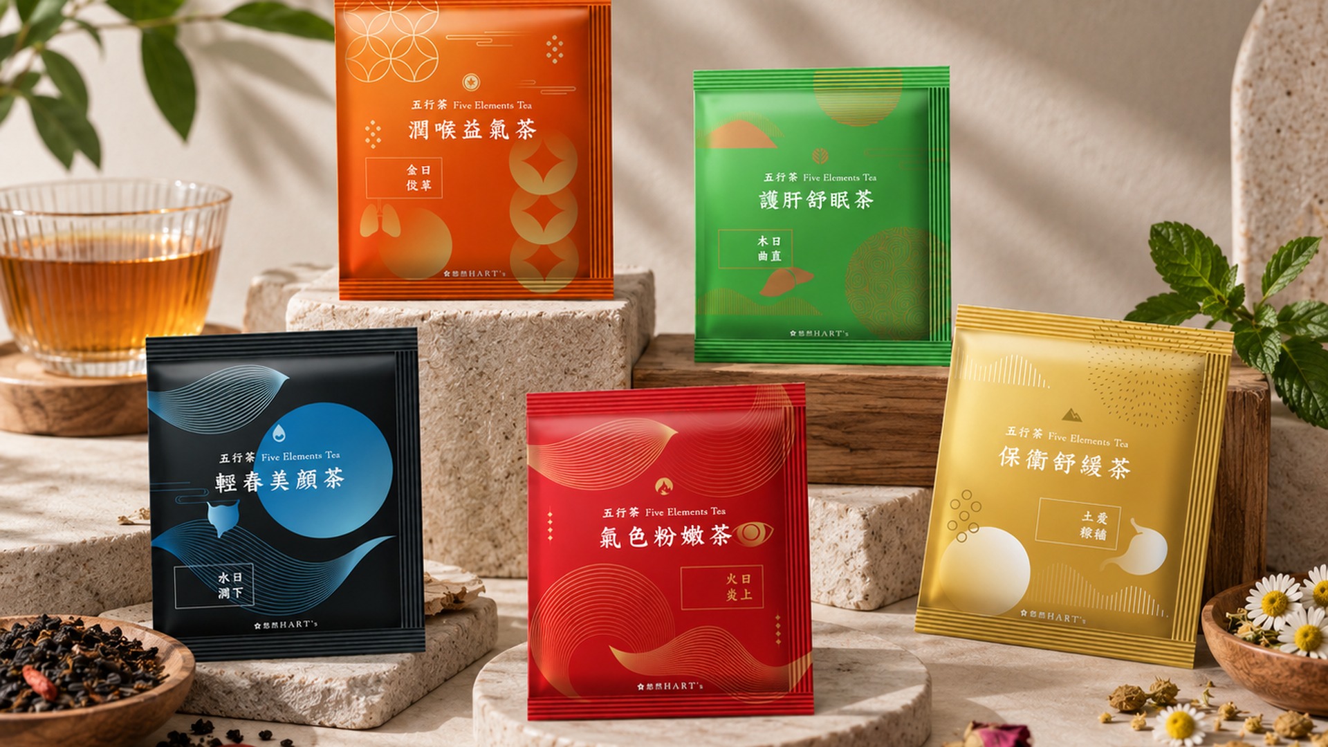
五行系列茶包
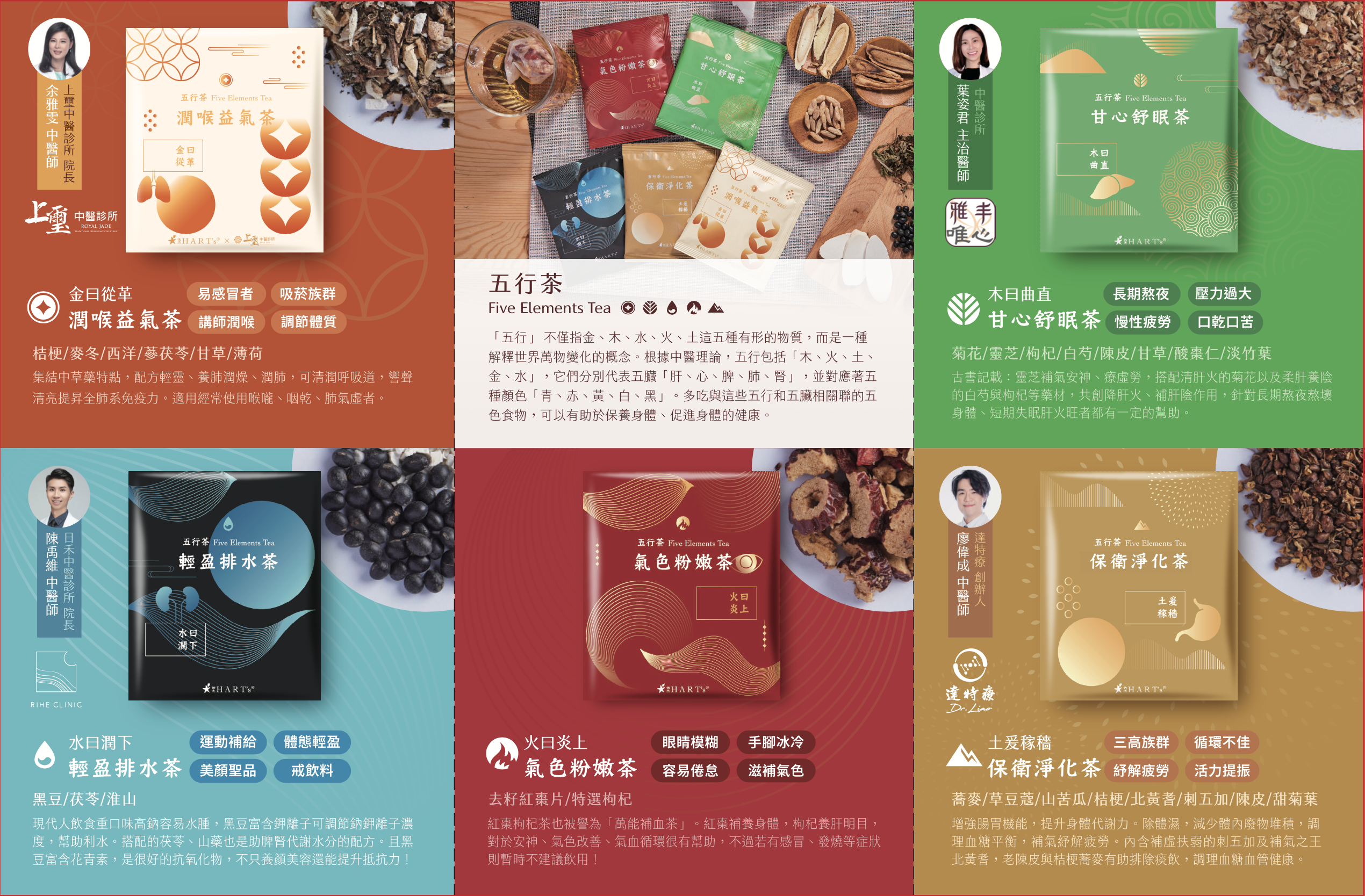
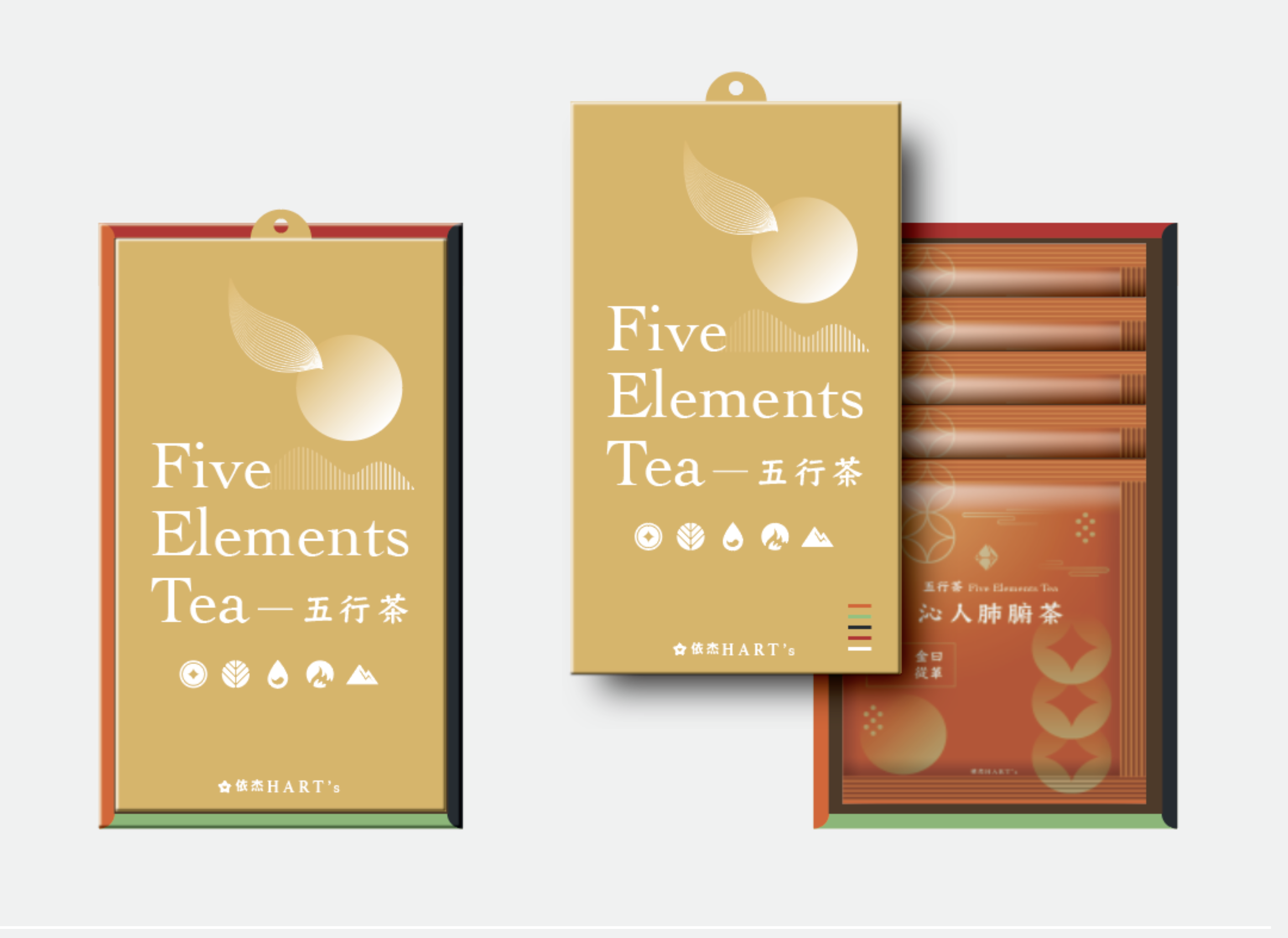
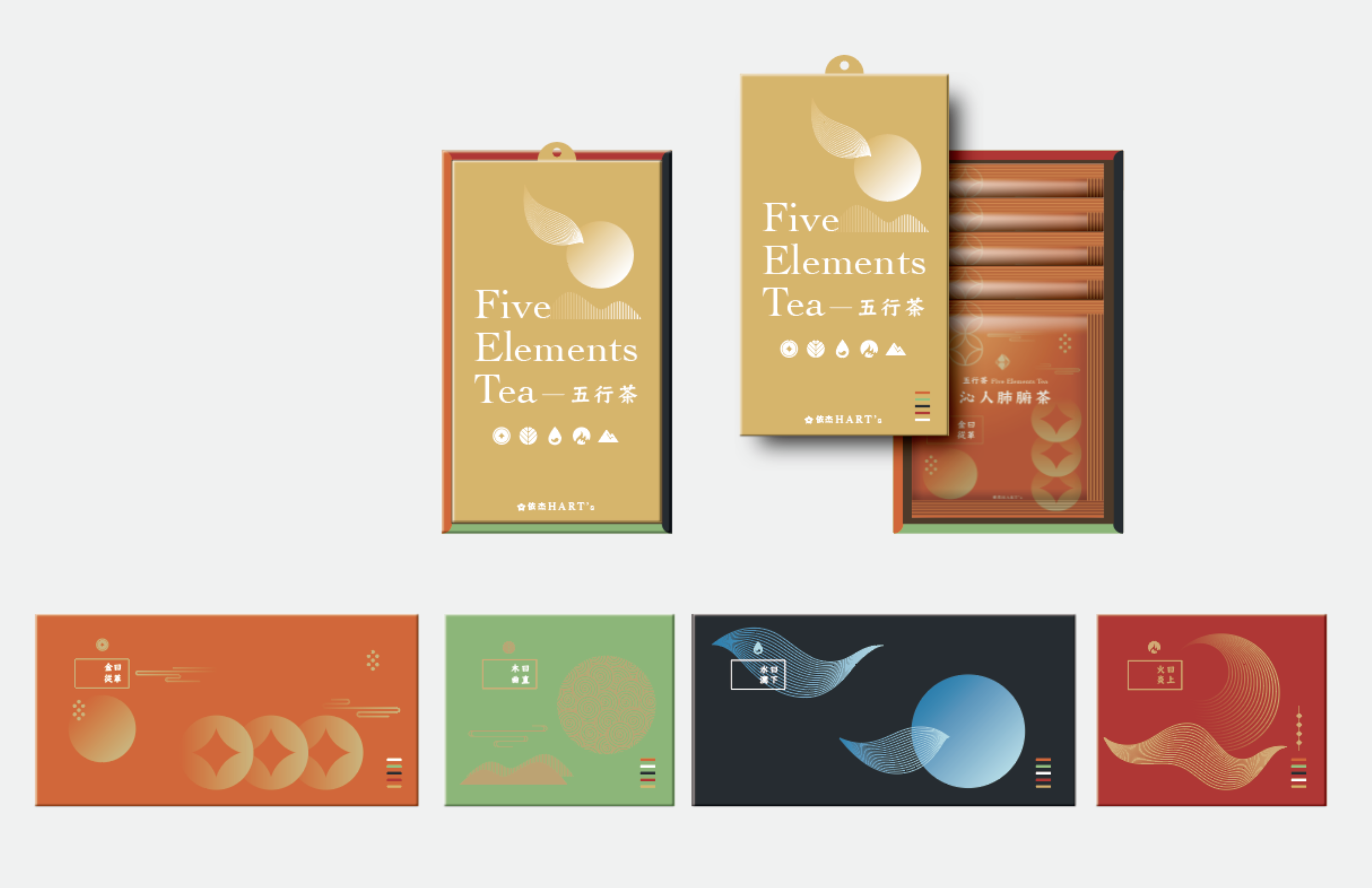
每款茶包以五行屬性對應專屬色彩與紋樣:金屬性採菱形錢幣幾何,木屬性以葉形曲線呈現,水屬性用波浪線條與滿月意象,火屬性以流動渦紋構成,土屬性則以圓潤的大地器物為主視覺。五款並列,即是一套完整的陰陽五行色彩圖騰。
Each tea bag corresponds to its elemental attribute through dedicated color and pattern: Metal with diamond coin geometry, Wood with leaf-curved lines, Water with wave motifs and a full moon, Fire with flowing spiral patterns, and Earth with round vessel forms. Together, the five form a complete Yin-Yang Five Elements chromatic totem.
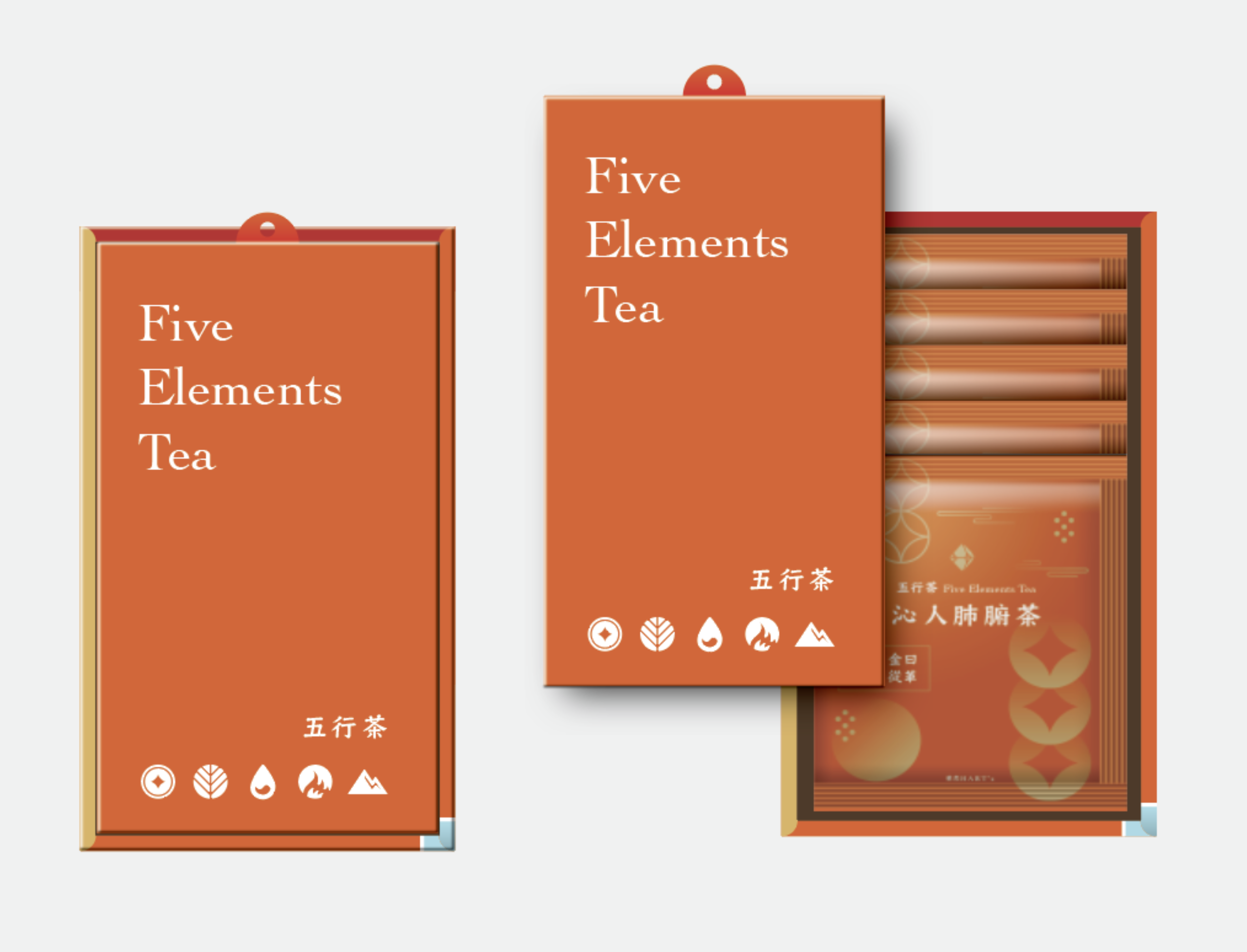
禮盒包裝
禮盒設計 / 開蓋式結構 / 雙色版本
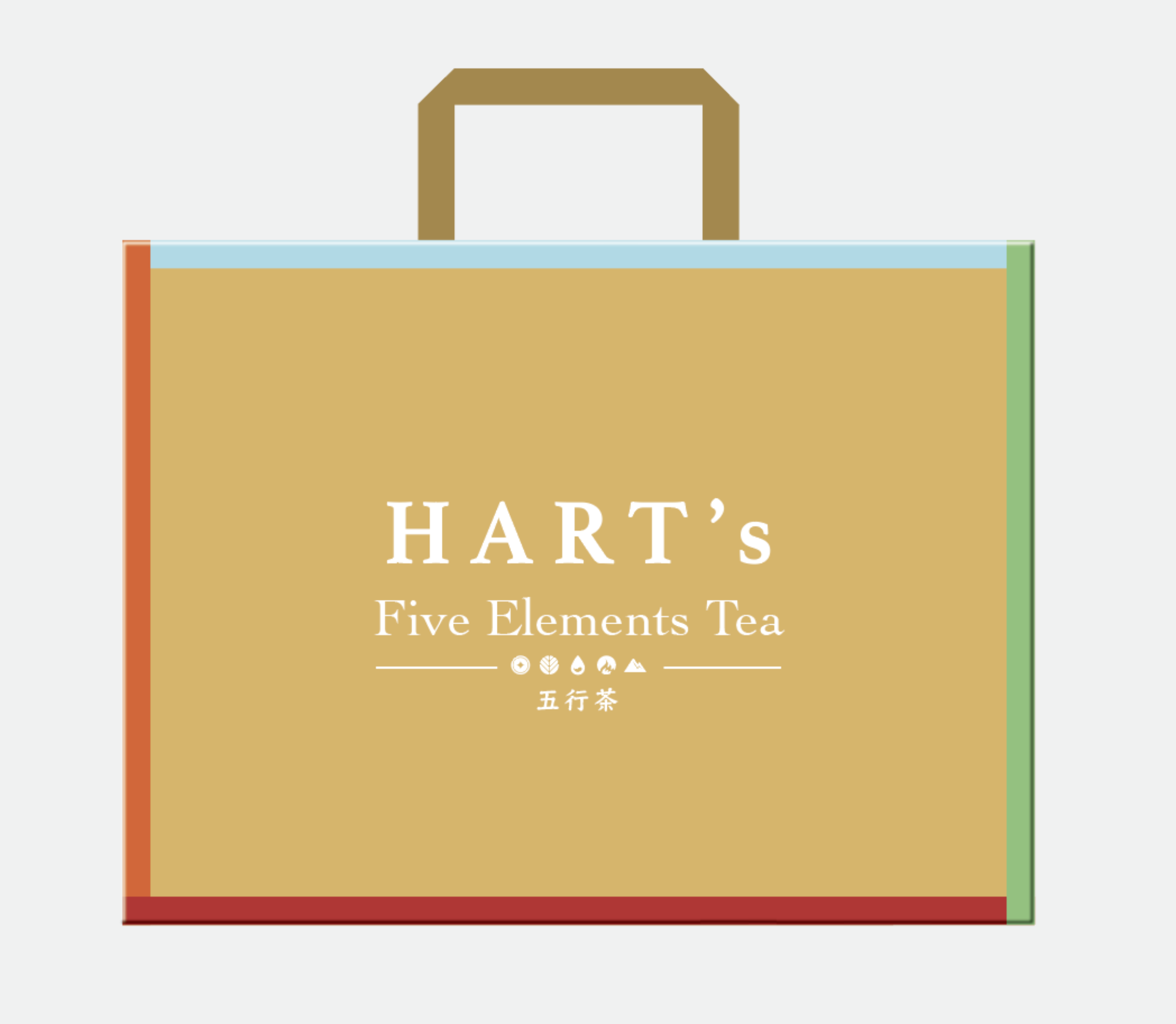
手提袋設計
依杰 HART's 五行茶|系列包裝設計 2024
CHIHE BRANDING CONSULTANCY