




植覺療癒 inHealing
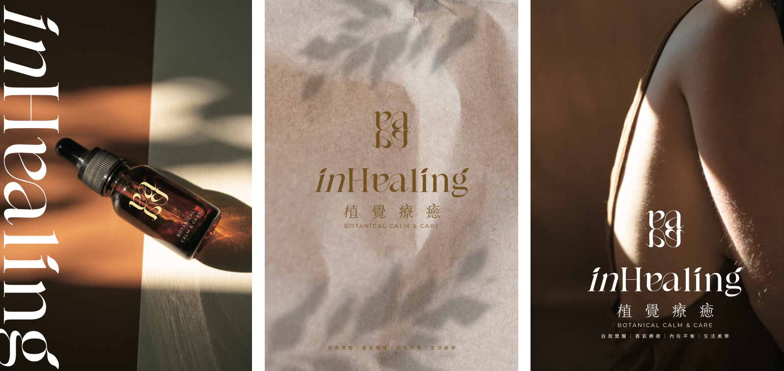
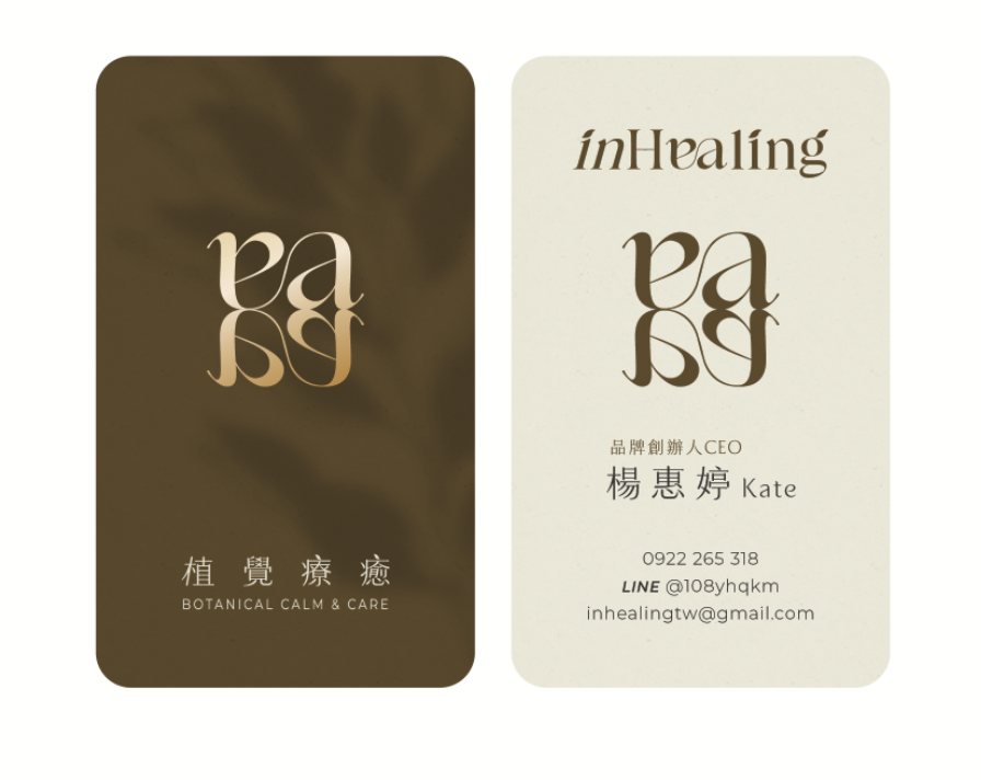
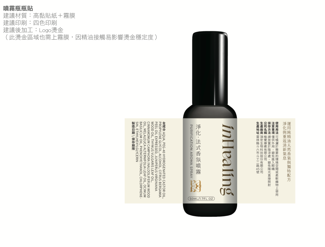
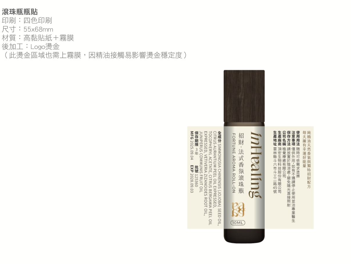
植覺療癒的創辦人 Kate 原為金融業副總裁,在高壓工作中逐漸迷失自我,因一次接觸芳療而改變生命方向——精油不只是香味的陪伴,更是帶來身心整合與情緒轉化的工具。齊禾以「鏡射」為設計核心,為品牌打造完整識別系統:從字母交疊的標誌、大地色彩到全系列產品包裝,讓療癒的力量有了安靜而深刻的視覺語言。
Kate, the founder of inHealing, was once a vice president in finance who gradually lost herself under pressure — until aromatherapy changed the direction of her life. Essential oils, she found, are not merely scents but tools for integration and emotional transformation. Chihe built the brand's identity around the idea of "reflection": from a mirrored monogram and earthy palette to a full packaging system, giving the power of healing a quiet, profound visual language.
品牌標誌設計
標誌由 e(emotion,感受)與 a(awareness,覺察)兩個字母上下鏡射交疊——鏡子意味著情緒的反照與照見,人們在療癒的過程中,勇敢面對自己未被看見的一面。筆劃內彎,象徵將注意力拉回自身,進行深層的感受與傾聽。
The monogram mirrors two letters — e for emotion, a for awareness — reflecting one another. The mirror stands for seeing one's emotions truthfully; the inward-curving strokes draw attention back to the self, toward deep feeling and listening.
品牌色彩
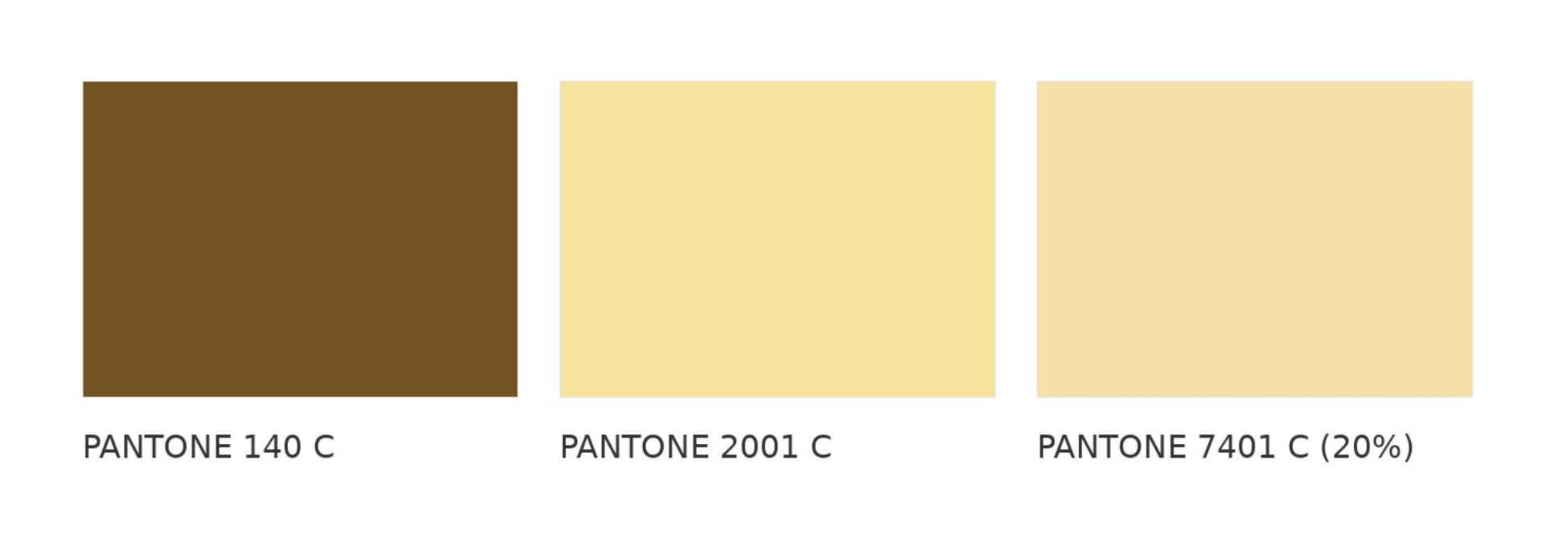
深棕 PANTONE 140 C 如被時間醞釀過的植物根部,象徵穩定、深層、歷久不衰;晨黃 PANTONE 2001 C 如晨起第一道灑落的光,是療癒旅程的第一步;留白 PANTONE 7401 C(20%)則像深呼吸之後的安靜片刻,映照香氣,也承接情緒。
Deep Brown, PANTONE 140 C, is the root of a plant aged by time — stable, deep, enduring. Morning Yellow, PANTONE 2001 C, is the first light of day, the first step of the healing journey. The Blank, PANTONE 7401 C at 20%, is the quiet moment after a deep breath — holding fragrance, and emotion.
品牌圖騰

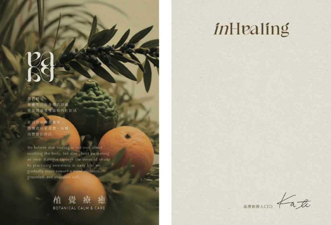
品牌形象
事務用品
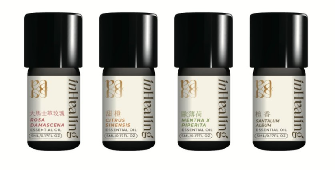
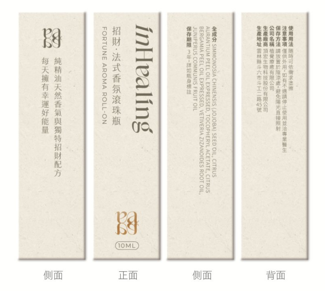
產品包裝
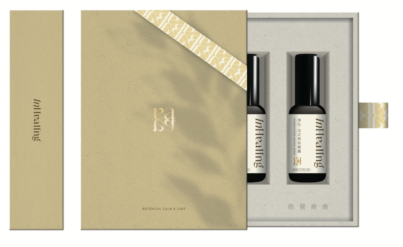
禮盒與週邊
CHIHE BRANDING CONSULTANCY