



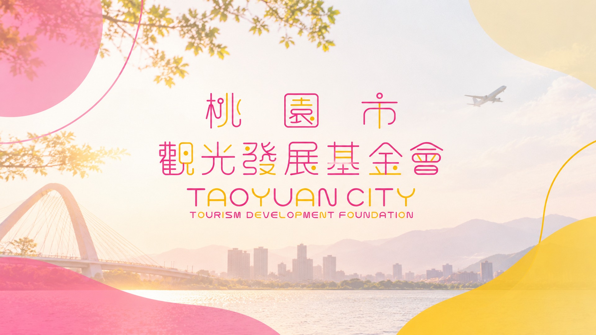
桃園市觀光發展基金會 | 品牌識別系統
以「國際感 × 在地連結」為品牌核心,打造具現代感與高延展性的城市品牌視覺語言。
Taoyuan City Tourism Development Foundation
桃園市觀光發展基金會
TAOYUAN CITY TOURISM DEVELOPMENT FOUNDATION
品牌策略核心
BRAND STRATEGY
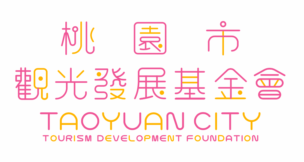
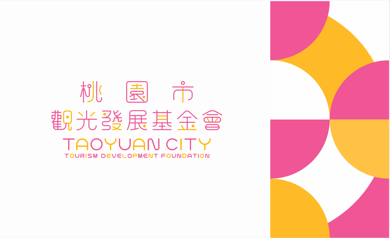
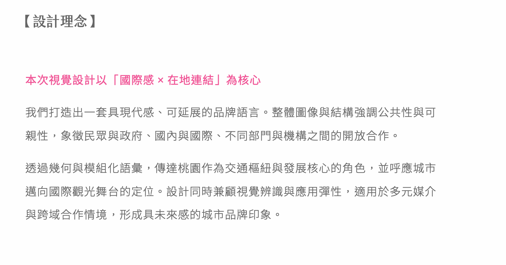
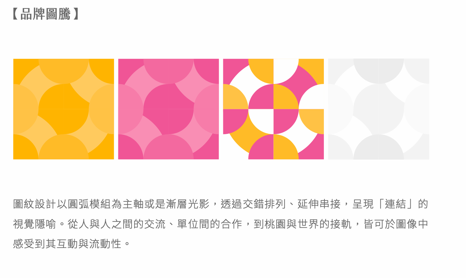
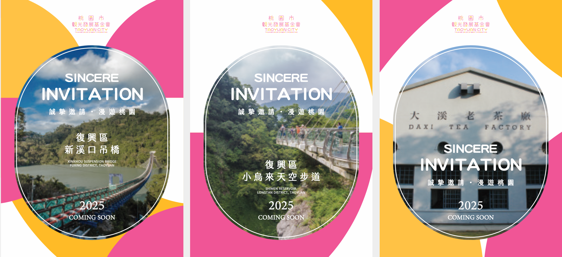
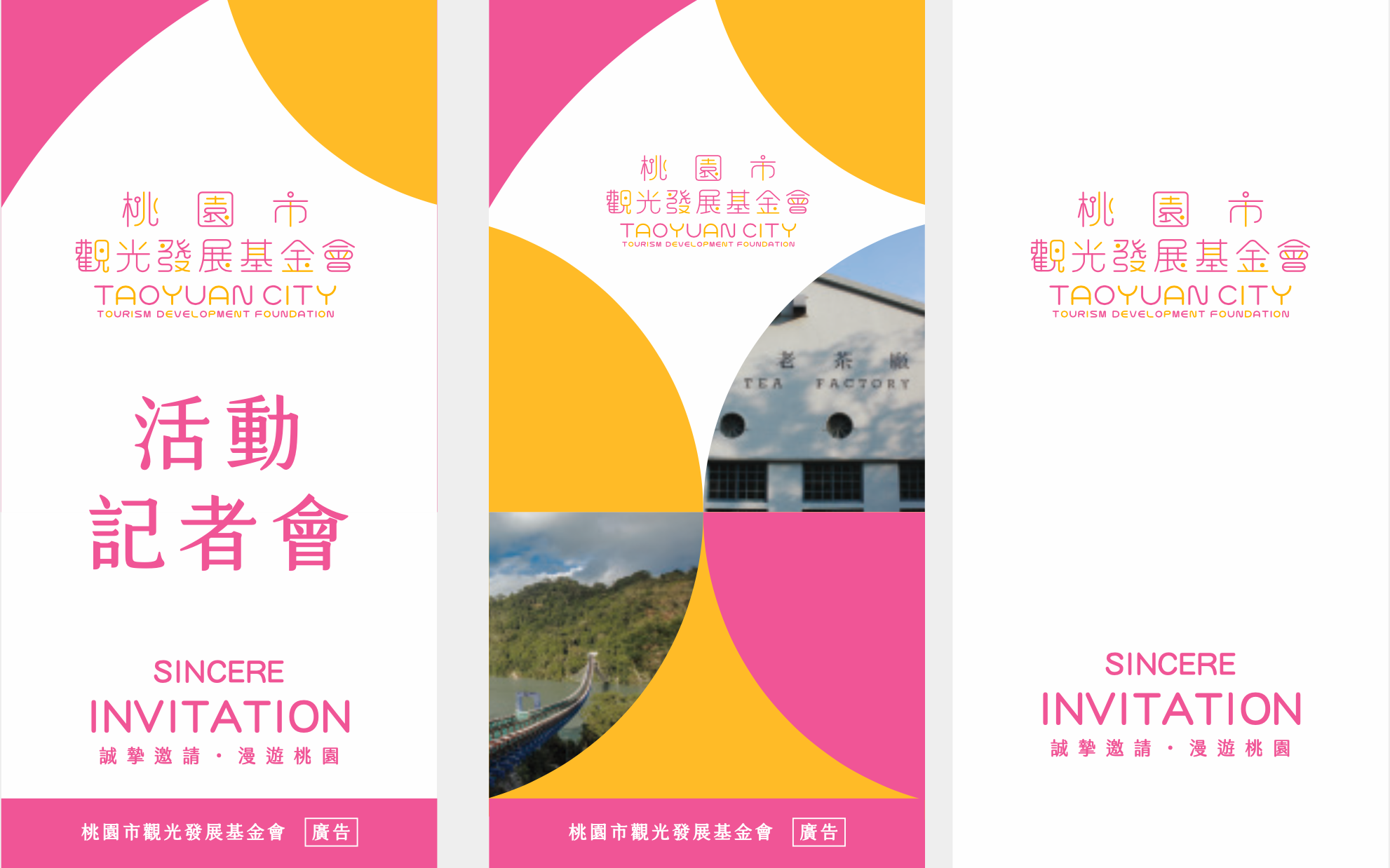
桃園市觀光發展基金會肩負推動城市觀光與國際交流的重要使命。齊禾設計以「國際感 × 在地連結」為品牌核心,打造一套具現代感、可延展的視覺語言系統,強調公共性與親和性,象徵民眾與政府、國內與國際、不同部門與機構之間的開放合作。設計取材桃園「千塘之鄉」的地貌特色,以圓弧幾何模組傳達城市作為交通樞紐與發展核心的角色,呼應桃園邁向國際觀光舞台的品牌定位。
Drawing from Taoyuan's landscape identity as the "City of a Thousand Ponds," the circular geometric modules convey the city's role as a transportation hub and development center, echoing Taoyuan's positioning as an international tourism destination.
Drawing from Taoyuan's landscape identity as the "City of a Thousand Ponds," the circular geometric modules convey the city's role as a transportation hub and development center, echoing Taoyuan's positioning as an international tourism destination.
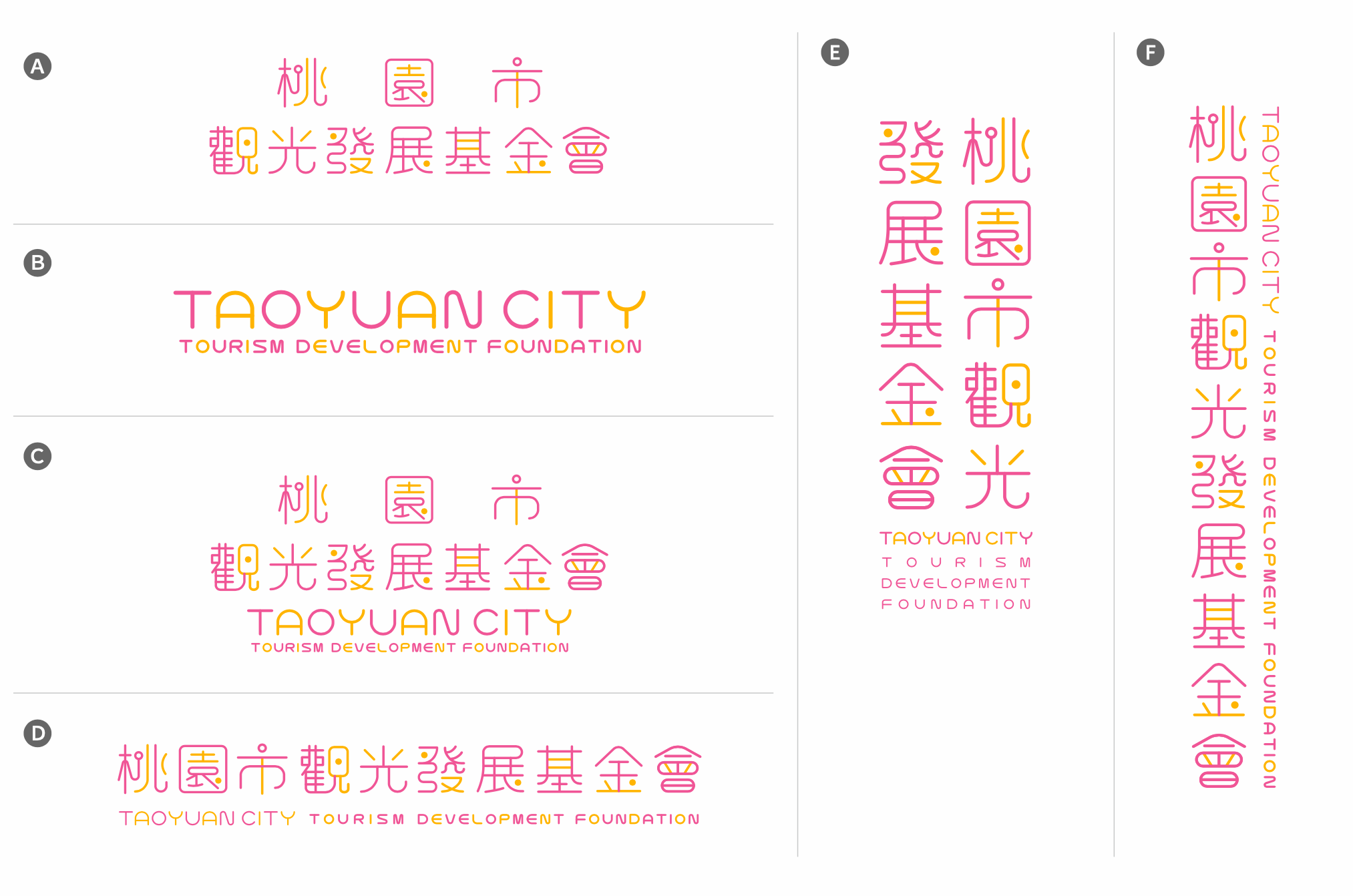
標準字排列系統
LOGOTYPE VARIATIONS
應用設計
VISUAL APPLICATION
CHIHE BRANDING CONSULTANCY
MORE