



北歐餐桌 A.table nordic | CIS 品牌識別設計
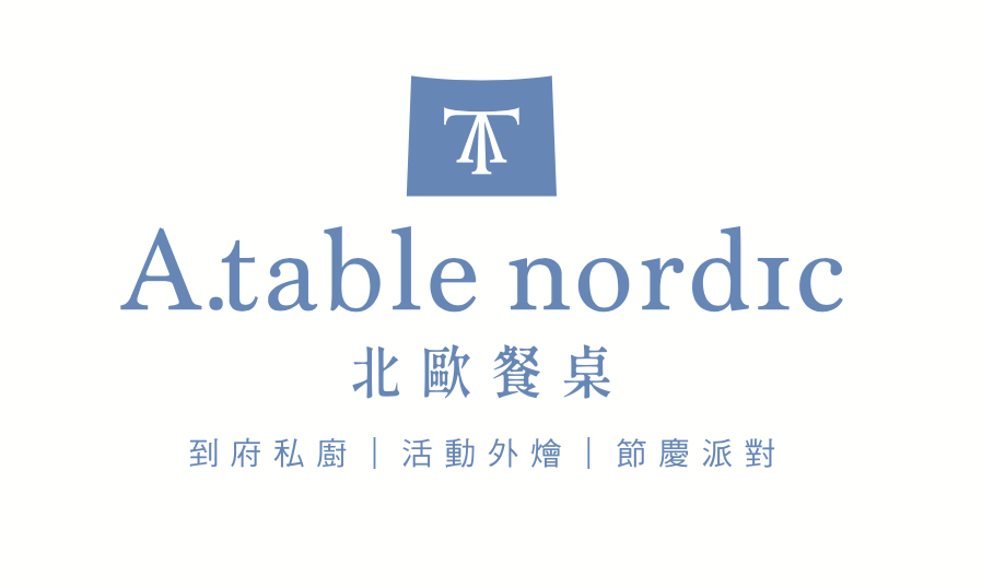
標誌設計|一張桌子的側影
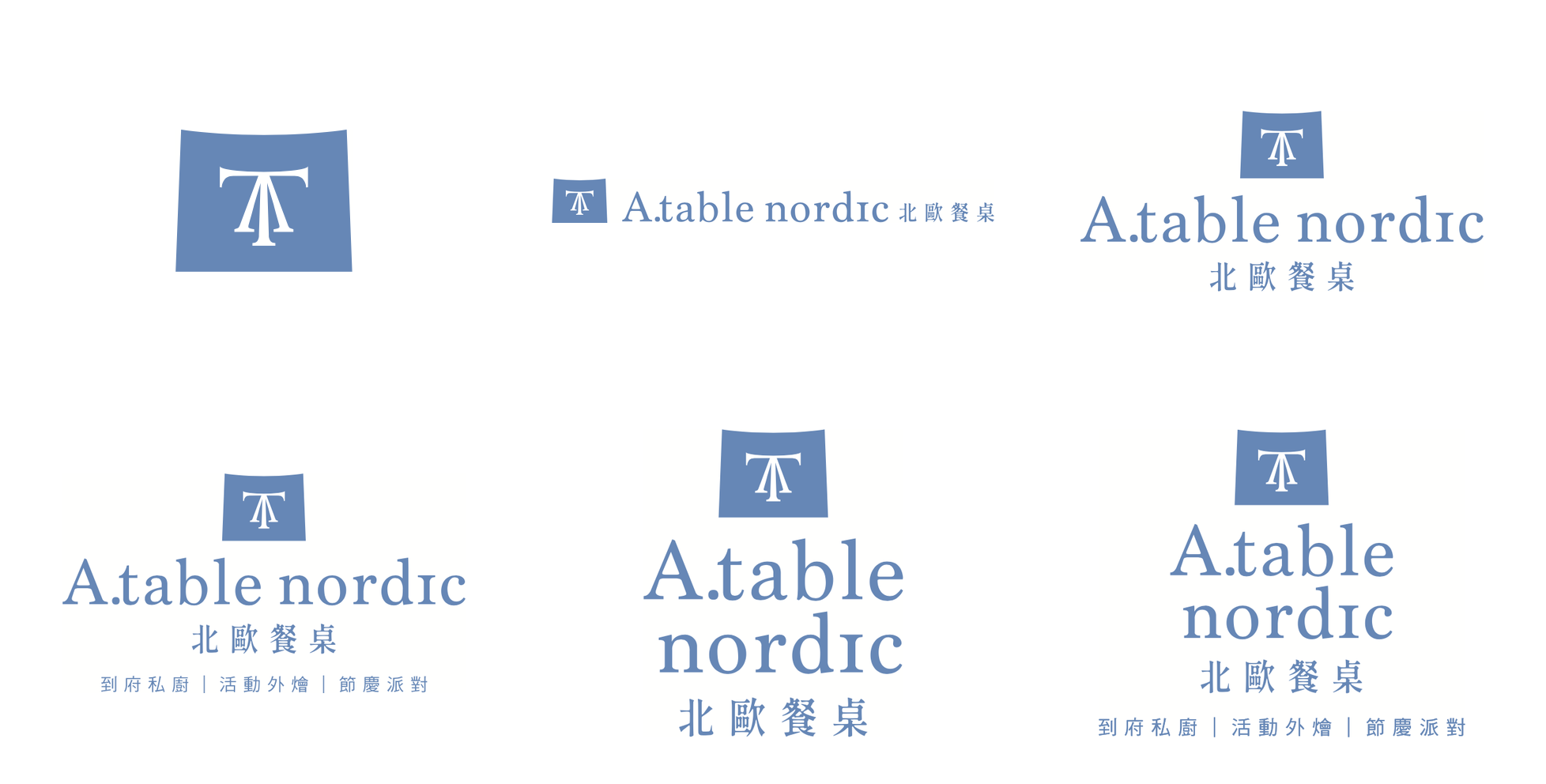
標誌以 A 與 T 疊合而成——A.table 的縮寫,也是一張餐桌的側視。外框是微微起伏的方塊,像一塊剛鋪上的桌巾,讓幾何有了手的溫度。霧藍與芥末黃互為表裡,深淺互換,是北歐日光下最自然的一組對話。
The mark merges A and T — the initials of A.table, and the side view of a dining table. The softly curved frame reads like freshly laid table linen, giving the geometry a human touch. Mist blue and mustard yellow reverse into each other, a natural dialogue under Nordic daylight.
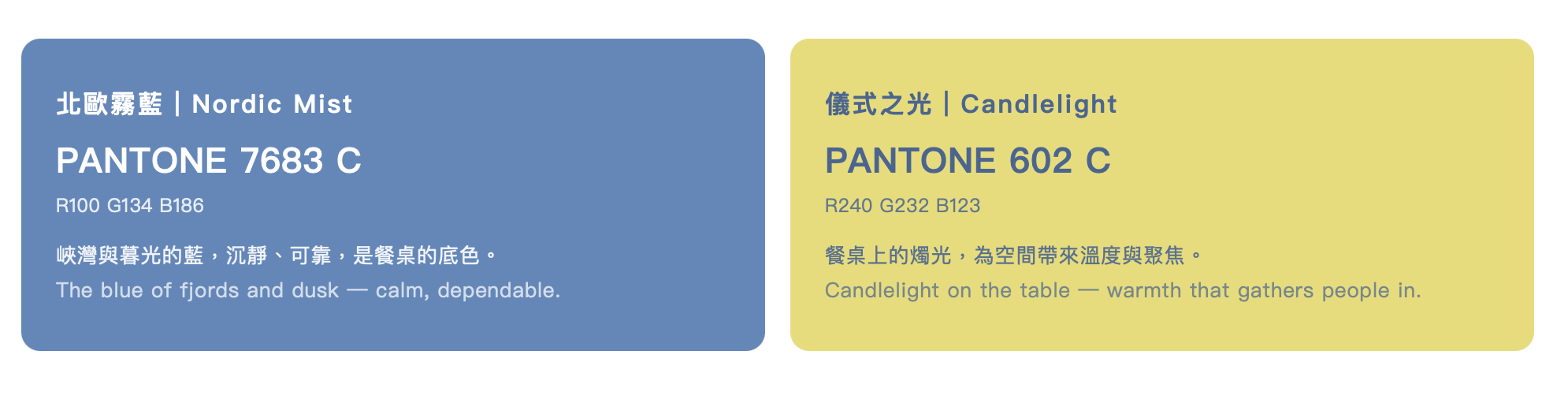
品牌色彩|儀式之光
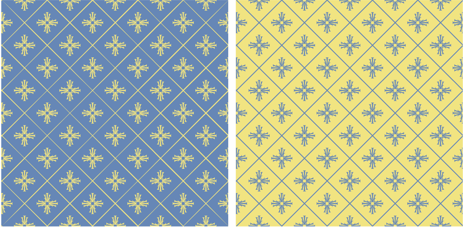
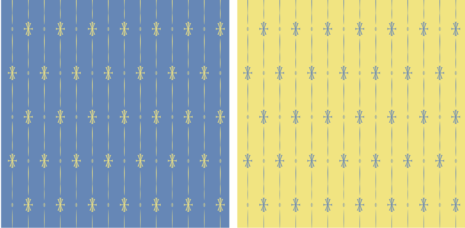
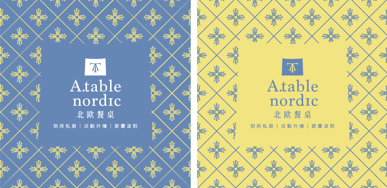
品牌圖騰|北歐織紋
圖騰取自標誌的桌形結構,發展為北歐織品的雪花紋樣。菱格紋用於正式場合,直條紋用於日常,兩者都可藍底黃紋或黃底藍紋互換,一套圖騰因此有了四種表情。
Drawn from the table structure within the logo, the motif grows into a Nordic snowflake weave. The diamond lattice serves formal occasions, the stripe everyday use — each reversible in both colourways, giving one pattern four expressions.
品牌插畫|Seize the Day
手繪食材插畫延伸品牌語彙——生鮮、烘焙、擺盤,全部以單色線條收攏在霧藍之中,成為菜單與包裝的敘事底層。
Hand-drawn ingredient illustrations extend the brand vocabulary — produce, baking, plating — all rendered as single-colour line work on mist blue, forming the narrative base for menus and packaging.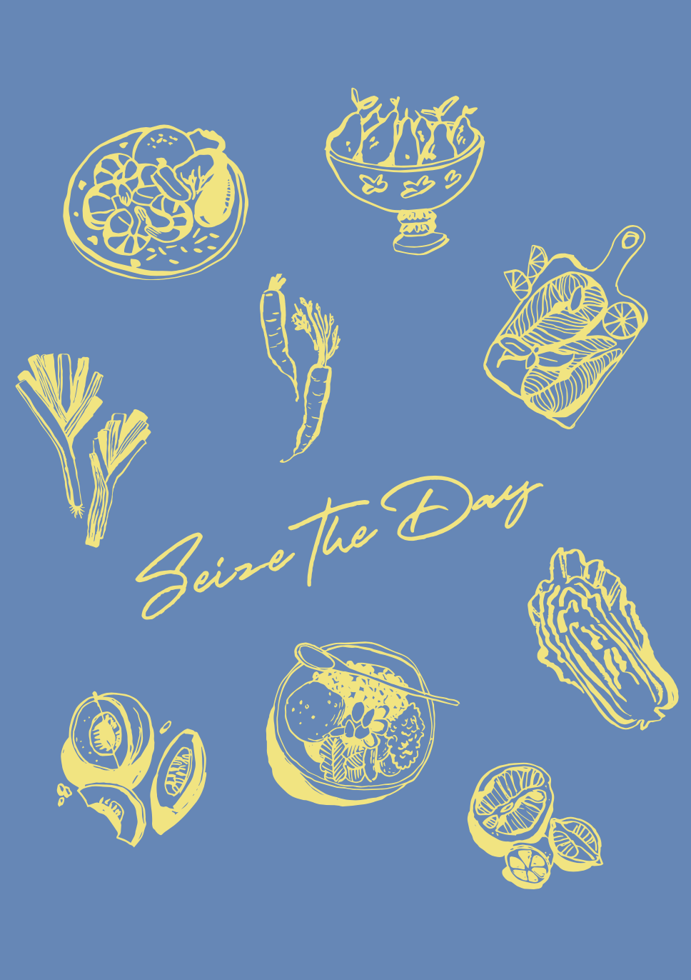
應用設計|從名片到餐車
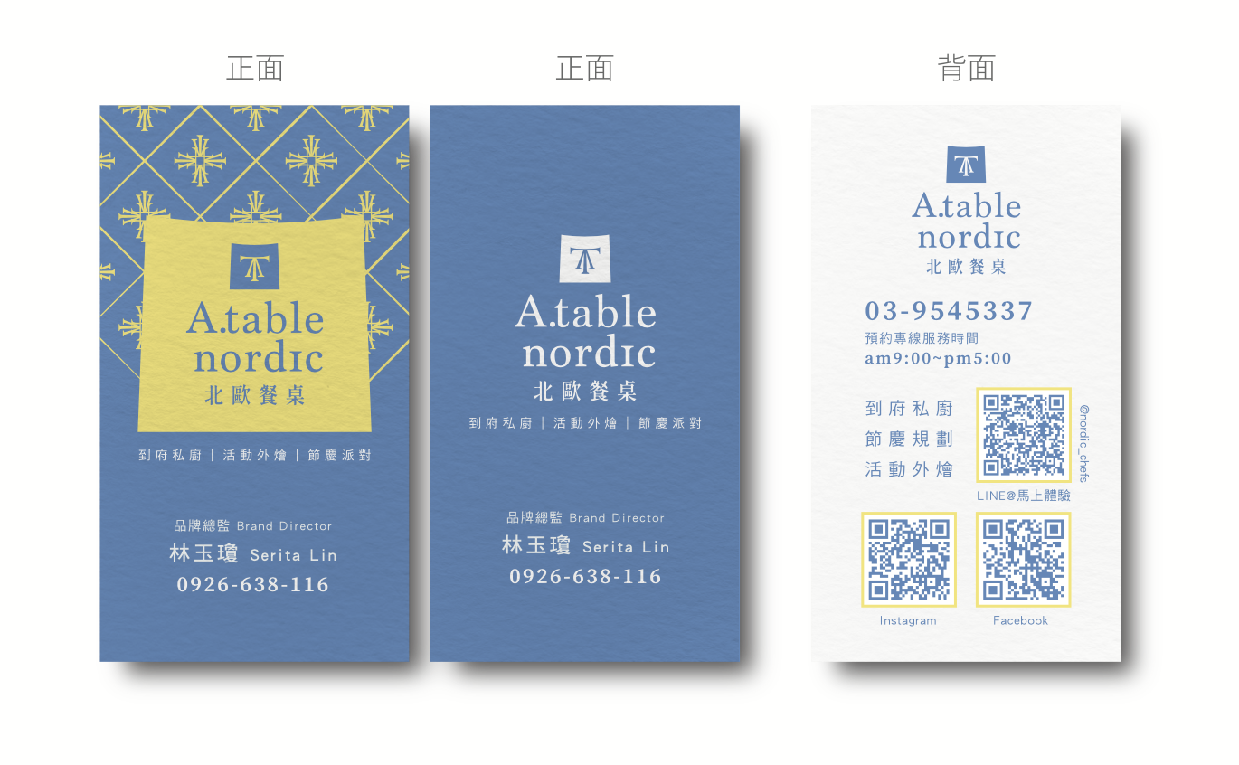
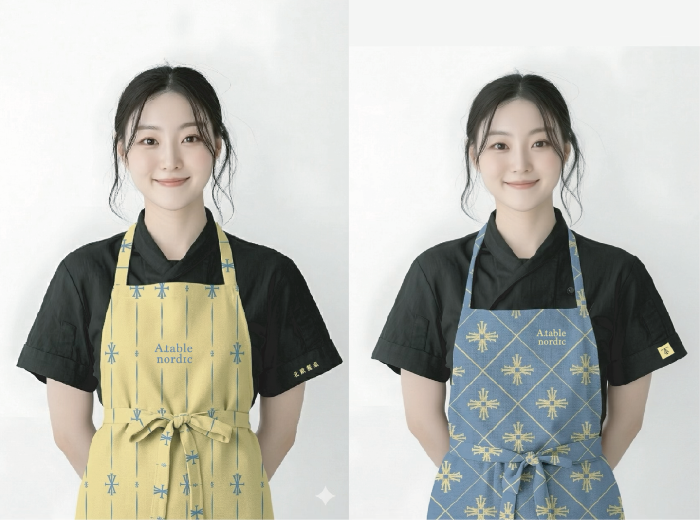
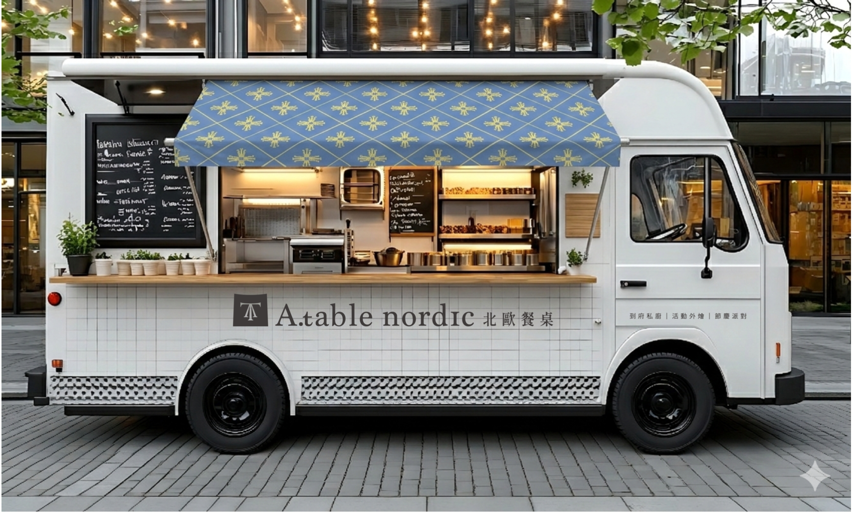
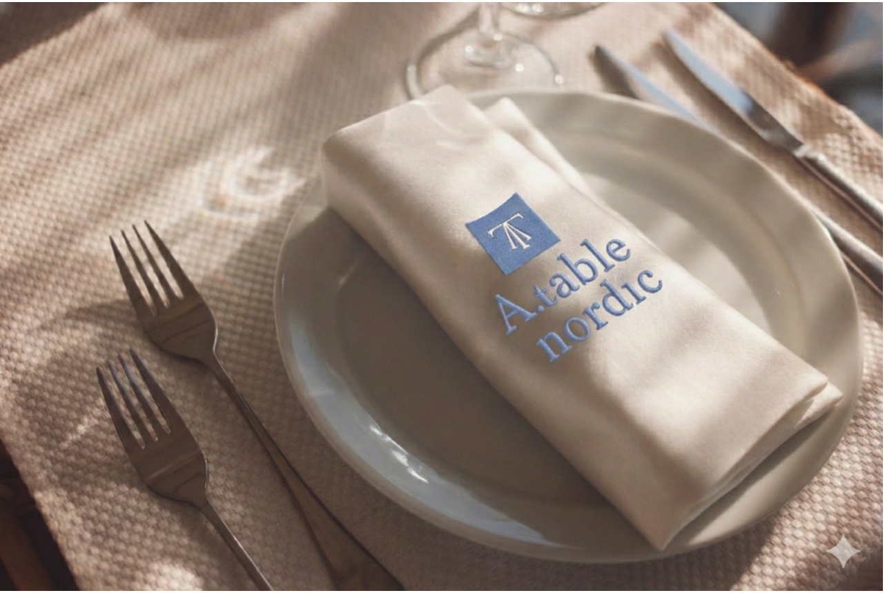
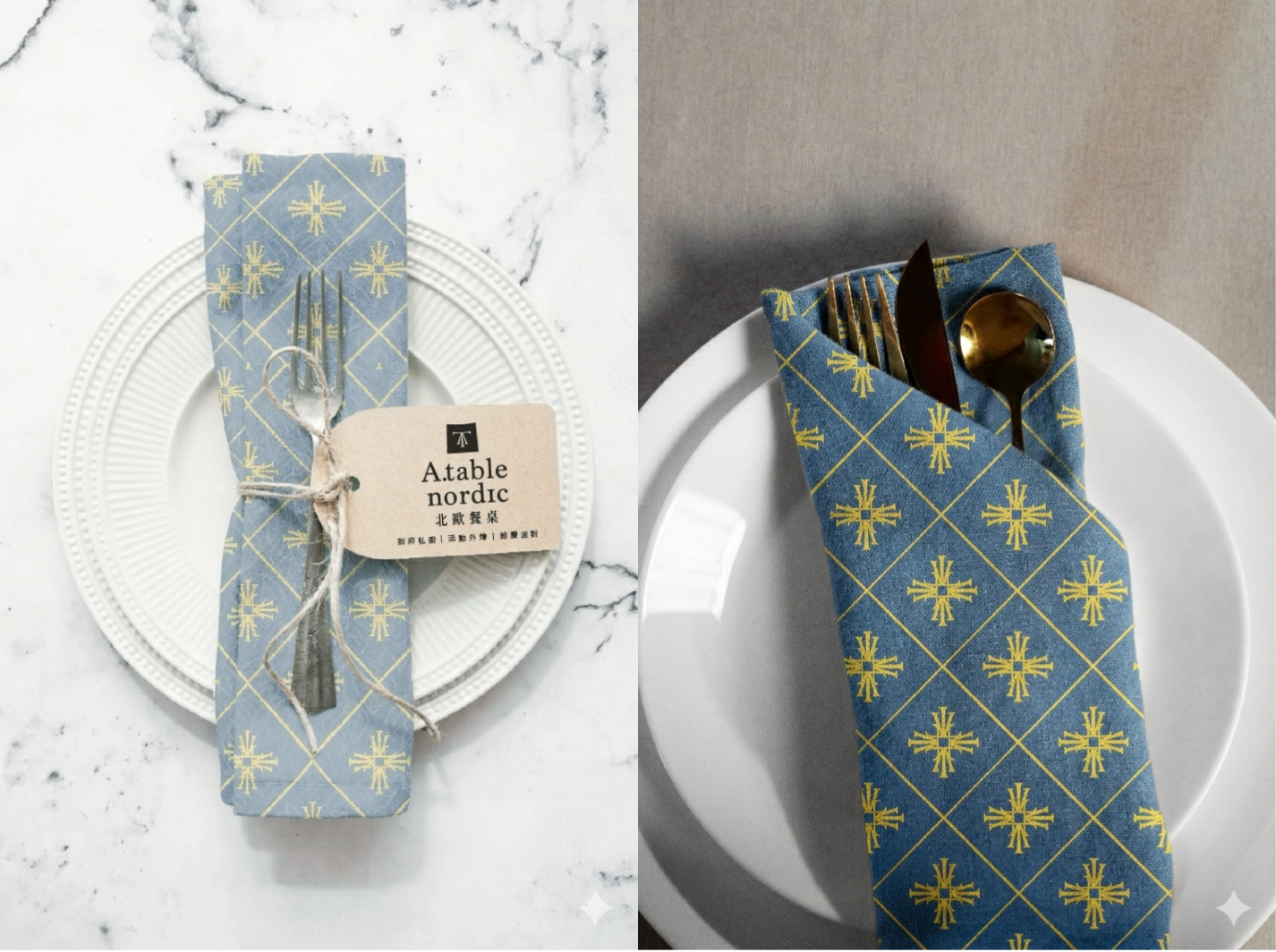
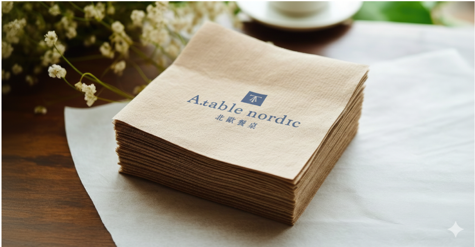
到府私廚沒有店面,餐桌就是門面。因此這套識別的重點不在招牌,而在餐巾的一角、圍裙的織紋、餐車掀起的遮陽棚——當廚師走進顧客家中,品牌也一起坐上了那張桌子。
A private chef has no storefront — the table is the façade. So this identity lives not on a sign, but in the corner of a napkin, the weave of an apron, the awning of a food truck. When the chef walks into a client's home, the brand takes a seat at the table too.
A.table nordic | CIS Brand Identity Design
CHIHE BRANDING CONSULTANCY