



鈦美旅遊 TM TRAVEL
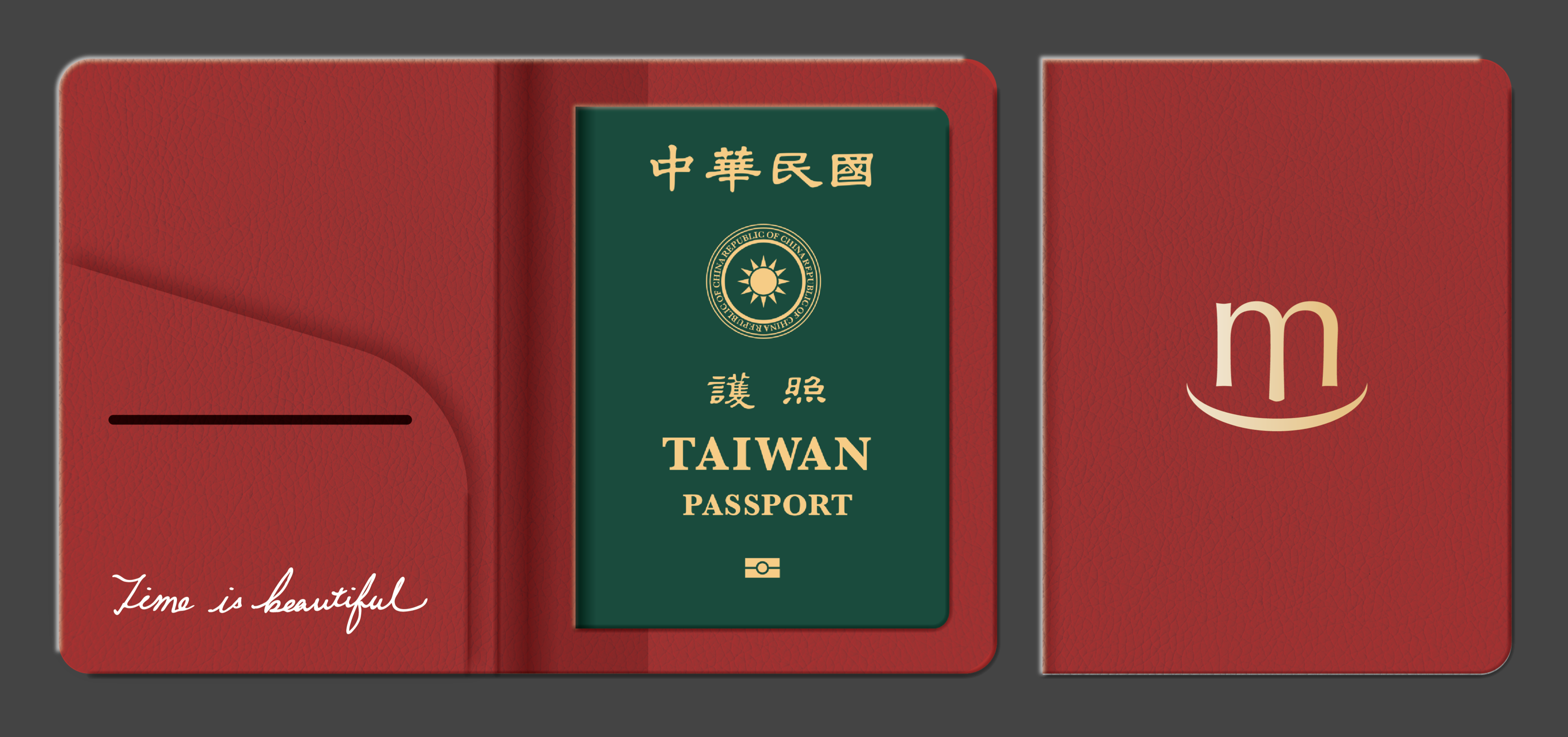
是專營高端海島與客製行程的旅遊品牌。齊禾為其進行品牌重塑,蛻變為 TM TRAVEL,建立一套從標誌到護照套、行李配件的完整 CIS 識別系統。
TM TRAVEL specialises in premium island getaways and bespoke journeys. Chihe led a complete brand transformation, establishing TM TRAVEL with a comprehensive CIS system spanning from its logo to passport holders and travel accessories.
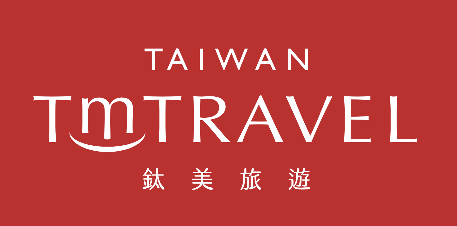
標誌設計|一抹啟程的微笑
Logo Design — a smile before departure
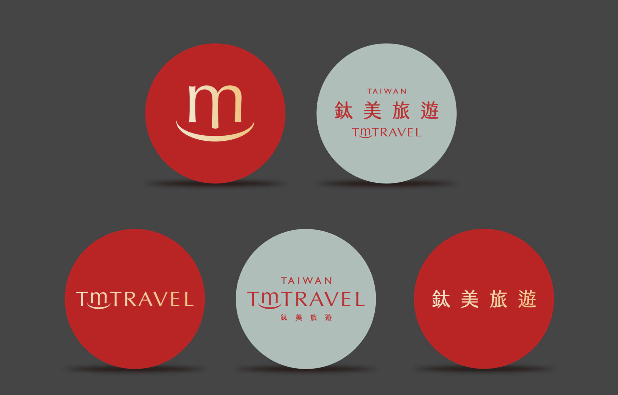
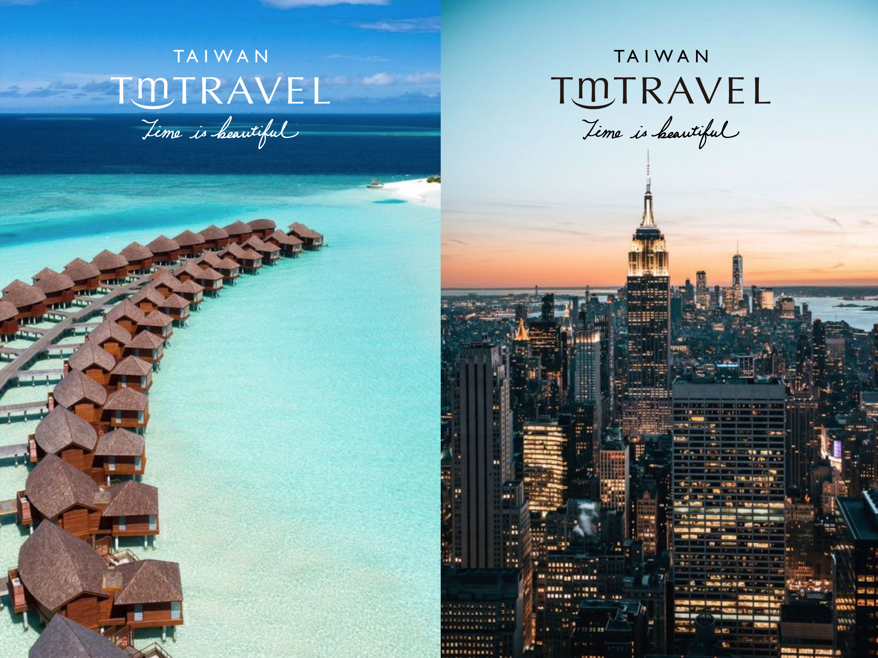
標誌以襯線字體寫下 TM TRAVEL,字母 m 的底部拉出一道弧線——是微笑,也是啟程時揚起的嘴角。上方冠以 TAIWAN,標示品牌的原點;下方是「鈦美旅遊」中文標準字,沉穩而優雅。
The wordmark spells TM TRAVEL in a refined serif, with the letter m curving into a gentle arc below — a smile, and the lift of anticipation before a journey. TAIWAN sits above as the brand's origin; the Chinese name grounds it with quiet elegance.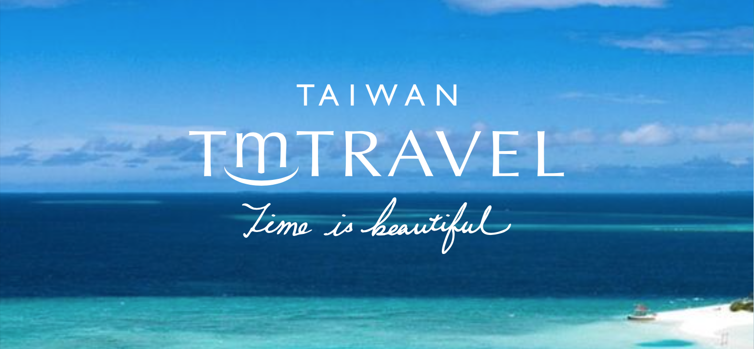
品牌色彩
Brand Colours
旅人紅|Traveller Red PANTONE 3546 C
熱情、行動、出發的勇氣,是品牌最鮮明的記號。
靜謐灰綠|Serene Sage PANTONE 5517 C
旅途中的沉靜與留白,平衡紅的張力。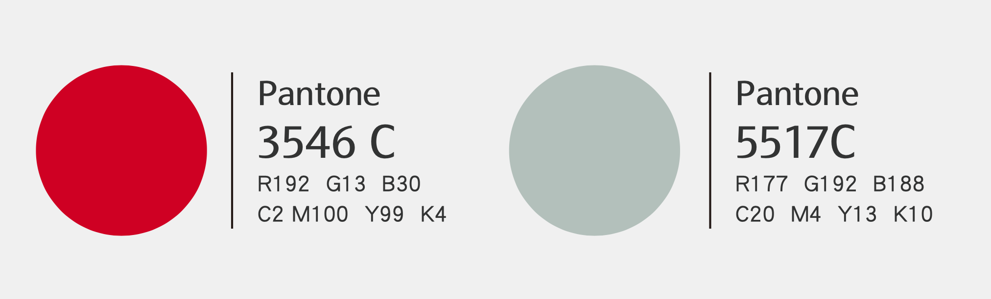
品牌圖騰|微笑的節奏
Brand Pattern
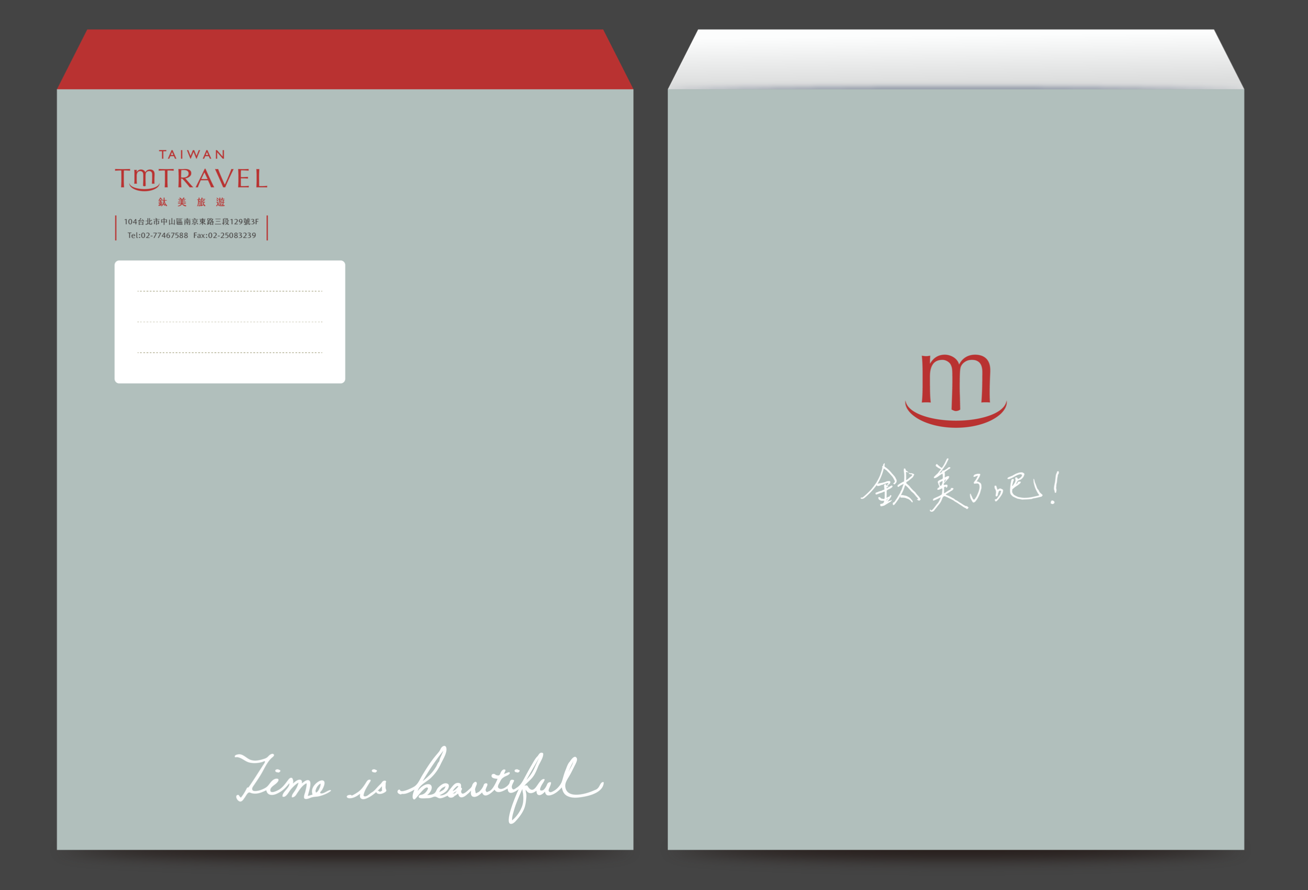
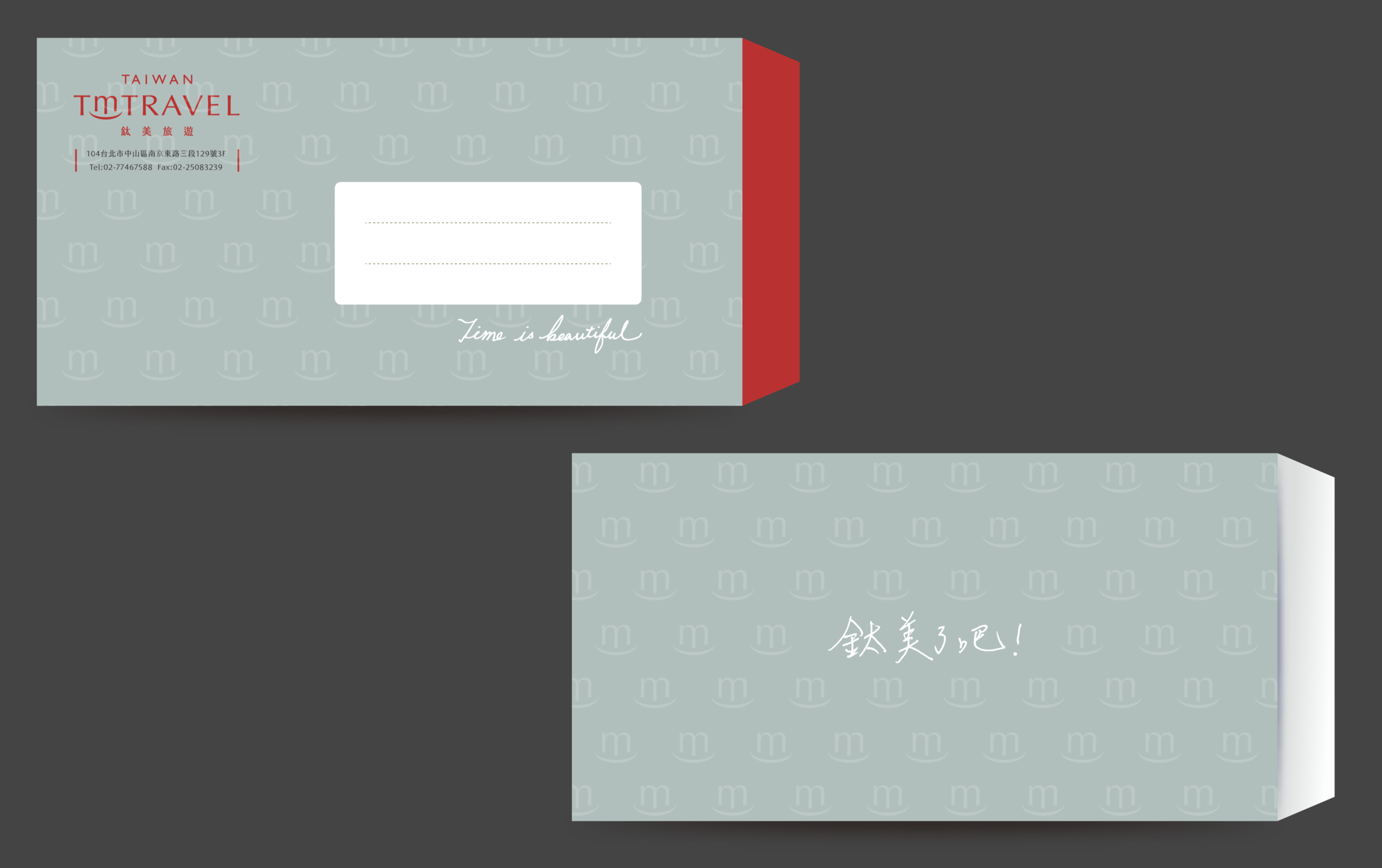
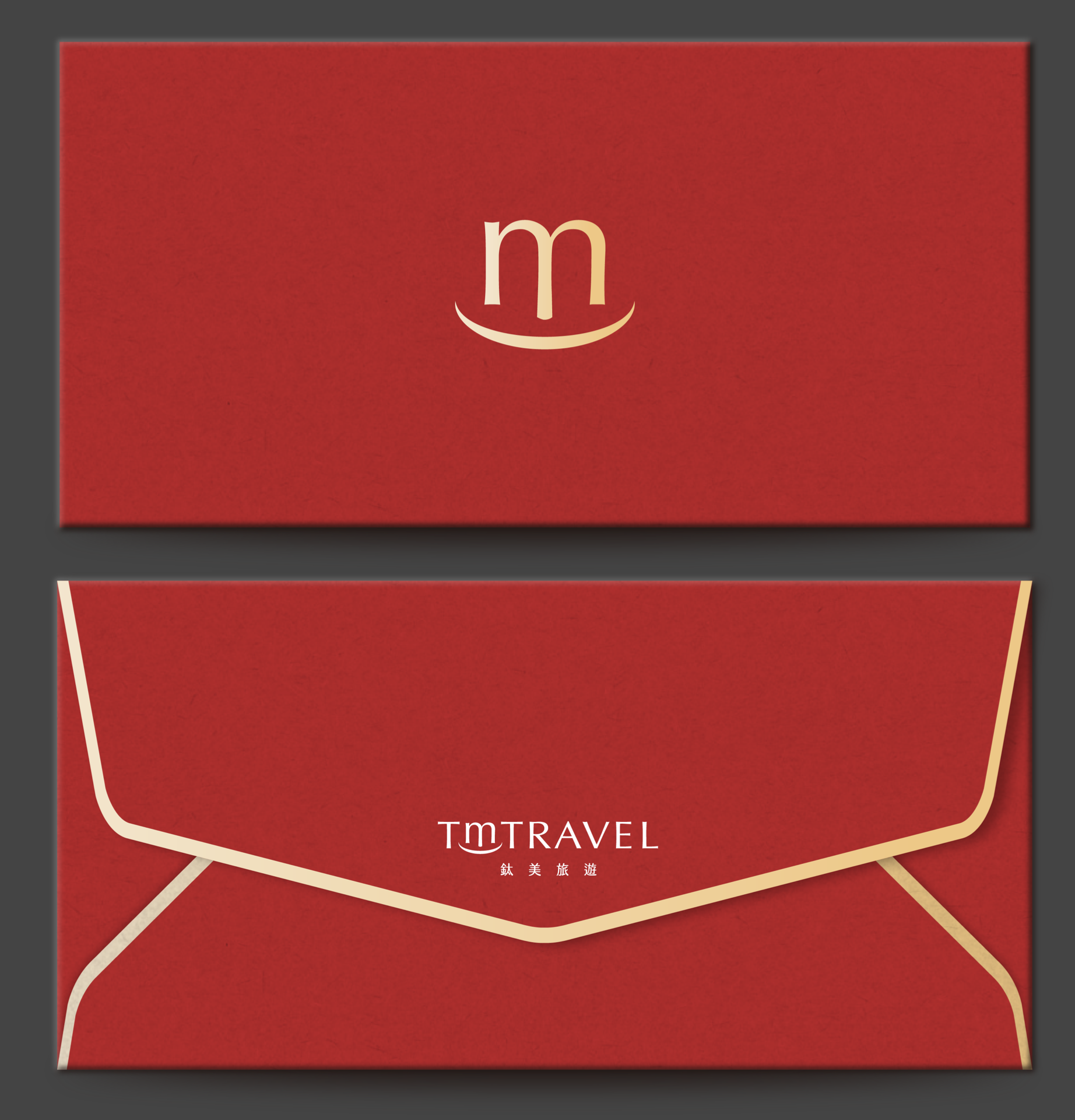
以標誌的 m 微笑符號發展成連續紋樣,紅與灰綠雙色互換,鋪陳於信封、信紙與各式應用,讓品牌在每個細節裡持續微笑。
The smiling m develops into a continuous pattern, reversible in red and sage, running across envelopes, letterheads and applications — a brand that keeps smiling in every detail.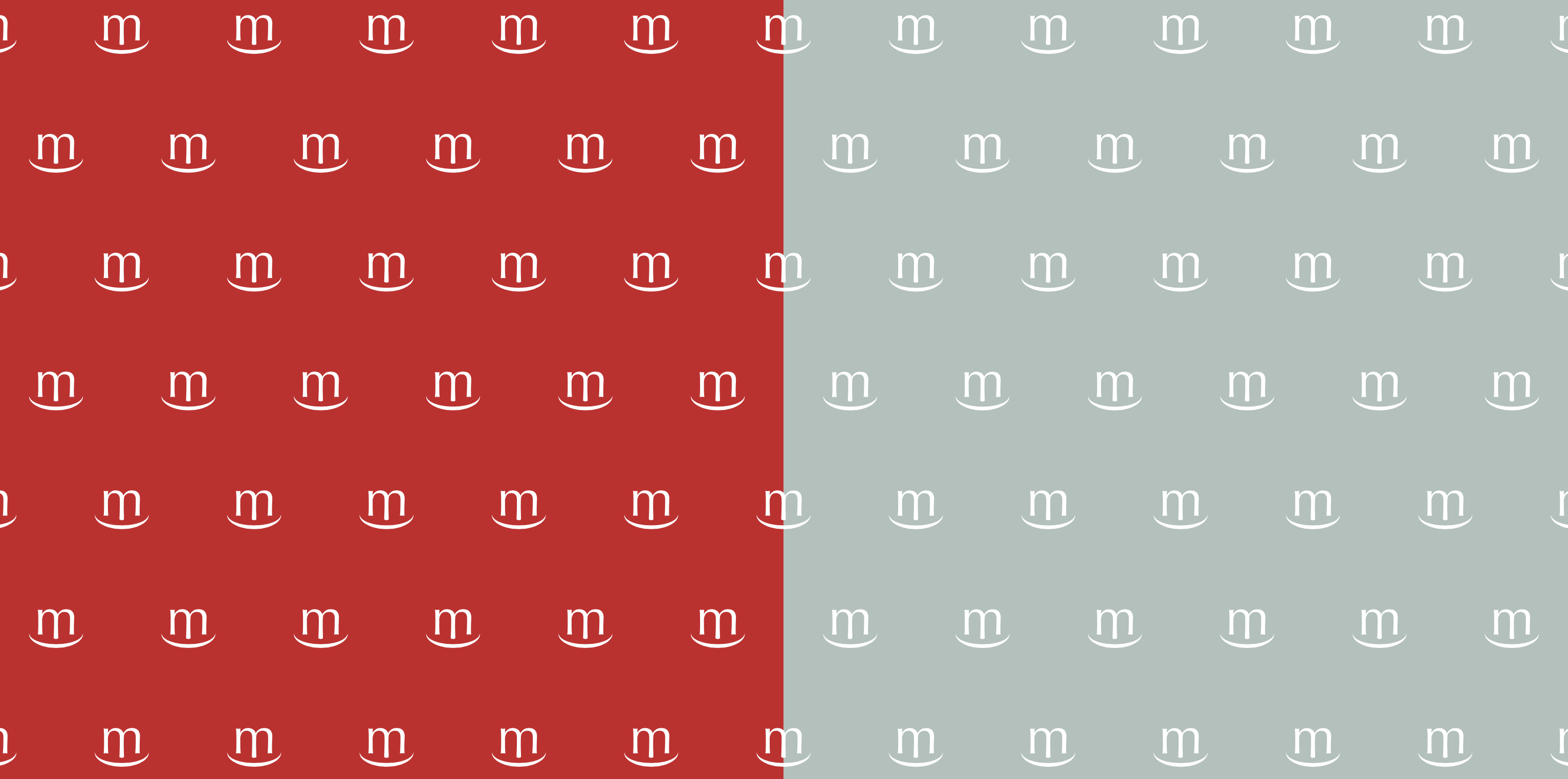
應用設計|從名片到行李
Applications — from name card to luggage
好的旅行從出發前就開始了
A good journey begins before departure.
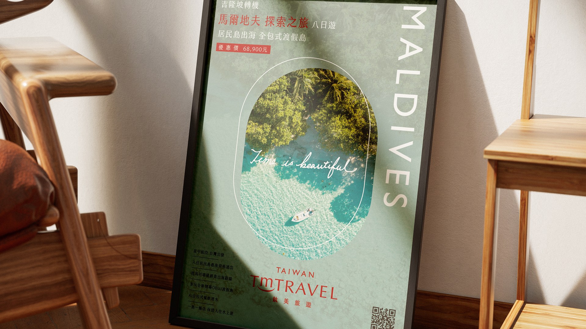
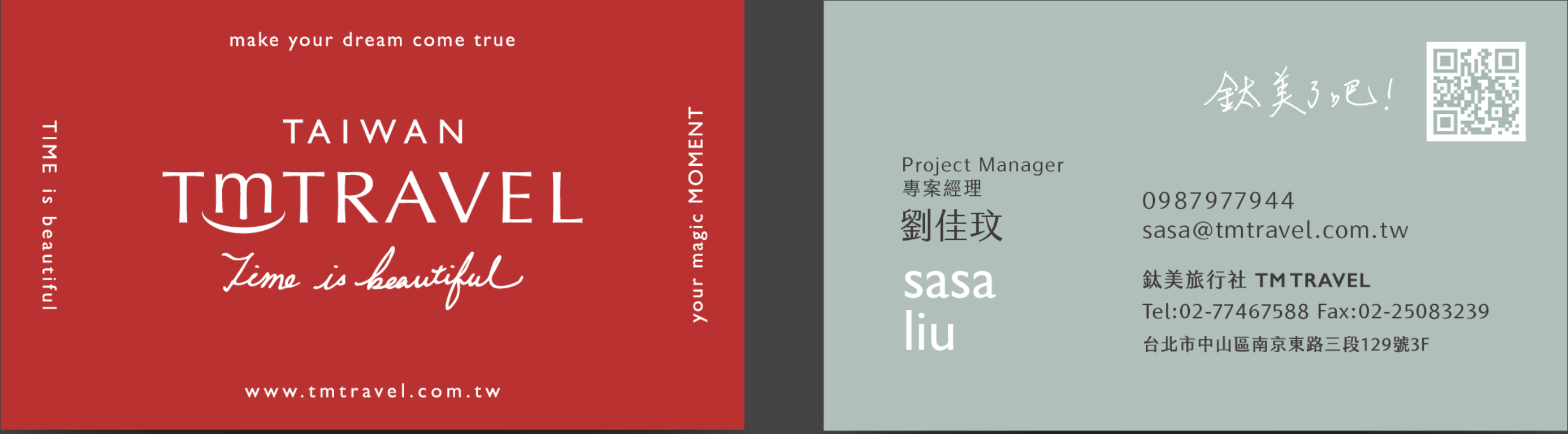
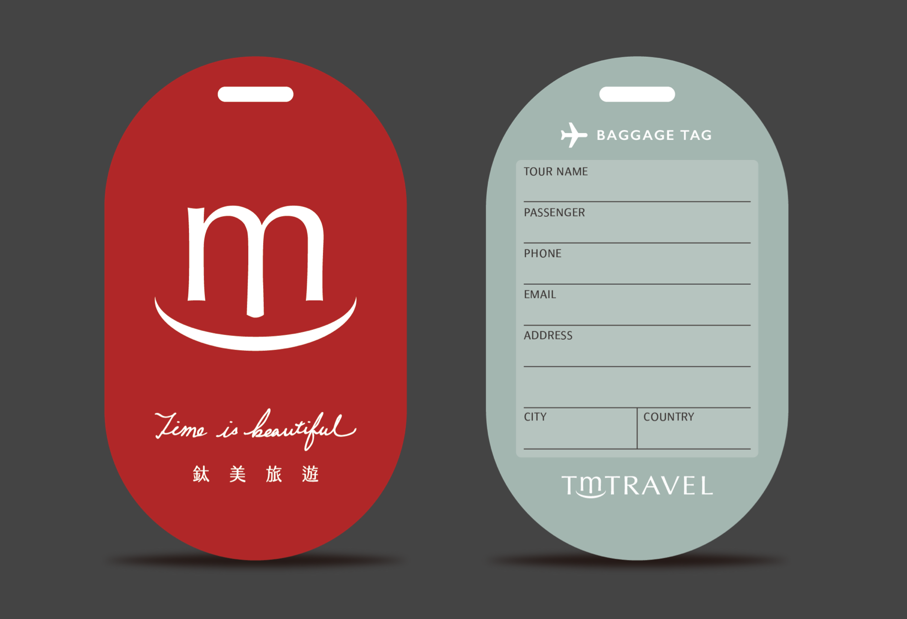
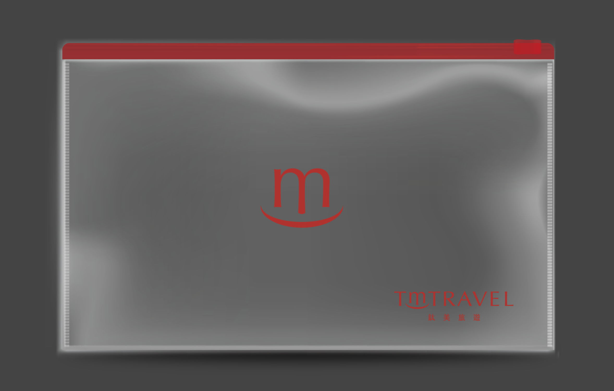
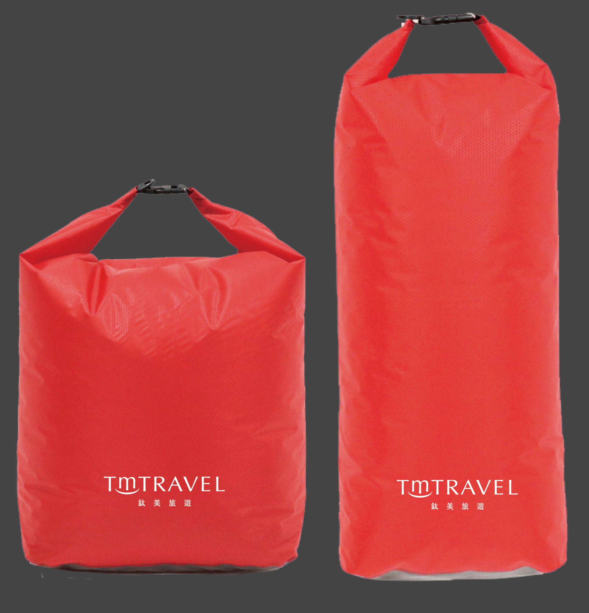
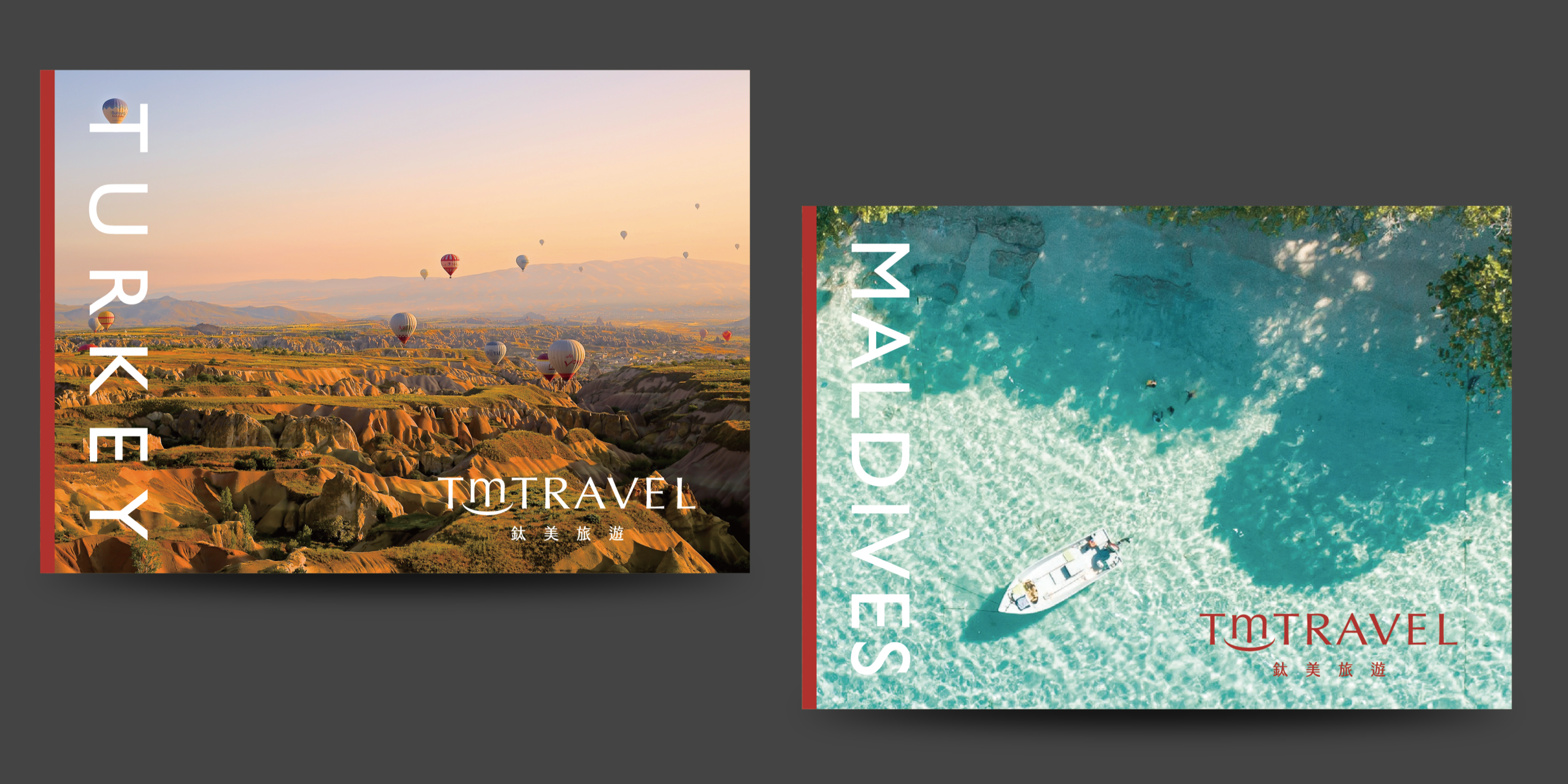
旅遊品牌賣的不是機票,是期待。所以這套識別從護照套、行李吊牌到防水袋,把品牌延伸到旅程的每一個觸點——當旅人整理行囊的那一刻,旅行的心情,就已經開始了。
A travel brand doesn't sell tickets — it sells anticipation. So this identity reaches from passport holders and luggage tags to dry bags, extending the brand to every touchpoint of the journey. The moment a traveller packs their bag, the trip has already begun.
鈦美旅遊
TM TRAVEL
CHIHE BRANDING CONSULTANCY