



甜一口精緻糖業|CANDIED BITE 品牌識別設計
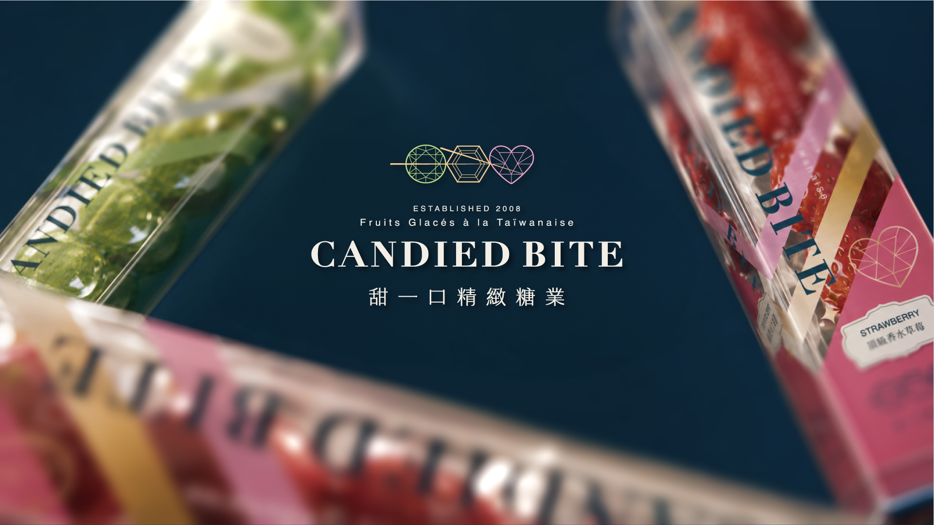
花蓮在地糖葫蘆品牌「甜一口」,從夜市攤位轉型為能上架大型連鎖通路的精緻糖藝品牌,打造一套完整的 CIS 識別系統。
CANDIED BITE — a Hualien-born candied fruit skewer brand — to transform it from a night-market stall into a refined brand ready for major retail channels, building a complete corporate identity system.
BRAND PHILOSOPHY
什麼是 CANDIED BITE|Brand Origin
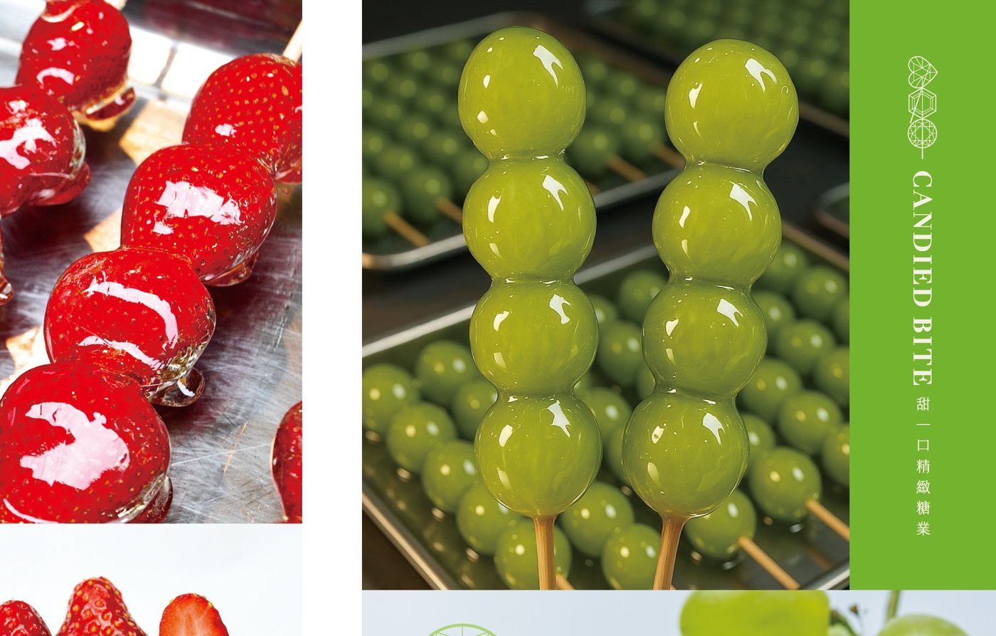
甜一口糖藝股份有限公司 CANDIED BITE,英文品牌名以「CANDIED BITE,咬一口幸福」的概念命名。源自花蓮在地傳產,創立 17 年,堅持優質新鮮水果原料,希望把傳統甜品小吃文化帶到全世界。
CANDIED BITE began as a franchised tanghulu stall at Taichung's Fengjia Night Market. After 12 years, the brand underwent a full transformation to enter major retail chains such as 7-ELEVEN. Rooted in Hualien and 17 years in the making, the brand name embodies "a bite of happiness," built on a commitment to fresh, high-quality fruit.
品牌識別 |Three Dimensions of Brand Identity
MI 核心價值 幸福・真誠・精緻 Happiness · Sincerity · Refinement
BI 行為標誌 專業・堅持・國際化 Professional · Persistent · International
VI 視覺標誌 晶瑩剔透・精緻華麗・清新明亮 Crystalline · Refined · Bright
MI — Happiness, Sincerity, Refinement: "One bite" embodies comfort and joy, turning tanghulu into a shareable, personal indulgence.
BI — Professional, Persistent, International: No artificial coloring, a thin crisp candy shell, and artisan craftsmanship elevate tanghulu to "candy art" comparable to gemstone cutting.
VI — Crystalline, Refined, Bright: Visual identity merges "candy" with "gemstone" cutting motifs, emphasizing clarity, transparency, and brilliance.
|"糖葫蘆是一種可食用的珠寶。"
DESIGN CONCEPT | 設計理念
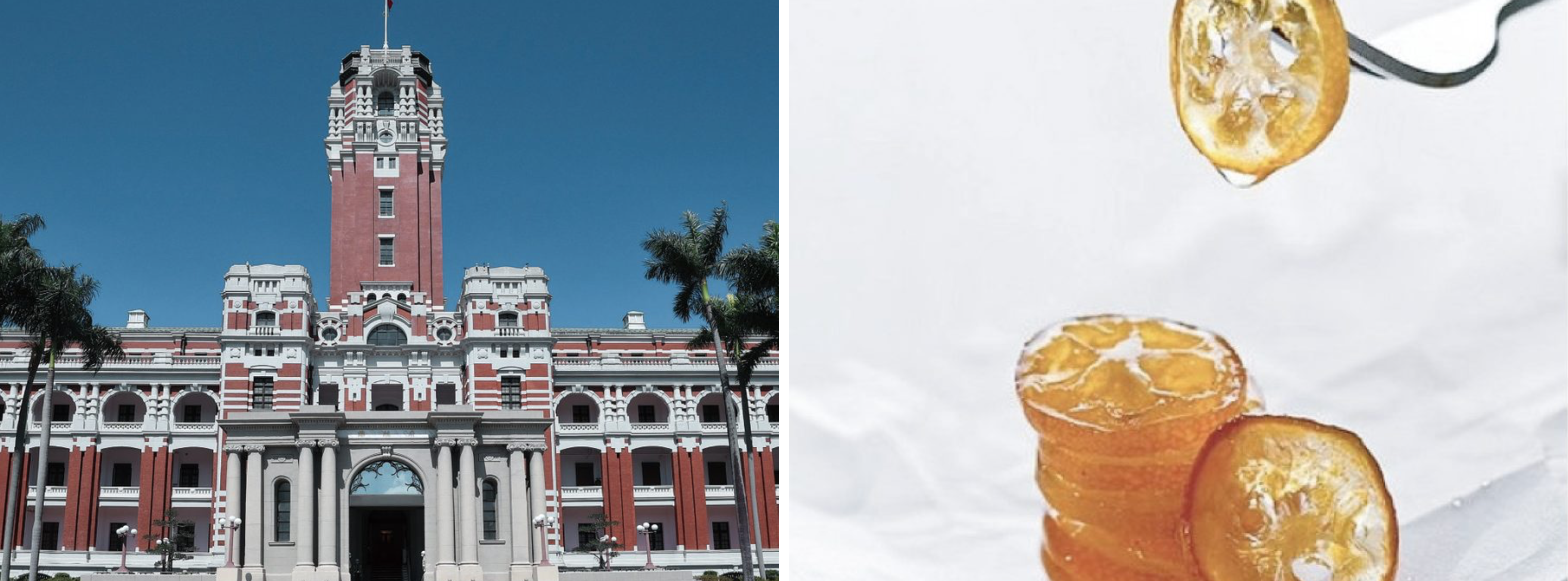
台歐混血:命名與定位巧思
A Taiwanese-European Hybrid Identity
齊禾借用這股「台歐混血」的文化基因,為甜一口重新定義糖葫蘆在世界甜點版圖上的位置。法式甜點分類中,Dessert 是飯後甜點、Pâtisserie 是西式糕點、Confiserie 則是糖果類(棒棒糖、巧克力、蜜餞、水果裹糖)。齊禾設計將糖葫蘆定義為「une confiserie aux fruits(水果糖果類點心)」,並取名「Fruit Glacé à la Taïwanaise(台灣式水果裹糖)」,讓在地小吃站上國際甜點的分類架構。
CHIHE Design drew on this "Taiwanese-European hybrid" DNA to reposition tanghulu within the world of fine confectionery. In French dessert taxonomy — Dessert, Pâtisserie, and Confiserie — tanghulu was classified as "une confiserie aux fruits," officially named "Fruit Glacé à la Taïwanaise," placing a local street snack within an international framework.
COLOR SYSTEM
品牌標準色系統|Brand Color Palette
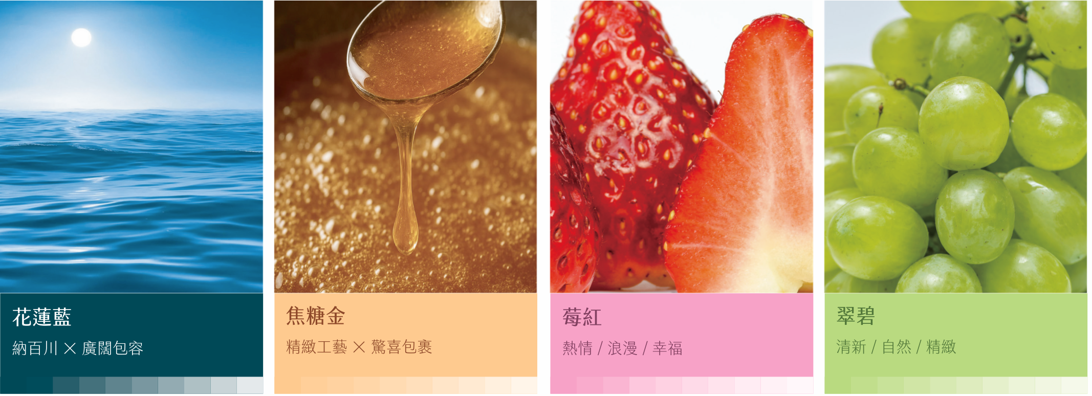
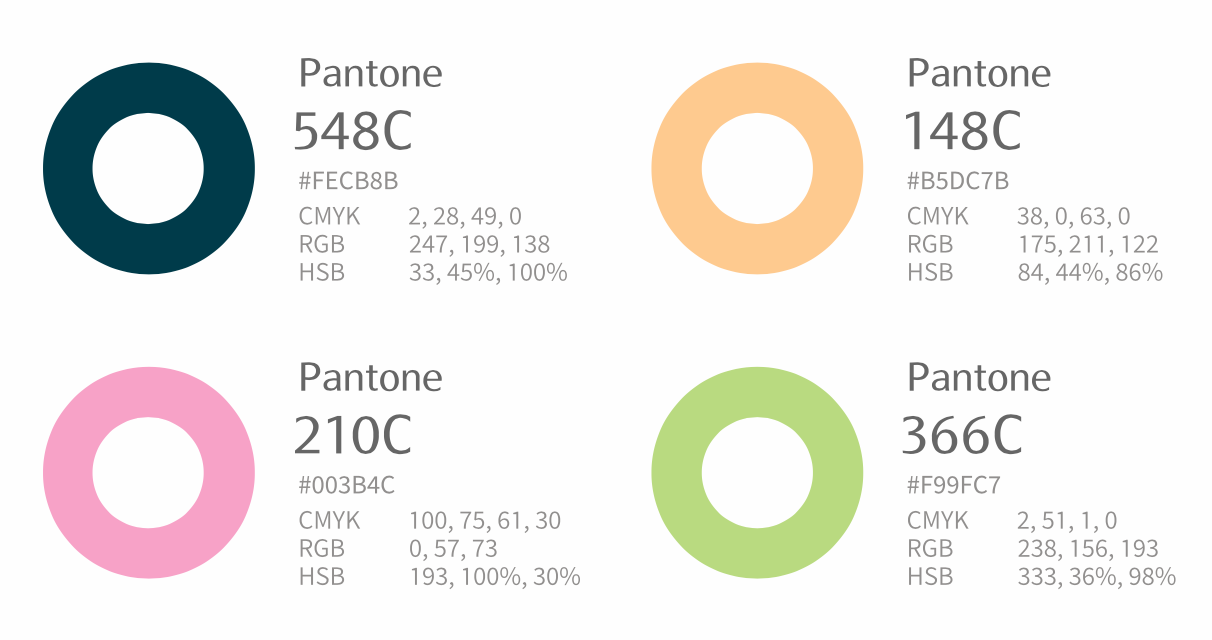
四個標準色分別呼應花蓮的海、糖漿的焦糖光澤、寶石般的熱情,以及天然清新的職人堅持。
Four brand colors echo Hualien's ocean, the caramel gleam of molten sugar, gemstone-like passion, and the natural, artisanal spirit of the brand.
LOGO DESIGN | 標誌設計
品牌標誌|Logo System
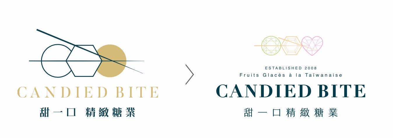
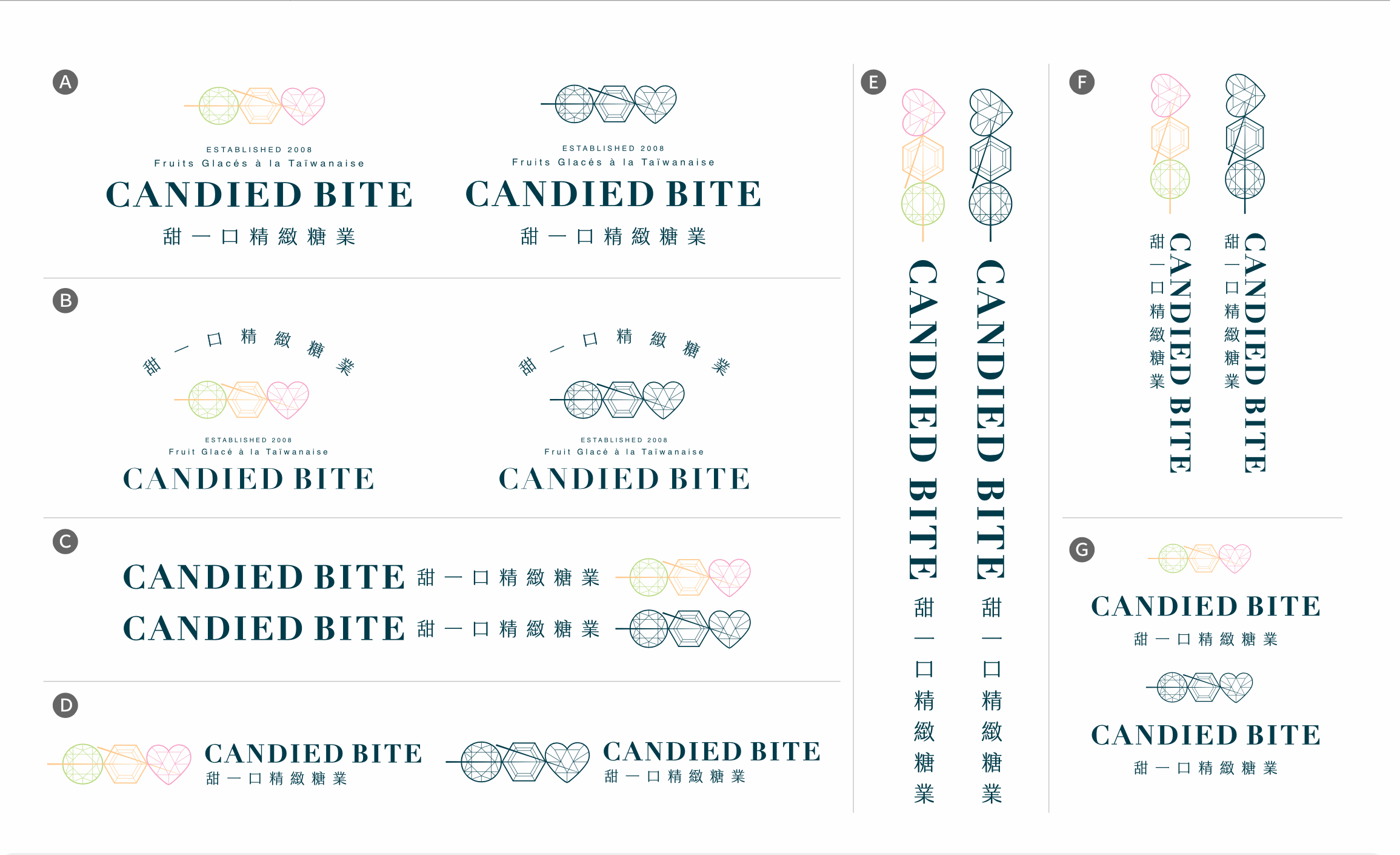
標誌以「寶石切割」為靈感核心,將糖葫蘆的圓潤果實轉化為晶亮的幾何切面,中英文標準字則延續品牌一貫的精緻質感,構成一套可延展的完整標誌系統。
The logo draws on gemstone-cutting geometry, transforming the rounded silhouette of candied fruit into faceted, crystalline forms. Paired with custom Chinese and English lettering, it forms a complete, extensible identity system.
BRAND APPLICATIONS | 產品應用細節
應用延伸|Brand Touchpoints
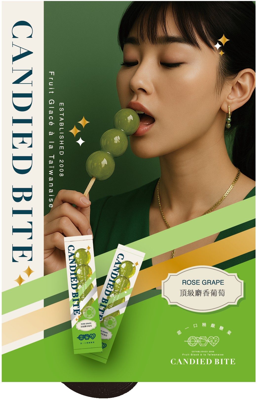
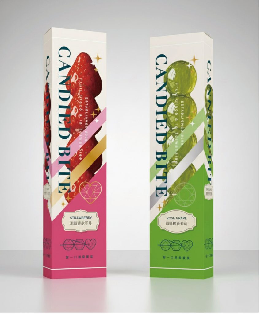
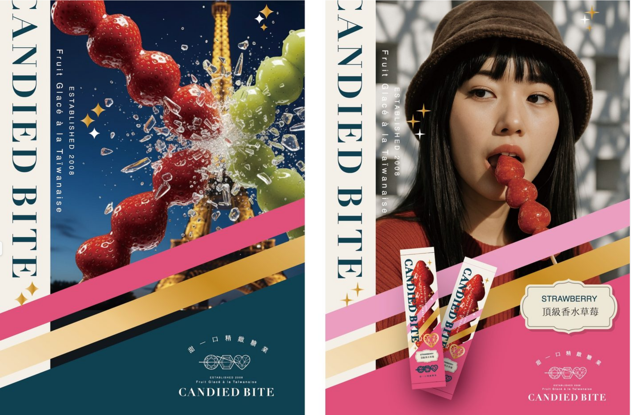
品牌識別延伸至包裝設計、形象海報、戶外看板等多元應用場域,讓「晶瑩剔透、精緻華麗」的視覺語言貫穿每一個消費者接觸點。
The identity extends across packaging, image posters, and outdoor signage — carrying the "crystalline, refined" visual language through every consumer touchpoint.
 _________________________________________________________
甜一口精緻糖業|CANDIED BITE
CIS 品牌識別設計
CHIHE BRANDING CONSULTANCY