




光感生活 Light Life 是一個結合希塔療癒、靜心冥想與永續生活的身心靈品牌。
齊禾以品牌既有的光之意象為基礎,為其設計名片與網站主視覺,讓「光」與「自然」的溫度,從線上延伸到手中的每一張名片。
Light Life is a mind-body-spirit brand weaving together Theta Healing, meditation and sustainable living. Building on the brand's existing imagery of light, Chihe designed its name card and website key visual — extending the warmth of light and nature from screen to the card in hand.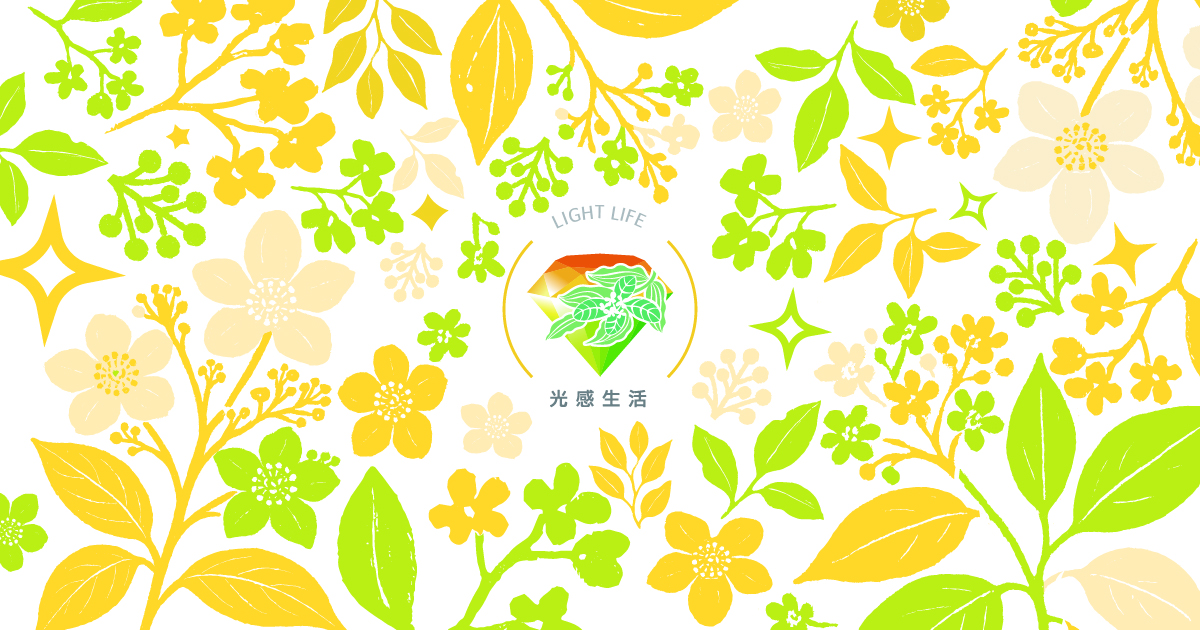
視覺概念|一片會發光的花園
品牌相信「每個人都是一顆星,彼此照亮成為星系」。齊禾以手繪花葉鋪成滿版的生機,星芒點綴其間,像散落在枝葉上的光。黃與綠交織,是陽光穿過葉隙的顏色,也是療癒最自然的溫度。
The brand believes each person is a star, lighting one another into a galaxy. Chihe fills the field with hand-drawn foliage, scattered with star-sparkles like light caught on leaves. Yellow and green interweave — the colour of sunlight through leaves, the most natural warmth of healing.
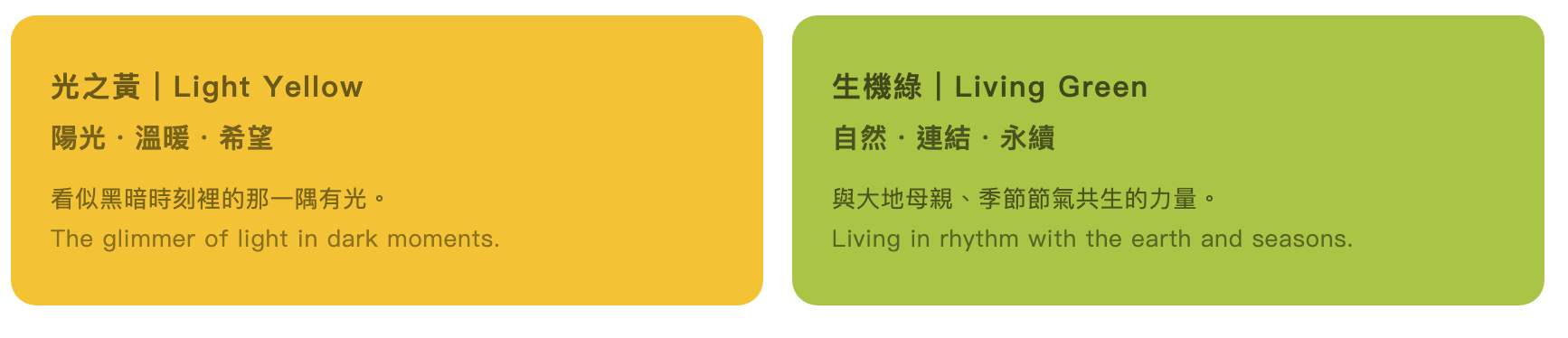
品牌色彩
名片設計
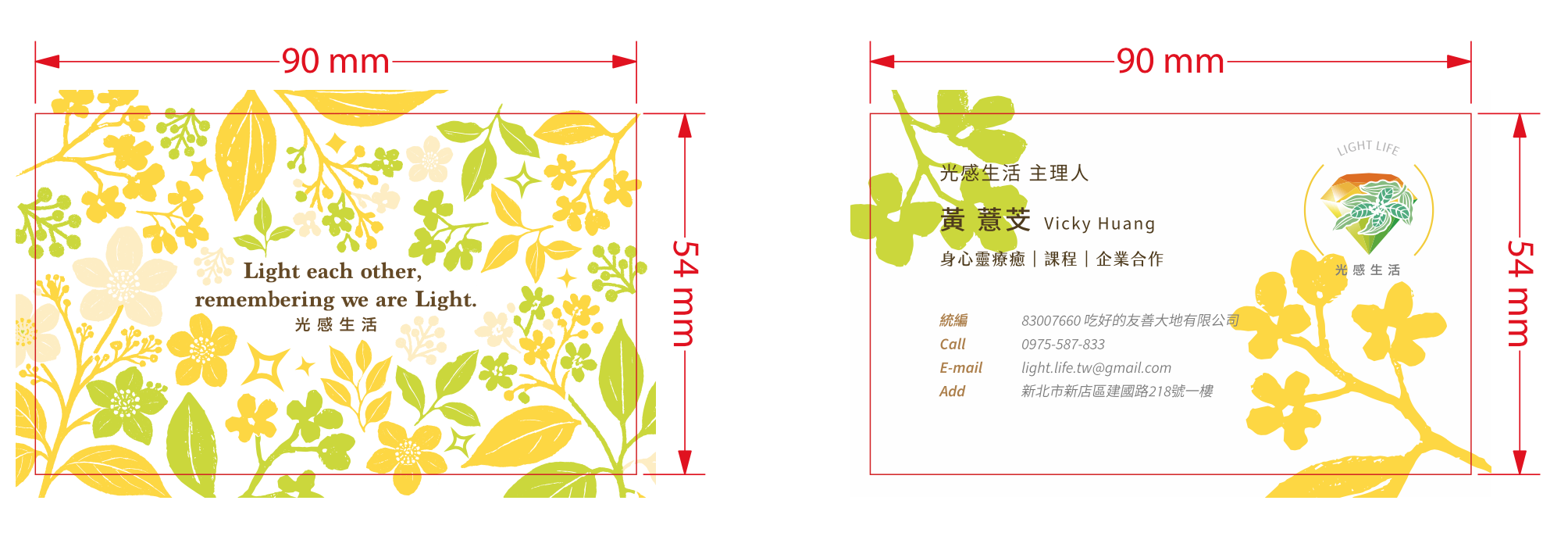
正面以滿版花園承載品牌 slogan,一遞出去就是一句祝福;背面收斂留白,花枝從對角延伸,讓主理人的資訊在光與綠之間清晰呈現。既有的鑽石光芒標誌經微調後,安放於右上,穩定整體重心。
The front carries the slogan within a full-bleed garden — a blessing handed over with every card. The back opens into calm white space, with floral branches reaching across the diagonal so the founder's details read clearly between light and green. The existing diamond-light logo, refined, anchors the top corner.
網站視覺
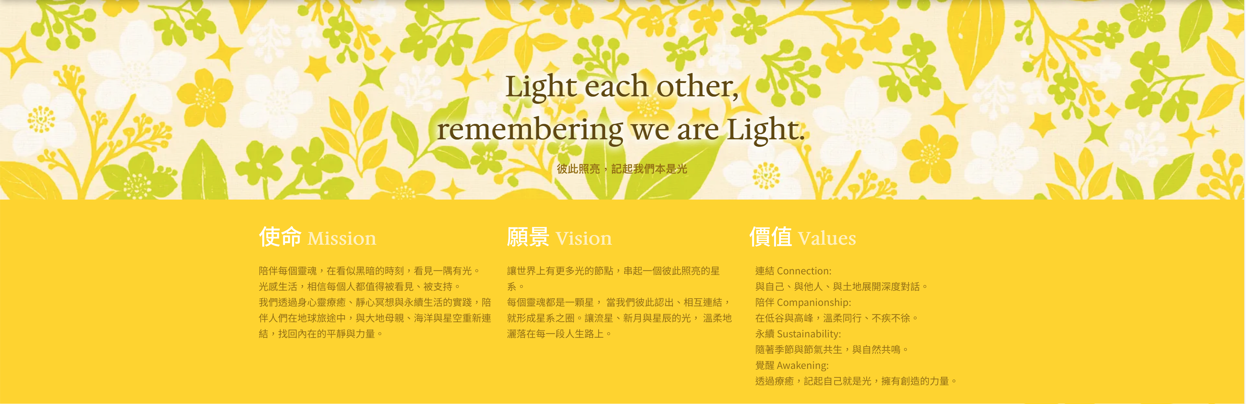
首頁主視覺|使命・願景・價值版面|整體色彩與插畫延伸
網站首頁以同一套花園視覺鋪陳,slogan 浮於花葉之上;向下進入黃色區塊,使命、願景、價值三欄並列。名片與網站共用一套語言,讓品牌無論在螢幕上或指尖間,都是同一道光。
The homepage unfolds with the same garden visual, the slogan floating above the foliage; scrolling into the yellow field, Mission, Vision and Values sit side by side. Card and website share one language — the same light, whether on screen or in hand.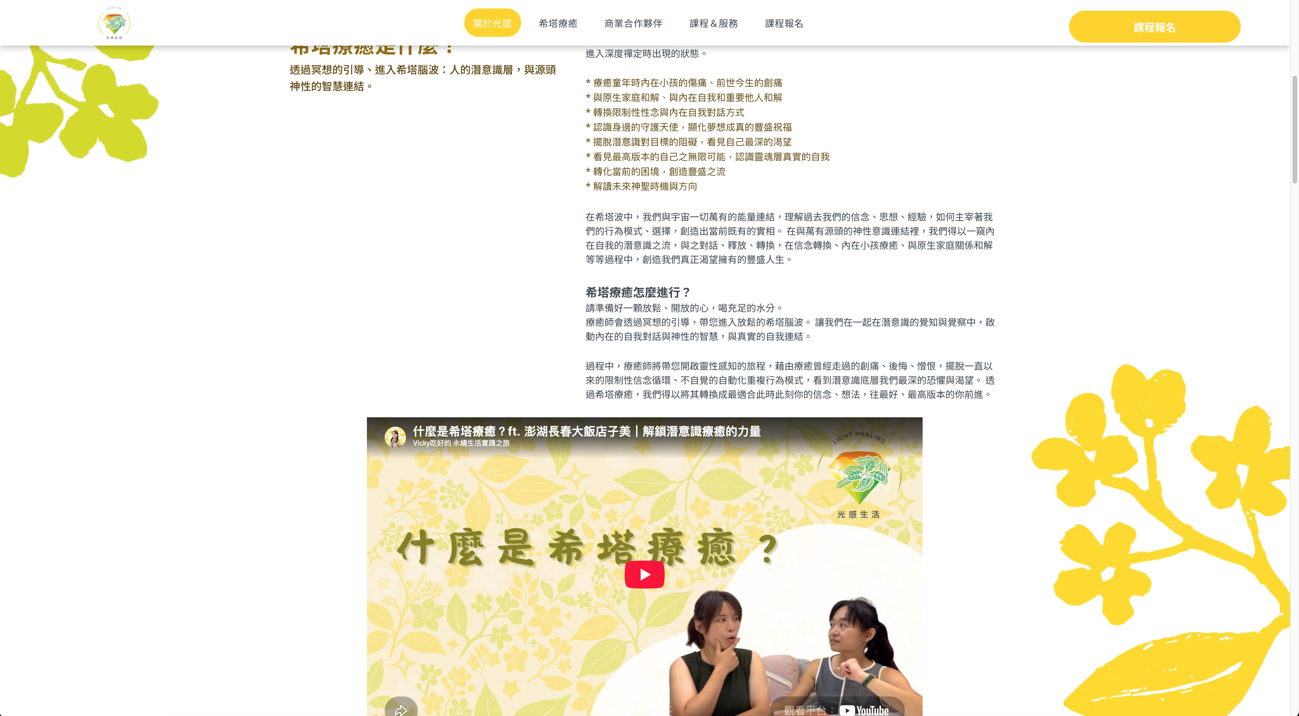
光感生活 Light Life | 名片 × 網站視覺設計 2025
Light Life | Name Card & Website Visual Design
CHIHE BRANDING CONSULTANCY